ExpenseTracker: Why a Monthly Sheet Beats the Endless Transaction Feed
A small Android app makes a big argument: if you organize money by month first, the UI, database, and charting logic all get simpler, sharper, and more human.

- ExpenseTracker is built around a month-sized financial object, and that product choice simplifies the interface, the schema, and the graph.
- The repo favors explicit control over abstraction, using raw SQLite and manual state syncing instead of Room.
- Compose handles the surface, but the ViewModel still does the bookkeeping needed to keep the UI honest.
- The app is small, but its architecture is coherent because every layer serves the same monthly model.
The app thinks in months, not transactions
Most expense trackers start with a stream. This one starts with a container. In 19jenil/ExpenseTracker, the core unit is the Monthly Sheet, and that decision changes the whole feel of the product. You are not browsing an infinite ledger. You are closing a loop.
That matters because monthly budgeting is already how many people think about money. Rent, salary, subscriptions, and discretionary spending all reset against a calendar rhythm. The app leans into that rhythm instead of fighting it.
The result is a cleaner mental model. A month has a beginning, a balance, and an end. Expenses live inside it. Income anchors it. The UI can stay focused because the data model already knows what belongs together.
One sheet is a financial container, not a folder
The data model follows the same logic. `ExpenseSheet` is not just a folder for rows. It holds the month, the year, the income, and the linked expenses, and it computes balance from those values. That keeps the business rule close to the record it describes.
data class ExpenseSheet(
    val sheetId: String,
    val month: Int,
    val year: Int,
    val income: Double,
    val expenses: List<Expense> = emptyList()
) {
    fun calculateBalance(): Double {
        return income - expenses.sumOf { it.amount }
    }
}
There is also a subtle consequence in how sheet changes work. If the month or year changes, the app treats that as a move into a different container, not a trivial field edit. That is a strong signal: the monthly sheet is the unit of meaning, not just a row in a table.
Why raw SQLite is the point, not a shortcut
This repo could have used Room. It did not. Instead, it uses `SQLiteOpenHelper`, cursors, and explicit foreign keys with `ON DELETE CASCADE`. That is not a missing abstraction. It is a choice to keep the persistence layer visible.
FOREIGN KEY(sheet_id) REFERENCES sheets(sheet_id) ON DELETE CASCADEThat decision makes the system easier to reason about at this scale. You can see exactly when records are inserted, read, updated, and deleted. You can also see the cost: more manual code, more cursor handling, and more responsibility in the ViewModel. For a small, focused app, that trade-off is fair.
| Dimension | Room-first tracker | This repo |
|---|---|---|
| Persistence style | Annotations and generated access | Manual SQL and cursor reads |
| Schema control | Higher-level abstraction | Explicit table and foreign key control |
| Learning value | Faster to ship | More transparent mechanics |
| Complexity fit | Better for larger apps | Well suited to a compact utility |
The cascade rule is especially important. Delete a sheet, and its expenses vanish with it. That makes the monthly container feel real. The container is not cosmetic. It governs the lifecycle of the data inside it.
Compose handles the surface, ViewModel handles the truth
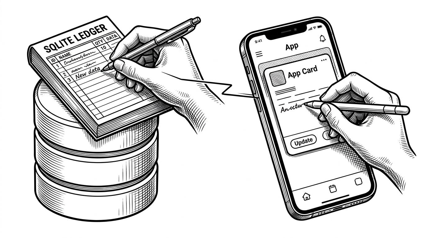
The UI stack is modern. The state strategy is more old-school. `ExpenseViewModel` writes to the database and then patches the in-memory list so Compose can recompose. That dual update pattern is the glue holding the app together.
dbHelper.updateSheetIncome(sheetId, newIncome)
val index = expenseSheets.indexOfFirst { it.sheetId == sheetId }
if (index != -1) {
    expenseSheets[index] = expenseSheets[index].copy(income = newIncome)
}
That is the right move for this codebase because the database is not just a backend. It is the source of truth, while the mutable state list is the live projection that the UI reads. The code is simple, but the architecture is honest.
| Question | Database-first answer | State-first answer |
|---|---|---|
| What gets updated first? | SQLite | Compose state |
| What is authoritative? | Stored rows | In-memory list |
| Why it works here | Persistence must survive process death | UI needs immediate recomposition |
| Main risk | Manual sync bugs | State drifting from disk |
The graph is custom because the graph is part of the product
The chart in `Graph.kt` is not a decorative extra. It is an extension of the same monthly model. If the app thinks in bounded periods, then the graph should help you move between bounded periods too. A generic charting library would have worked. It would also have hidden the point.
Instead, the repo uses a custom Canvas-based graph with horizontal drag gestures. That gives the developer full control over the shape of the visualization and the interaction model. The graph is not just showing data. It is teaching the user how the app understands time.
pointerInput(Unit) {
    detectHorizontalDragGestures { _, dragAmount ->
        // move across time periods
    }
}
This is where the app feels most coherent. The same month-scoped logic that shapes the database also shapes the visualization. The chart is not bolted on. It belongs to the product model.
What this project gets right, and where it stays small
| Aspect | What it gets right | What remains limited |
|---|---|---|
| Product model | A clear monthly budgeting rhythm | Not built for open-ended finance workflows |
| Architecture | Simple MVVM with explicit persistence | No visible dependency injection layer |
| Visualization | Custom chart matched to the data model | Not a full analytics suite |
| Maturity | Focused and easy to follow | Thin test coverage and lightweight scaffolding |
That balance is why the repo is worth reading. It is not trying to be a universal finance platform. It is trying to be a clean monthly tracker, and almost every line supports that goal. The scope is small, but the idea is tight.
If you are comparing it with more mature Android finance apps, the difference is obvious. Bigger projects lean on Room, Hilt, and broader feature sets. This one chooses clarity over breadth. That is a limitation, but also the reason it is readable in one sitting.