recipe-finder-pro: Recipe Finder Pro: The Small React App That Treats State Like a Design Decision
A clean recipe browser, a weird API made usable, and a surprisingly thoughtful split between Context and localStorage.
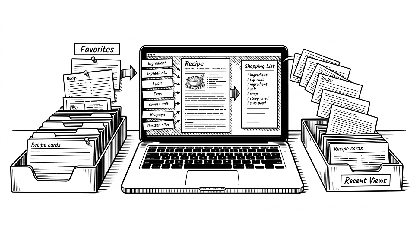
- Recipe Finder Pro is strongest when it assigns each kind of memory the lightest tool that can still do the job.
- Favorites belong in Context because the whole app needs to react to them, while recent views belong in localStorage because they are page-local and disposable.
- TheMealDB’s flat ingredient schema is the real friction point, and normalizing it is what makes the UI feel clean.
- The project reads less like a recipe platform and more like a disciplined demo of good judgment under constraints.
Why this recipe app feels more thoughtful than its size suggests
Most recipe apps look impressive because they have huge catalogs, meal plans, or social features. Recipe Finder Pro does something smaller and smarter. It makes a simple promise: search recipes, save the good ones, and keep your last few views without dragging in a backend or user accounts.
That restraint is the point. The app separates Favorites from Recently Viewed and does not pretend those are the same kind of data. One needs to wake up the whole interface. The other just needs to stick around long enough to be useful.
Two kinds of memory, two different tools
| Need | Favorite recipes | Recently viewed recipes |
|---|---|---|
| Scope | App-wide UI state | Page-local history |
| Tool | React Context | localStorage |
| Why this fits | The whole app may need to react | Only the details page needs to write it |
| Behavior | Toggle on and off | Append and trim the last few entries |
The real trick: flattening TheMealDB into something map-able
TheMealDB does not return ingredients as a tidy array. It returns a stack of fields like strIngredient1 through strIngredient20 and matching measure fields. That is fine for a database, but awkward for a UI.

const ingredients = [];

for (let i = 1; i <= 20; i++) {
  const ingredient = meal[`strIngredient${i}`];
  const measure = meal[`strMeasure${i}`];

  if (ingredient && ingredient.trim()) {
    ingredients.push({
      ingredient: ingredient.trim(),
      measure: measure ? measure.trim() : ""
    });
  }
}
That loop is small, but it does a lot of product work. It turns a legacy-shaped response into a structure the UI can actually reason about. Once that happens, the ingredient list stops being a dump of API fields and becomes a shopping list.
The homepage is a search cockpit, not a landing page
The home screen is doing more than greeting you. It is juggling recipe-name search, ingredient search, cuisine filtering, loading states, and skeleton screens. That makes it feel like a command center for intent, not a static marketing page.
That matters because discovery is where recipe apps usually get bloated. Here, the UI stays narrow. It gives you enough paths to explore without turning the first screen into a maze.
What the app borrows from bigger products, and what it leaves out
| Project | What it optimizes for | What it leaves out | Best fit |
|---|---|---|---|
| Recipe Finder Pro | Clarity, speed, and a polished basic flow | Accounts, meal planning, and a full content database | Portfolio project and personal browsing |
| Yummly | Scale, recommendations, and broad discovery | Simplicity | Commercial consumer platform |
| Tandoor Recipes | Self-hosted recipe management and ownership | A lightweight front-end-only experience | People managing their own collection |
| Mealie | API-first self-hosting and meal planning | A minimal demo-sized footprint | Serious home recipe infrastructure |
That comparison is the fairest way to read the repo. It is not trying to compete with Yummly on catalog depth or with Mealie and Tandoor on self-hosted infrastructure. It is trying to show that a small app can still make disciplined choices about data, persistence, and UX.
A polished frontend built on a very modern stack
The stack is straightforward, and that is part of the appeal. React 19, Vite, React Router, Tailwind, and Axios are enough to build a fast, modern interface without hiding the work inside a heavy framework. The codebase reads like someone wanted current tools, not fashionable complexity.
The project also looks early-stage, and that is okay. There is no visible test harness to dress it up as mature infrastructure. What it does have is a clear sense of scope, and that is rarer than a giant feature list.