EV-Charging-Station-Predictor Turns City Maps Into Placement Math
A geospatial ML pipeline that reads OpenStreetMap like a satellite, learns from negative samples, and scores where EV chargers should go.
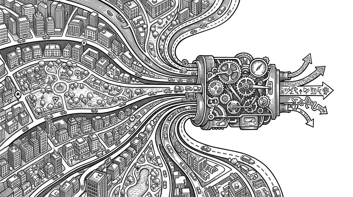
- This repo turns OpenStreetMap into a spatial feature stack that a model can score for charger suitability.
- Its real trick is not the classifier itself but the way it manufactures negative samples so the model learns what a bad site looks like.
- The Flask and Leaflet dashboard turns static training code into an interactive planning tool that can score a drawn bounding box on demand.
- The project feels more like a research instrument than a tutorial because heuristics, tuning, reporting, and deployment all ship together.
Most EV prediction projects ask a narrow question: how much traffic will a charger get, or when will it be used? This repo asks a different one. Where should the charger go in the first place? That shift matters because site suitability is a spatial problem before it is a forecasting problem.
The city is the model
The central move is to treat a city like a machine-readable signal stack. Roads, buildings, land use, and nearby amenities are not treated as decoration. They become features. In this repo, OpenStreetMap is less a map than a dense urban sensor.
That framing is what makes the project feel unusual. It does not start with a dataset of charger sessions and then fit a forecast. It starts with the urban fabric itself and asks which places look charger-friendly before any utilization history enters the picture.
How streets become features
The core pipeline lives in ev_ml_predictor.py. The code parses OSM data around a site, then compresses what it finds into a 23-feature vector inside a 500 meter radius. That vector includes counts and normalized signals from tags such as highway, amenity, landuse, and building.
QUERY_RADIUS_M = 500

features = extract_features_from_overpass(
    osm_data,
    center_lat=lat,
    center_lon=lon,
    radius_m=QUERY_RADIUS_M,
)

# Features include road counts, node density,
# land-use mix, building density, and amenities.
X = np.array([features])
prediction = model.predict_proba(X)[0, 1]
The important part is not the model input shape. It is the geometry-to-table conversion. Spatial ML fails when the map stays pictorial. This repo makes the map numeric, then lets tree-based models do what they are good at: combining many weak signals into a sharper decision.
Why negative samples make the model smarter
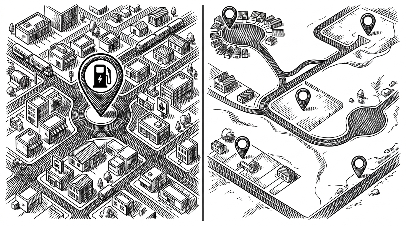
The hidden strength of the dataset is negative sampling. The pipeline does not only collect coordinates where chargers already exist. It also manufactures nearby places that do not have chargers. That gives the classifier something essential: examples of urban context that looks similar on the surface but should score lower.
| Approach | Training data | What it learns | Main weakness |
|---|---|---|---|
| Positive-only site lists | Existing charger locations | What charger areas look like | Learns one class, not a boundary |
| Naive GIS scoring | Roads and nearby POIs | A hand-tuned suitability heuristic | Hard to calibrate and easy to overfit |
| This repo’s hybrid dataset | Chargers plus nearby negative samples | Where charger sites belong and where they do not | Depends on thoughtful sampling and feature quality |
That distinction is easy to miss and easy to underestimate. A model trained only on charger locations can become a pattern matcher for density. A model trained on positive and negative sites can begin to learn placement.
Heuristics before ML, not after it
The repo does not pretend the model is the only source of judgment. In ev_campus_analyzer.py, heuristic scoring comes first. The code classifies urban context, assigns local suitability signals, and uses that baseline to structure the problem before the ML layer refines it.
That is a mature design choice. It avoids the usual false binary between rules and ML. In this repo, heuristics are not a fallback. They are a scaffold.
The dashboard turns the model into a planning tool
The product moment appears in the Flask and Leaflet layer. A user draws a bounding box, the backend fetches fresh OSM data, the model scores the area, and the frontend renders the result as a GeoJSON heatmap. The key endpoint, /api/predict-bbox, turns the whole pipeline into something interactive.
That matters because a placement model is only useful if someone can interrogate it. The dashboard does not just display an answer. It lets a planner ask a local question, then see how the system reasons across the selected area.
How it differs from ordinary EV prediction projects
| Dimension | Typical EV prediction project | This repo |
|---|---|---|
| Prediction target | Usage, occupancy, or load | Site suitability |
| Core data | Historical station activity | Geospatial context from OpenStreetMap and OpenChargeMap |
| Feature style | Temporal or network-based | Spatial and land-use based |
| User interaction | Often offline notebooks | Draw-a-box web workflow |
| Strength | Forecasting demand | Selecting where infrastructure should go |
| Weakness | Less useful for planning siting decisions | Less focused on session-level forecasting |
The difference is philosophical as much as technical. Many projects forecast what happens after a station exists. This one is about deciding whether the station deserves to exist there at all.
Why the repo feels more mature than a tutorial
The supporting pieces matter. Optuna appears in the model tuning flow. There is benchmarking code, LaTeX reporting, Docker packaging, Gunicorn deployment, and a cloud-ready configuration. Those are not decorative extras. They signal a repo built to be used, reproduced, and compared.
The strongest open-source signal here is compositional: data fetching, feature engineering, modeling, reporting, and deployment are all present in one place. That makes the repo feel like a research artifact with a product path, not a notebook that escaped into version control.