CarAuction: The Auction Site That Thinks Like a Community Network
A React marketplace where the feed, leaderboard, and event UI matter as much as the listings, revealing how social design can make a niche auction app feel premium and sticky.
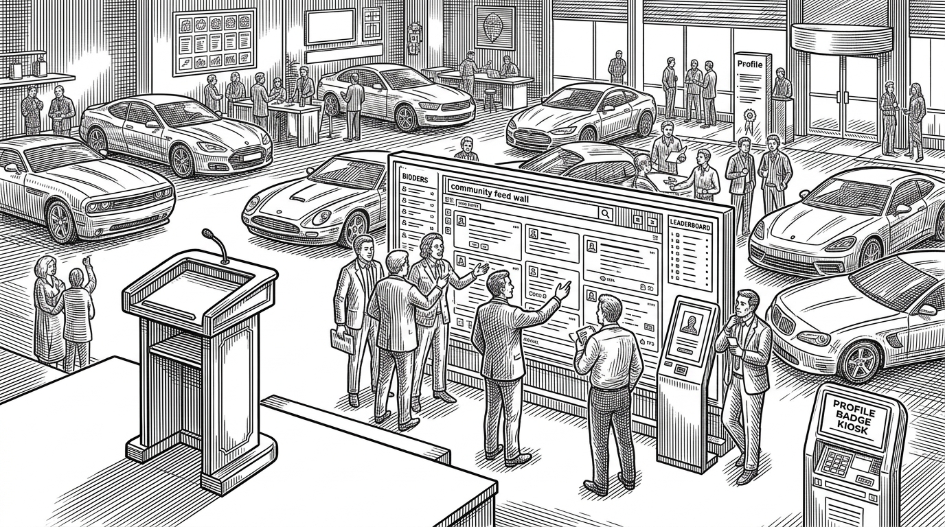
- CarAuction’s strongest idea is not auction mechanics, but the social layer wrapped around them.
- The feed, leaderboard, and events page are doing product work by creating repetition, status, and return visits.
- The frontend uses familiar React patterns, but the architecture is tuned to keep attention moving between community and commerce.
- It sits in a useful middle ground between a tutorial demo and a production auction platform.
A Marketplace That Wants a Following
Most auction apps are built like catalogs. CarAuction is built like a place. The listings matter, but the repo spends unusual effort on the social machinery around them: feed, leaderboard, events, profile state, and navigation patterns that keep those surfaces visible.
That is the thesis. The project treats trust and belonging as core marketplace features. A buyer is not just evaluating a car. They are evaluating the room around the car, and whether it feels alive enough to trust.
Why the Community Layer Matters
The community page carries more weight than you would expect in a car-auction concept. A sticky sidebar, mobile bottom navigation, and repeated calls into social content all push the app toward habitual browsing instead of one-off transactions.
This matters because niche marketplaces do not win only on inventory. They win on repeat visits, visible momentum, and the feeling that the platform knows who belongs. CarAuction’s community layer is an attempt to manufacture that feeling in the interface itself.

The App Is Built to Keep Attention Moving
The most revealing choices are interaction choices. Signup appears as a modal, not a separate destination. The leaderboard is partially locked, turning curiosity into a CTA. Profile state hydrates from localStorage, which gives the UI a sense of continuity even before a real backend personality exists.

| Pattern | What it does | Why it works here | What it is missing |
|---|---|---|---|
| Modal-driven signup | Interrupts browsing at the moment of intent | Makes joining feel lightweight and immediate | Still depends on the user wanting to continue |
| Locked leaderboard | Teases status and social proof | Turns curiosity into engagement | Does not yet represent a live competitive system |
| localStorage profile hydration | Persists identity across visits | Creates a sense of continuity without backend complexity | Is not the same as durable account infrastructure |
| Custom event controls | Makes the carousel feel owned by the product | Keeps motion aligned with the site’s aesthetic | Adds polish, not new marketplace depth |
How the Frontend Is Organized
The codebase follows a familiar React shape, but the organization is intentional. App.jsx acts as the routing hub and modal state center. Feature pages live under domain-based folders, while reusable components are split across vehicle, navbar, footer, and common UI pieces.
// App.jsx centralizes routing and shared modal state
function App() {
  const [open, setOpen] = useState(false);

  return (
    <BrowserRouter>
      <Navbar setOpen={setOpen} />
      <Routes>
        <Route path="/community" element={<Community setOpen={setOpen} />} />
        <Route path="/events" element={<Events />} />
      </Routes>
      <SignupModal open={open} setOpen={setOpen} />
    </BrowserRouter>
  );
}
That pattern is simple, but it is the right kind of simple. Shared UI state lives high enough to stay useful, while the pages themselves stay focused on their domain. For a solo-built app, that is a strong tradeoff.
What Makes It Feel More Premium Than a Typical Demo
The premium feel comes from restraint and repetition. Tailwind keeps layout decisions consistent. MUI fills in heavier UI needs. Swiper gives the events page motion without forcing a custom animation system, and the local asset library gives the app visual density that most demos never reach.
| Design choice | Effect on the UI | Why it reads as premium |
|---|---|---|
| Sticky layout patterns | Important actions stay in view | The interface feels planned instead of assembled |
| High-contrast color palette | Gold and deep blue create a luxury signal | The site borrows the visual language of high-value retail |
| Asset-heavy local imagery | Cars, banners, and community visuals feel abundant | The product looks populated, not empty |
| Motion via Swiper and custom controls | Carousels feel deliberate | Movement supports the brand instead of distracting from it |
How It Compares to Generic Tutorial Apps and Real Auction Platforms
CarAuction sits in the middle of two very different worlds. It is more thoughtful than a standard tutorial repo, but far less operationally complete than a production auction business. That gap is exactly what makes it interesting.
| Product type | Core goal | Strengths | Missing pieces | What CarAuction does differently |
|---|---|---|---|---|
| Generic tutorial MERN app | Teach stack basics | Clear CRUD patterns, easy to follow | Usually thin on product thinking | Adds a visible social layer and a stronger brand feel |
| Production auction platform | Run real bidding business | Payments, identity, trust, and live market behavior | Complex, expensive, and infrastructure-heavy | Focuses on community signals instead of transaction depth |
| CarAuction | Explore a niche marketplace concept | Premium UI, social incentives, cohesive frontend | Not a live trading system | Uses marketplace mechanics as a frame for social belonging |
What the Project Suggests
CarAuction is less a proof of auction mechanics than a study in marketplace psychology. It suggests that for high-value purchases, the interface should not only list inventory. It should create status, momentum, and a reason to come back.
That is the project’s real value. It shows how social design can make a narrow commerce app feel bigger than its feature list, and how a solo developer can use frontend decisions to express a product thesis clearly.