E-Commerce-Data-Analysis-DSGroup: The Repo That Turns Discounts Into a Profit Audit
A phased Python and Power BI workflow that starts with raw orders, finds the discount threshold where margin collapses, and ends with a recovery plan the business can act on.
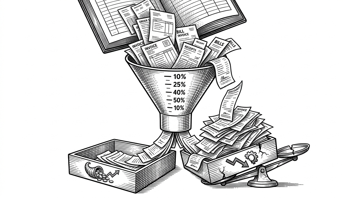
- This repository is strongest when read as a profit audit, because it searches for the discount point where sales turn into margin destruction.
- Its real move is threshold detection, not generic visualization, which makes the analysis usable as a business rule.
- The five-phase structure turns raw transaction data into a decision pipeline that ends in recommendations, not just charts.
- The Power BI handoff matters because it packages the findings for executives who need action, not notebooks.
The most interesting thing about Hitzz0109/E-Commerce-Data-Analysis-DSGroup is not that it analyzes e-commerce data. It asks a harder question: where does discounting stop stimulating demand and start eating the business alive?
That shift matters. A lot of portfolio repos stop at charts, summaries, and a polished dashboard. This one goes further and behaves like a financial recovery memo.
The hidden cost of discounting
The repository’s core finding is blunt. Discounts are not treated as a harmless growth lever. They are treated as a hypothesis that needs to survive margin analysis.
In practice, the analysis lands on a threshold. Around the 30% discount mark, profit stops behaving normally and begins to flip negative. The project then asks the most useful follow-up question: what happens if the business simply caps discounts at 20%?
| Generic dashboard project | E-Commerce-Data-Analysis-DSGroup | |
|---|---|---|
| Primary goal | Show sales performance | Find the point where discounting destroys profit |
| Output | Charts and KPIs | A cleaned dataset, a Power BI dashboard, and recommendations |
| Treatment of discounts | Reported as a sales tactic | Modeled as a margin risk |
| Treatment of loss-making orders | Usually ignored | Explicitly isolated and analyzed |
| Business actionability | Informational | Decision-ready |
| Final artifact | Presentation layer | Recovery plan |
A five-phase workflow built like a consulting engagement
The repository is structured like a client engagement, not a school assignment. It moves from data engineering to EDA, then to executive dashboarding, then to a deep dive on discounting, and finally to recommendations.
The architecture is practical. Phase 1 produces Superstore_cleaned.csv as the shared source of truth. Phase 3 uses Power BI for executive consumption. Phase 4 does the real forensic work. Phase 5 converts findings into a what-if scenario the business can use.
Why the discount threshold matters more than top-line sales
This is the analytical heart of the repo. Instead of chasing raw revenue, it bins orders by discount level and compares the profit behavior across those bins. That exposes the cliff edge.
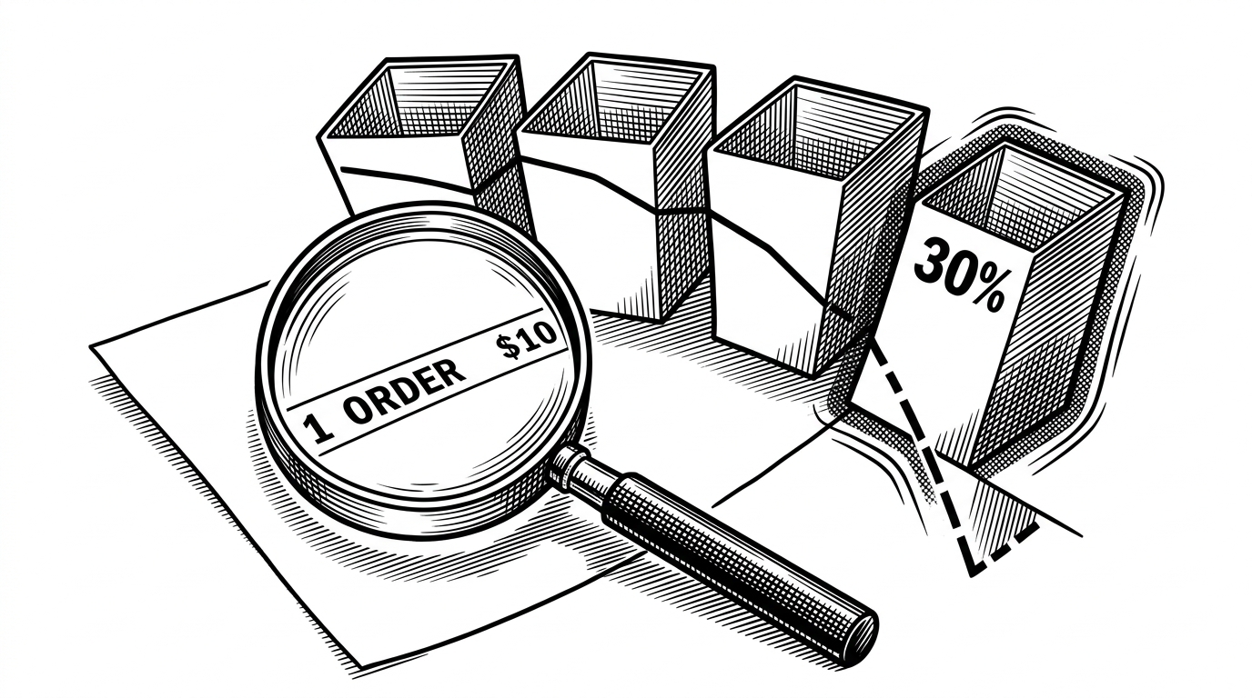
The repo’s power is in that boundary. A discount is not good or bad in the abstract. A discount below the cliff may still be useful. A discount above it becomes self-sabotage.
| Discount band | Observed behavior | Business meaning |
|---|---|---|
| 0% | Highest average profit | Full-margin orders carry the business |
| 0 to 20% | Still viable | Discounting may support demand without breaking margin |
| 20 to 30% | Borderline | This is the warning zone |
| 30%+ | Profit turns negative | The deal starts paying customers to buy |
| 50%+ | Deep loss | The pricing policy is actively destructive |
That logic is why the project feels more like an intervention than a report. It does not just describe the curve. It identifies the exact slope where the company should stop leaning in.
Negative-space analysis: finding the orders that lose money
The repo does not only study winners. It deliberately examines loss-making orders and slices them by region and sub-category. That is a better way to think about operational risk than looking at top sellers alone.
Build these 5 SQL projects to get job-ready 💼 ① Customer Churn Analysis → identify at-risk users with SQL analytics ② ETL Pipeline Database → clean, transform & load raw data ③ Banking Transaction Analyzer → detect anomalies with window functions ④ Data Warehouse for
The analysis calls out the Central Region as a weak spot, then zooms further into sub-categories like Tables and Bookcases. That matters because a global average can hide a local failure. Granularity is the difference between noticing a bruise and finding the fracture.
| Lens | What it answers | Why it helps |
|---|---|---|
| Overall sales | What sold? | Too broad to guide action |
| Loss-making orders | Where are we losing money? | Separates healthy demand from toxic demand |
| Region analysis | Where is the bleed concentrated? | Finds operational pockets of risk |
| Sub-category analysis | Which products are most damaging? | Turns a problem into a fix list |
This is where the project’s maturity shows. It is not trying to make every segment look important. It is trying to identify the few segments that deserve intervention.
From notebook insight to executive tool
The Power BI dashboard is the bridge between analysis and adoption. Python discovers the pattern. Power BI packages it for people who need to act on it without reading a notebook.
That separation is smart. It keeps the exploratory work flexible, then hands over a clean artifact for consumption. The result feels closer to a consulting deliverable than a throwaway analysis notebook.
The recommendation layer: what happens if discounts are capped
The final move is the most useful one. The repository does not stop at diagnosis. It tests a specific intervention: cap discounts at 20%, then estimate the profit recovered.
| Scenario | Expected effect | Interpretation |
|---|---|---|
| Current discount behavior | Margin leakage continues | The business keeps buying volume at the wrong price |
| 20% cap | Recovered profit of roughly $81,000 | A practical policy change with visible upside |
| No cap on high-discount orders | Deeper losses | The cliff keeps claiming margin |
That number matters because it turns a pattern into a decision. A manager can debate a chart. A manager can act on an estimated recovery figure.
The result is a rare thing in portfolio work. It is descriptive, diagnostic, and prescriptive in one line of sight.
Why this repo works as a portfolio piece
The project works because it is legible. The phases are clear. The method is reproducible. The conclusion is business-shaped.
It also understands audience. A strong portfolio piece does not only show that someone can analyze data. It shows that they can convert analysis into a decision boundary, a dashboard, and a recommendation.
That is the real win here. The repo does not just explain sales. It locates the point where sales become self-sabotage.