fitzone-gym: FitZone Gym: How a Plain HTML, CSS, and JavaScript Landing Page Still Feels Finished
A close look at the smallest possible fitness site, and why its simplicity is the whole point.
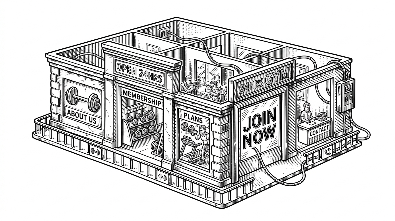
- FitZone proves that a landing page feels complete when the information architecture is disciplined, not when the stack is large.
- The repo uses HTML as the content engine, CSS as the persuasion layer, and JavaScript as a tiny cleanup step.
- Its strength is scope control: it looks like a product page without pretending to be a platform.
- The lesson is not that frameworks are bad, but that many small business sites need less software and better structure.
The smallest site that still feels like a product
FitZone Gym is interesting because it already has the shape of a real conversion page. There is a clear hero, a trust section, pricing cards, and a contact form, all inside a single static experience. That is enough to make it feel finished.
The surprise is not that this works. The surprise is how little machinery it needs. The repo behaves like a polished service site without a framework, a build step, or a pile of dependencies.
Why this repo exists
Read as a project, FitZone looks like a first-principles exercise: a portfolio piece, a learning build, or a reusable starting point for a small business site. It is not trying to be gym software. It is trying to show that the basics can still feel professional.
That matters because a lot of modern web work starts by adding complexity before the page has earned it. FitZone does the reverse. It starts with structure, then lets the structure do the selling.
The page is the architecture
The core pattern is a section-based single page flow. The sticky header keeps navigation present. The internal anchors turn the page into a scrollable path instead of a maze of routes. It reads like a small app, even though nothing here needs app machinery.
| Pattern | What it feels like | What it buys | What it leaves out |
|---|---|---|---|
| FitZone single-page flow | A guided scroll through one story | Speed, clarity, low friction | Deep admin workflows, content sprawl |
| Traditional multi-page small business site | Separate pages for each topic | Room for expansion | More clicks and weaker narrative control |
| Framework-heavy landing page | A polished product with runtime overhead | Component reuse at scale | Complexity that this site does not need |
This is the first big clue. FitZone is not a smaller version of a platform. It is a better-sized version of a landing page. That difference changes everything.
HTML does the product work
index.html is doing most of the heavy lifting here. Semantic sections establish the narrative, internal links create the page flow, and the document itself becomes the product shell. The HTML is not a passive container. It is the content strategy.
<header class="sticky-header">
  <nav>
    <a href="#home">Home</a>
    <a href="#about">About</a>
    <a href="#plans">Plans</a>
    <a href="#contact">Contact</a>
  </nav>
</header>

<section id="home" class="hero"></section>
<section id="about" class="about"></section>
<section id="plans" class="plans"></section>
<section id="contact" class="contact"></section>
That structure matters because it creates order before design enters the picture. A visitor does not need to learn a system. They just keep moving down the page.
CSS is where the site becomes convincing
The styling does not try to impress by piling on effects. It uses spacing, overlays, responsive breakpoints, and smooth scrolling to make the page feel intentional. That restraint is the design system.
| UI choice | What it does | Why it matters |
|---|---|---|
| Flexbox alignment | Keeps navigation and plan cards balanced | Lets the layout adapt without extra components |
| Responsive breakpoint | Stacks content on smaller screens | Preserves readability on phones |
| Overlay treatment | Protects text contrast over imagery | Makes the hero legible and usable |
| Smooth scrolling | Softens anchor jumps | Makes the single-page structure feel polished |
The important thing is not any one CSS trick. It is the cumulative effect. The site feels finished because every visible detail is doing a job.
JavaScript only steps in when it has to
The JavaScript layer stays small on purpose. It intercepts the contact form, checks for required input, and resets the form after success. That is enough interactivity for the job at hand, and nothing more.
document.getElementById('contactForm').addEventListener('submit', function (e) {
  e.preventDefault();
  const name = document.getElementById('name').value;
  const email = document.getElementById('email').value;

  if (name === '' || email === '') {
    alert('Please fill all required fields.');
    return;
  }

  alert('Thanks for reaching out!');
  this.reset();
});
That is the right kind of JavaScript for a page like this. It guards a user action, confirms success, and gets out of the way. No state machine, no client router, no hidden complexity.
What FitZone refuses to be
FitZone is not competing with a gym management system, a Laravel app, or a Django platform. It does not track memberships, schedule classes, or run billing. It is a front-end template with a narrower mission: present a business clearly and capture interest quickly.
| Project type | Primary job | Complexity | FitZone’s relation |
|---|---|---|---|
| Gym management app | Operate the business | High | Not the same category |
| Framework-heavy landing page | Scale a componentized site | Medium to high | Solves a different problem |
| FitZone | Convert a visitor with minimal code | Low | This is the actual target |
That is why the repo is useful. It shows how little is required to make a site feel credible when the scope is honest. The absence of extra machinery is not a gap. It is the design constraint.
The real lesson
FitZone Gym is a reminder that many small business websites do not need more software. They need better sequencing, clearer hierarchy, and fewer excuses. The page works because it respects the order of attention.
If you are building a landing page, that is the useful part to steal. Not the gym theme. Not the boilerplate. The decision to make structure do the persuasion before code tries to do it for you.