customer-churn-retention-analytics: The Churn Model That Refuses to Stay a Model
A Streamlit app that turns prediction, explainability, revenue risk, and retention advice into one executive-facing workflow.
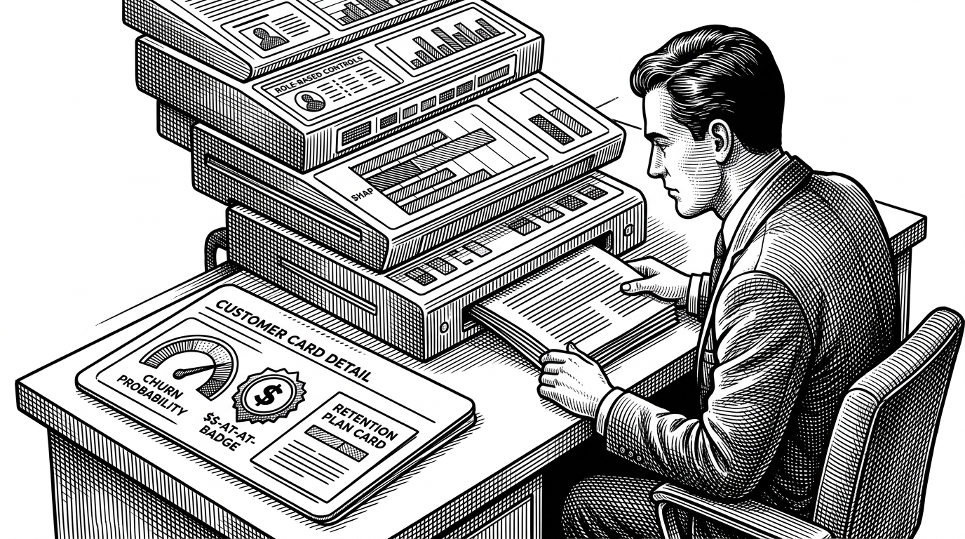
- This repo treats churn prediction as a product design problem, not a modeling exercise.
- Its real value is the chain from score to explanation to recommendation to executive report.
- Role-aware access and custom UI make the app feel like an internal retention tool, not a notebook.
- Revenue-at-risk framing turns a machine learning demo into a business conversation.
Why this churn app feels like a product, not a notebook
Most churn demos stop at a probability score. This one keeps going. It wraps prediction in role-based access, explainability, AI-written retention advice, revenue-at-risk logic, and PDF output, which is exactly the kind of stack that helps an analyst cross from model building into decision support.
That is the interesting move here. The repo is not trying to be a research artifact. It is trying to behave like a manager-ready tool that can survive a meeting with sales, retention, or customer success.
The interface is role-aware on purpose
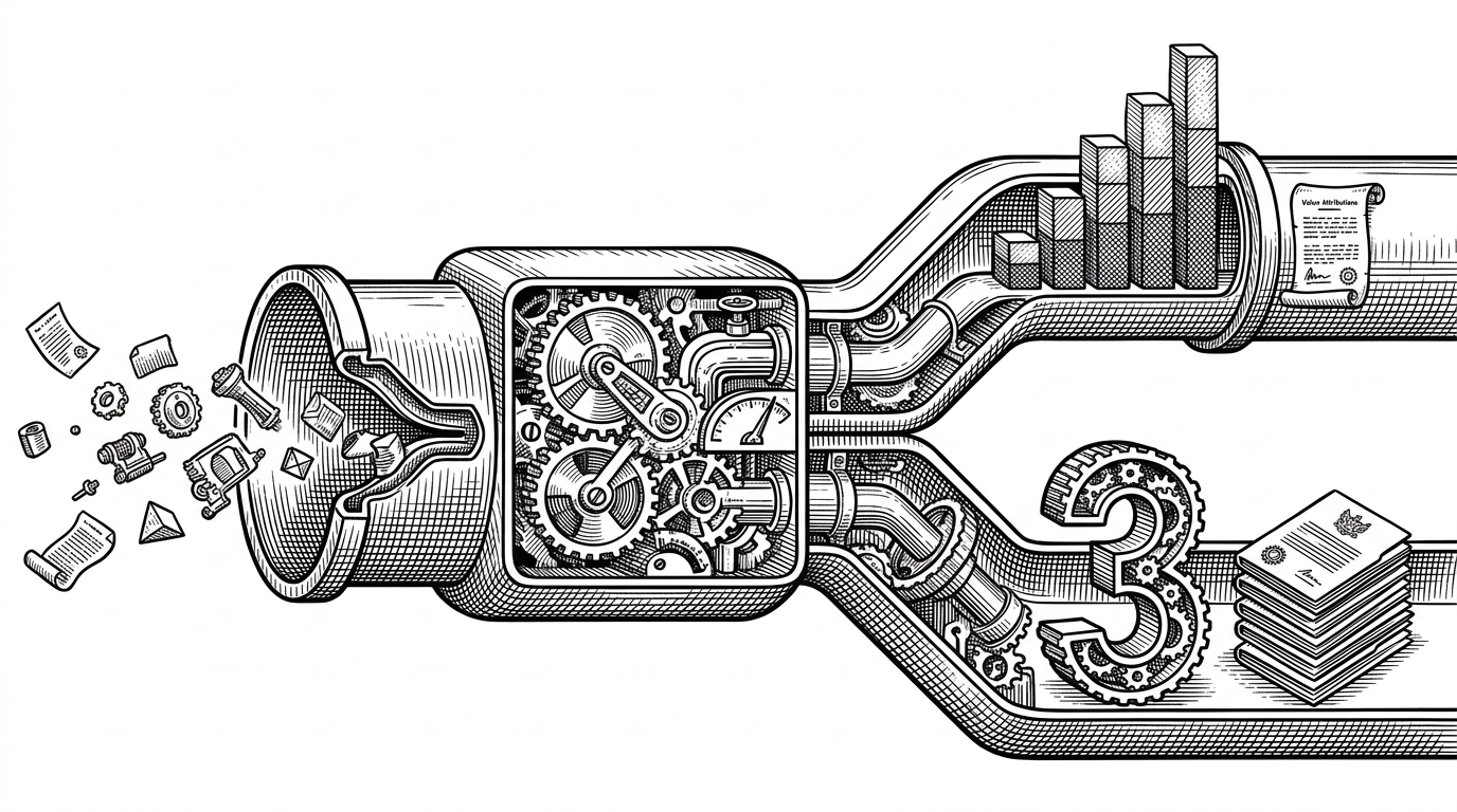
The app is not a single flat screen. It uses role-based access control so different users see different surfaces. Admins can reach deeper model and batch views. Analysts get the tools they need for diagnosis. Viewers get a cleaner, safer surface. That is a small detail with a big product consequence: the same system can serve multiple stakeholders without exposing everything to everyone.
# app/main.py pattern
role = st.session_state.get("role", "viewer")
if role == "admin":
    pages = [home, dashboard, prediction, insights, batch]
elif role == "analyst":
    pages = [home, dashboard, prediction, insights]
elif role == "user":
    pages = [home, dashboard, prediction]
else:
    pages = [home, dashboard]

st.navigation(pages).run()
The prediction flow does more than score a customer
The heart of the app is the single-customer prediction path. Inputs arrive through a multi-tab form, feature engineering happens on the fly, and the model uses a custom threshold of 0.47 rather than the default 0.5. That last detail matters. It suggests the system is tuned to catch more at-risk customers, even if that means some extra false positives.
This is where the project stops looking like a classroom churn classifier. It is using the model as a decision policy, not just a label generator.
# utils.py pattern
avg_charges_per_month = total_charges / (tenure + 1)
churn_prob = model.predict_proba(X)[0, 1]
should_flag = churn_prob >= 0.47

return {
    "probability": churn_prob,
    "flagged": should_flag,
    "avg_charges_per_month": avg_charges_per_month,
}
The custom threshold is the tell. Default thresholds are convenient. Business thresholds are negotiated. This repo clearly chose the second.
Explainability is the bridge between score and action
SHAP gives the app its explanatory layer. It tells the user which features pushed risk up or down for a specific customer. That alone already improves the product, because a retention manager can see whether the danger comes from contract type, charges, service usage, or tenure.
The second layer is more ambitious. The app turns that explanation into an AI-generated retention recommendation. So the user does not just get a reason. They get a proposed response. That is the difference between insight and workflow.
# conceptual flow in app/utils.py
explainer = load_shap_explainer(model)
shap_values = explainer(X_row)
recommendation = generate_ai_recommendation(customer_data, shap_values)

# explanation -> action
Revenue risk turns ML into a business conversation
A churn probability is abstract. Dollar at risk is concrete. By pairing prediction with revenue impact and customer segmentation, the app changes the unit of discussion from accuracy to prioritization. That matters because retention teams do not spend probability scores. They spend time and money.
| Capability | Plain churn classifier | This repo | Commercial retention platform |
|---|---|---|---|
| Prediction | Yes | Yes | Yes |
| Explainability | Usually no | Yes, with SHAP | Yes |
| Retention recommendations | No | Yes, AI-assisted | Yes |
| Role-based access | No | Yes | Yes |
| Revenue risk | No | Yes | Yes |
| Exportable reports | Rarely | Yes, PDF output | Yes |
| Business-user fit | Low | High | Very high |
That middle column is the niche. It is more than a demo, but lighter than an enterprise suite. For a portfolio project, that is a smart place to live.
Why Streamlit works here
Streamlit is often dismissed as a quick prototype tool. Here it does more than enough because the app has strong product structure around it. Custom CSS gives the interface a more polished feel. Caching keeps the model and explainer snappy. Multi-page navigation keeps the surface organized. Report generation gives the user something they can take to a meeting.
In other words, Streamlit is not the story. The story is what happens when you wrap a good decision workflow around it.
What this project is and is not
| Lens | What it is | What it is not |
|---|---|---|
| Analyst portfolio | A polished retention intelligence demo | A research benchmark |
| Product demo | An executive-facing decision workflow | A raw notebook export |
| ML system | Prediction plus explanation plus action | A black-box classifier |
| Enterprise platform | A lightweight proxy for one | A full customer success suite |
That distinction is important. The repo is best read as a blueprint for how an analyst can operationalize churn thinking with accessible tools, not as a competitor to full commercial platforms.
Who built it and why that matters
That background explains the shape of the repo. It is built with business stakeholders in mind. The emphasis on dashboards, cohort analysis, reportability, and actionability fits a profile shaped by analytics work, not pure model research.