-Web-Accessibility-Widget: Web Accessibility Widget: A Tiny State Machine for Any Website
A vanilla JavaScript overlay that rewrites contrast, typography, and motion with one apply() loop, a few CSS classes, and no framework at all.
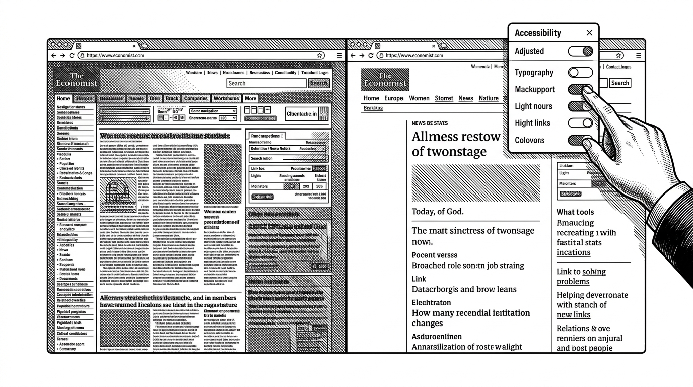
- This repo treats accessibility as a reversible preference layer, not as a rebuilt website or a compliance platform.
- Its real strength is the state-to-class pipeline, where one apply() loop turns a small state object into visible host-page changes.
- The widget’s CSS does most of the work by separating its own UI from aggressive global overrides on the page beneath it.
- The project is compelling precisely because it is restrained, transparent, and honest about the limits of an overlay.
The smallest possible accessibility layer
The first thing to notice is what this repo does not try to be. It does not rebuild the site, and it does not hide behind a framework. It adds a small preference panel, then uses the browser’s own class system to reshape the page underneath it.
That makes the project feel less like a widget and more like infrastructure. The UI is just the front door. The real product is a reversible layer that can sit on top of someone else’s website without taking it over completely.

How the widget thinks
The technical heart is simple: load state, apply state, persist state. The widget reads from localStorage, stores preferences in a central object, and then maps those values onto the document root through classList.toggle() and a few direct style updates.
const def = {
  contrast: false,
  dyslexia: false,
  grayscale: false,
  fontSize: 1,
  motion: true
};

let state = load() || { ...def };

function apply() {
  const html = document.documentElement;
  html.classList.toggle('a11y-contrast', state.contrast);
  html.classList.toggle('a11y-dyslexia', state.dyslexia);
  html.classList.toggle('a11y-grayscale', state.grayscale);
  html.classList.toggle('a11y-reduce-motion', !state.motion);
  html.style.setProperty('--a11y-font-size', state.fontSize + 'em');
  save(state);
}

function reset() {
  state = { ...def };
  apply();
}
That pattern is clean because it keeps the side effects in one place. The UI can change, the settings can grow, and the implementation still stays legible because there is a single translation point between state and behavior.
Why the CSS is doing the real work
The CSS is split into two jobs. One set of selectors styles the widget itself, with namespacing so it does not leak into the host page. The other set reaches outward, using high-specificity selectors and !important to override the site that already exists.
That split is the whole bargain. The widget behaves like a polite guest on the surface, then becomes forceful where it has to. It is a negotiation layer, not a decorative sidebar.
The result is a surprisingly practical pattern for any drop-in tool. Keep the chrome isolated. Make the effects global. Do not blur the boundary between the two.
The reset button is the tell
The reset logic reveals the project’s taste. Instead of patching each control back by hand, the code clones the default state and re-runs the same apply path. That is the software equivalent of a clean room reset: obvious, boring, and excellent.
This matters because the repo never pretends the state is magical. It treats preferences like data, not like scattered DOM accidents. That restraint is why the implementation is easy to trust.
What this repo is competing against
The broader category is messy. Commercial overlays promise automated accessibility, but they often arrive with opaque scripts, recurring fees, and a lot of distrust from accessibility professionals. Open-source widgets sit at the opposite end of the spectrum: lighter, clearer, and usually far less ambitious.
| Approach | Transparency | Performance | Privacy | Cost | Accessibility philosophy |
|---|---|---|---|---|---|
| This repo and similar open-source widgets | Source is readable and behavior is easy to inspect | Small footprint and limited surface area | No obvious need for tracking or analytics | Free to adopt | Adds user preference controls without pretending to fix the whole site |
| Commercial overlay platforms | Often proprietary and harder to audit | Heavier scripts and more moving parts | May include analytics or vendor telemetry | Recurring subscription | Markets automation as a shortcut to compliance |
| Native accessibility work | Built into the site itself | Usually the best runtime outcome | Depends on implementation, not a vendor layer | Internal engineering cost | Fixes structure, semantics, and interaction at the source |
The strongest case for this repo is not that it wins every comparison. It is that it tells the truth about its scope. It is a preference layer, not a remediation machine.
Where it fits in the real world
This kind of tool is most useful in institutions that need an immediate, low-friction way to give users control over readability. That includes legacy systems, under-resourced teams, and sites where a full redesign is not on the table yet.
In that setting, the widget is a pragmatic bridge. It gives people a better surface now while the slower work of fixing the underlying site continues. It should not be treated as a substitute for that work.
| Use case | Widget layer | Native remediation |
|---|---|---|
| Immediate readability controls | Strong fit | Possible, but slower to ship |
| Legal or compliance claims | Weak fit | Much stronger fit |
| Long-term accessibility quality | Supportive only | Essential |
| Low-friction deployment | Very strong | Depends on site architecture |
The limit of the overlay model
The cleanest conclusion is also the least flashy one. A widget can make a site more tolerable, more configurable, and more respectful of personal preferences. It cannot replace semantic markup, accessible components, or real remediation work.
That boundary is not a flaw. It is the point. The best version of this repo knows exactly what it is, and exactly what it is not.