ousi-ui: Ousia UI is trying to make React design systems flatter, lighter, and easier to bend
A new component library built around Ark UI, Panda CSS, and per-component customization, with a monorepo that treats design tokens and theme recipes as first-class code.
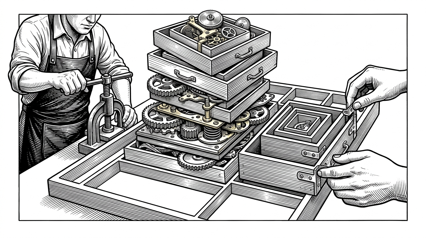
- Ousia UI treats dependency flattening as a product feature, not a build detail.
- Its strongest move is separating component logic, theme recipes, and shared tokens so customization stays local.
- Ark UI and Panda CSS supply the foundation, but the repo's real value is how it packages that foundation for per-component control.
- The library competes less on brand gravity and more on how cleanly it sits between headless primitives and a bespoke design system.
The interesting part is not the component count
A lot of design systems sell breadth. Ousia UI is more interesting as a structural opinion: it wants to make a React component stack feel less layered and less fragile. The README frames it as a Park UI design system for React, but the real story is how it tries to keep the moving parts close to the component that uses them.
That matters because most UI libraries drift in one of two directions. They either become heavy, opinionated platforms, or they become loose collections of copy-paste snippets. Ousia UI is betting that there is room in the middle for a system that is strict about composition, but generous about local overrides.
What the repo is organized to do
The repository reads like a product team trying to keep every concern in its own lane. There are packages for shared core logic, design tokens, theme definitions, and the component library itself, plus a docs app and a playground for testing the system in real time. That split is not cosmetic. It is how the project keeps the design language centralized without forcing every component through one oversized abstraction.
The stack is slimmer than it looks
Ousia UI stands on a familiar but carefully chosen foundation. Ark UI and Zag handle headless behavior. Panda CSS handles styling through recipes and tokens. That combination matters because it separates what the component does from how it looks, then lets the look be shaped without rewriting the behavior.
The design system side is where the project gets opinionated. Instead of forcing global theme churn, it pushes decisions into component-level recipes and shared tokens. That is a better fit for teams that want a consistent visual language, but still need a button, slider, or dialog to bend a little differently in different contexts.
/* Representative structure, not verbatim source */
export const buttonRecipe = defineRecipe({
  className: "button",
  base: {
    display: "inline-flex",
    alignItems: "center",
    justifyContent: "center"
  },
  variants: {
    variant: {
      solid: {
        backgroundColor: "accent.9",
        color: "white"
      },
      ghost: {
        backgroundColor: "transparent"
      }
    },
    size: {
      sm: { height: 32, paddingInline: 12 },
      md: { height: 40, paddingInline: 16 }
    }
  }
})
Why the comparison with Park UI matters
| Dimension | Ousia UI | Park UI | shadcn/ui |
|---|---|---|---|
| Styling engine | Panda CSS recipes and tokens | Panda CSS and Zag-based structure | Tailwind CSS plus copied source |
| Delivery model | Monorepo packages with shared core and theme layers | Component library with a broader preset-style ecosystem | Copy into your app and own the code |
| Customization model | Per-component override with centralized tokens | Opinionated system with a larger preset surface | Local edits after copying components |
| Best fit | Teams that want a compact system with controlled flexibility | Teams that want a mature Panda and Zag ecosystem | Teams that want maximum ownership and minimal abstraction |
The table is not about declaring a winner. It is about positioning. Park UI is the more established reference point, shadcn/ui is the ownership-first extreme, and Ousia UI is staking out a narrower claim: keep the system structured, but let individual parts stay editable without a pile of glue code.
Who should care
This is for teams that feel the pain of design systems becoming either too rigid or too hand-assembled. If you are building a product with a lot of interactive surfaces, especially one where consistent tokens matter more than a huge catalog of branded presets, the repo is worth studying. The payoff is not novelty. It is fewer places where style, behavior, and dependency churn can tangle each other up.
The caution is equally clear. A system like this only pays off if the architecture stays disciplined. Shared tokens have to stay truly shared. Component recipes have to stay local. And the docs and playground have to make the customization model obvious enough that teams do not rebuild their own conventions on top of it.