divyanshugupta72688/digital-clock: How a Few Strips of HTML Make Time Feel Mechanical
A tiny vanilla JavaScript clock uses sliding digit reels, neumorphic shadows, and vmin math to turn a standard digital display into a physical object.
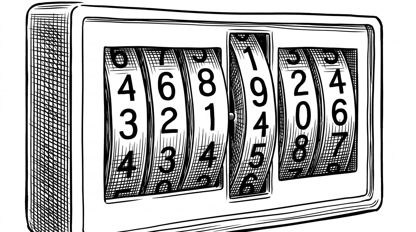
- This clock feels premium because it stages time as a physical mechanism instead of a text swap.
- The repo's simplest trick is also its strongest one: hard-coded digit strips plus translateY motion.
- CSS carries most of the aesthetic load, while JavaScript only feeds the next offset and pop state.
- Using vmin everywhere turns the whole component into a responsive object instead of a brittle widget.
Why This Clock Feels Like a Machine
Most digital clocks are honest. They replace text, blink a colon, and stop there. divyanshugupta72688/digital-clock goes after a different target: it makes time feel like it has gears, depth, and weight.
That illusion is the point of the repo. The numbers do not pop in like labels. They travel on strips, settle into a viewport, and briefly gain a raised surface through shadow. The effect is modest in code and surprisingly rich in perception.
The Strip System Under the Hood
The markup is closer to a machine drawing than a typical app layout. Hours, minutes, and seconds are split into digit tracks, with separate columns for tens and units. That hard-coded structure lets each segment behave like a reel instead of a string.
<div class="clock">
  <div class="hour-strip"></div>
  <div class="hour-strip"></div>
  <div class="minute-strip"></div>
  <div class="minute-strip"></div>
  <div class="second-strip"></div>
  <div class="second-strip"></div>
</div>
The key decision is not sophistication. It is restraint. By prebuilding the possible digit positions in the DOM, the clock avoids creating and destroying elements every second. The result is predictable, lightweight, and easy to reason about.
CSS Does the Heavy Lifting
The motion reads as polished because CSS owns the choreography. A transform transition slides the reel, while shadow work on the active digit makes it appear pressed forward from the surface. JavaScript only tells the strip where to go.
.strip {
  transition: transform 500ms ease-in-out;
}

.number.pop {
  box-shadow:
    -1vmin -1vmin 2vmin -0.5vmin #f9fbfd,
    1vmin 1vmin 2vmin rgba(0, 0, 0, 0.12);
}
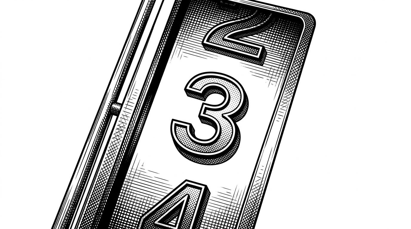
That `.pop` state matters more than it first looks. Without it, the clock would still function, but it would feel flatter and less intentional. The animation becomes a cue that the current digit is being selected, not merely displayed.
Why vmin Is the Quiet Genius Here
The sizing strategy is the cleverest part of the styling. Instead of juggling breakpoints, the clock uses vmin for dimensions, spacing, and even shadow scale. That keeps the object proportionate whether the viewport is tall, wide, or somewhere awkward in between.
| Approach | What it buys you | What it costs you |
|---|---|---|
| px-based sizing | Predictable absolute control | More tuning across devices |
| vmin-based sizing | Uniform scale across viewports | Less direct pixel-by-pixel control |
This is why the component feels like a single object rather than a stack of unrelated values. The typography, the frame, and the shadows all scale together. That coherence is what makes the UI feel designed instead of assembled.
.clock {
  width: 40vmin;
  height: 12vmin;
  font-size: 4vmin;
  border-radius: 2vmin;
  box-shadow: 0 1vmin 3vmin rgba(0, 0, 0, 0.12);
}
The Timer Loop and the Pop State
The JavaScript loop is plain on purpose. A timer grabs the current time, splits each value into tens and units, and pushes the right offsets into the strip elements. The interface then lets CSS do the visible work.
setInterval(() => {
  const now = new Date();
  stripSlider(hourStrip, now.getHours());
  stripSlider(minuteStrip, now.getMinutes());
  stripSlider(secondStrip, now.getSeconds());
}, 1000);
There is one more small touch: the active digit gets a short-lived emphasis state, then returns to rest before the next tick. That tiny pulse keeps the clock from feeling dead between updates.
Elegant, But Deliberately Rigid
The tradeoff is clear. A hard-coded strip system is fast and simple, but it is not trying to be a general-purpose time formatter. If you want flexible layouts, alternate locales, or a 12/24-hour toggle, you would need to reshape the DOM, not just change a string.
| Sliding digit reels | Plain text swapping |
|---|---|
| Feels mechanical and tactile | Feels flat and utilitarian |
| Needs prebuilt digit tracks | Needs only string updates |
| Lets CSS animate the motion | Usually relies on instant replacement |
| Best for a designed object | Best for a minimal utility |
That rigidity is not a flaw. It is what keeps the effect sharp. The repo knows exactly what it wants to be, and it stops there.