react-shopping-cart: The Cart Demo That Teaches Real React Architecture
A lightweight ecommerce prototype that hides a surprisingly disciplined state model, offline-friendly data flow, and portfolio-grade polish behind a simple storefront.

I'm working on a new React component to manage a shopping cart. It's going to be simple, flexible and easy to use. Stay tuned!
- react-shopping-cart’s strongest idea is architectural: it splits catalog and cart concerns so the UI stays clean without leaning on Redux.
- The repo uses custom hooks as a facade, which makes the state model easier to test, easier to explain, and harder to misuse.
- Its dual data path, local JSON in development and Firebase in production, turns a demo into a contributor-friendly project.
- The project sells itself as portfolio work because the polish, tooling, and accessibility choices are part of the lesson, not decoration.
Most cart demos prove they can add and remove items. This one proves something more useful: that a small React app can still have a disciplined state model. That matters because the difference between a toy and a reference implementation is usually not features. It is the shape of the code underneath them.
The clever part is the cart brain
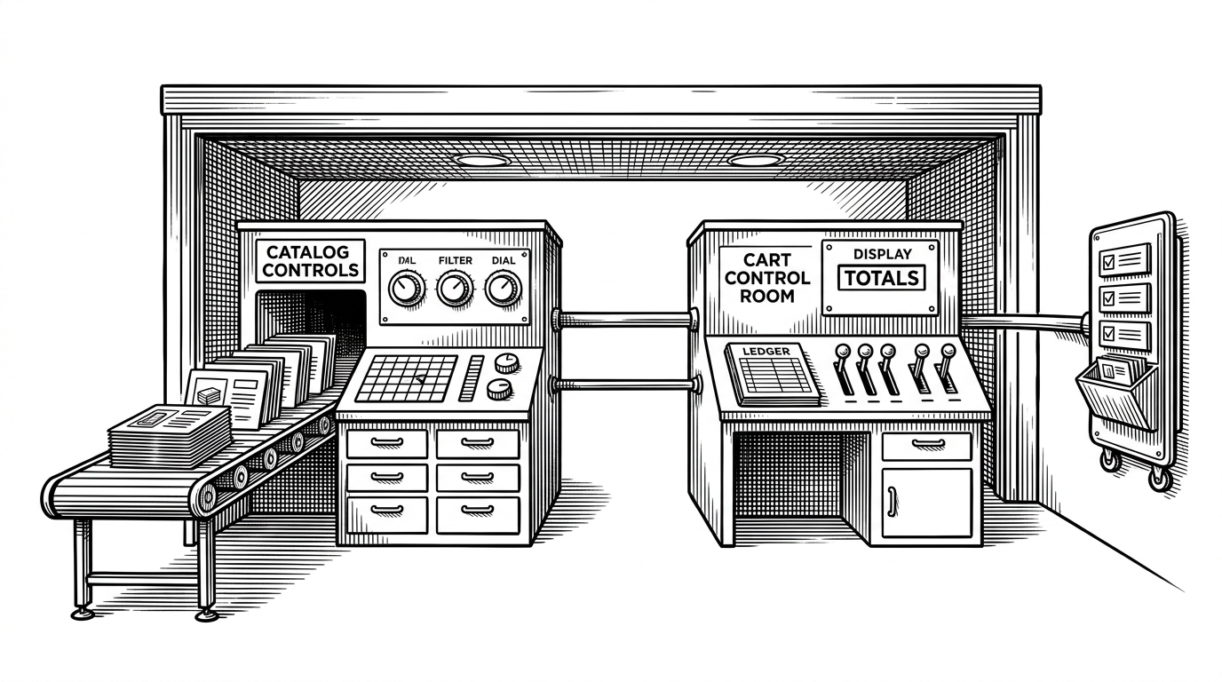
The interesting move in react-shopping-cart is not the storefront layout. It is the separation between ProductsContext and CartContext, with custom hooks doing the real orchestration work. Instead of one oversized store object, the repo decomposes cart behavior into smaller units that are easier to reason about and easier to test.
That split changes the way the app behaves as a system. Product data comes in through a service layer, catalog state lives in one context, and cart math lives in another. The UI consumes a tidy API instead of negotiating with a giant store, which is why the app feels simple even though the internals are carefully layered.
How the app moves from products to state to UI
The data path is deliberately boring in the best way. services/products.ts chooses between local JSON in development and Firebase in production, so contributors can run the app offline while the live demo still feels real. That dual-mode setup is a quiet but strong product decision. It lowers friction without making the sample code feel fake.
From there, product data enters the catalog context and becomes visible to components like Product.tsx and CartProduct.tsx. The interesting part is that the UI never needs to know where the data started. It just reads the current shape of the store, which keeps the component layer focused on interaction rather than plumbing.

The facelessness of the architecture is the point. The repo does not force the developer to think in terms of one huge global object. It gives them small, named responsibilities, then hides the wiring behind a cleaner hook API. That is a better teaching pattern than a monolithic demo because it reflects how serious frontends are usually maintained.
const { products, addProduct, removeProduct } = useCartProducts();
const { total, updateCartTotal } = useCartTotal();

export const useCart = () => ({
  products,
  total,
  addProduct,
  removeProduct,
  updateCartTotal,
});
Why this feels like a real product, not a toy
The polish is not superficial. Product.tsx includes keyboard support, which means the shopping flow is not mouse-only. The theme layer is strongly typed, the assets are handled as modern .webp images, and the side cart pattern keeps the primary browsing flow uninterrupted. Those choices make the app feel complete, not just functional.
That is why the repo lands as a portfolio piece. It does not just show that React can render cards and counts. It shows that accessibility, design tokens, and asset discipline can be treated as part of the architecture.
The repo is also a portfolio strategy
The tooling tells the same story. High coverage thresholds, Husky, commitlint, and CircleCI make the project look like something built for long-term maintenance, not a weekend exercise. Even the contributor setup suggests a repo meant to be read, forked, and used as a pattern library by other developers.
| Dimension | What this repo does | Why it matters |
|---|---|---|
| Testing | Strict coverage thresholds in package.json | Signals that the demo code is expected to stay healthy |
| Git hygiene | Husky and commitlint | Keeps changes disciplined and reviewable |
| Delivery | CircleCI and Firebase | Makes the repo feel shippable instead of static |
| Contributor experience | Local JSON in development | Lets people run the app without backend friction |
| Design system | Typed styled-components theme | Makes UI changes safer and more consistent |
What it beats, and what it does not
This repo sits in a very useful middle zone. Compared with Shopify or BigCommerce, it is tiny, local, and transparent. Compared with a generic cart hook library, it is more complete and more opinionated. Compared with a Redux-heavy custom build, it is easier to read and easier to teach from.
| Option | Setup cost | Learning value | Product completeness | Best fit |
|---|---|---|---|---|
| Shopify or BigCommerce | High | Low for React architecture | Very high | Full commerce operations |
| Generic cart hook library | Low | Medium | Low to medium | Quick integration |
| Redux-style custom cart | Medium to high | Medium | Medium | Teams that already standardize on Redux |
| react-shopping-cart | Low | High | Medium to high | Portfolio projects, teaching, and lightweight storefronts |
That middle position is the real product insight. It is not trying to replace a platform, and it is not trying to be a one-file snippet. It is a reference implementation with enough structure to be serious and enough restraint to stay legible.
The pattern worth copying
The takeaway is simple. When a common UI feels unusually good, the win is often architectural, not visual. Split the state by concern. Wrap the messy pieces behind a clean hook. Keep the contributor path easy. Then let the product polish reinforce the code shape instead of covering it up.