sales-crm: Kargul Sales CRM: The Boilerplate Built for Humans and AI
A polished Next.js CRM starter is one thing. A starter kit with embedded agent skills, performance rules, and a design system that trains the coder is something else.
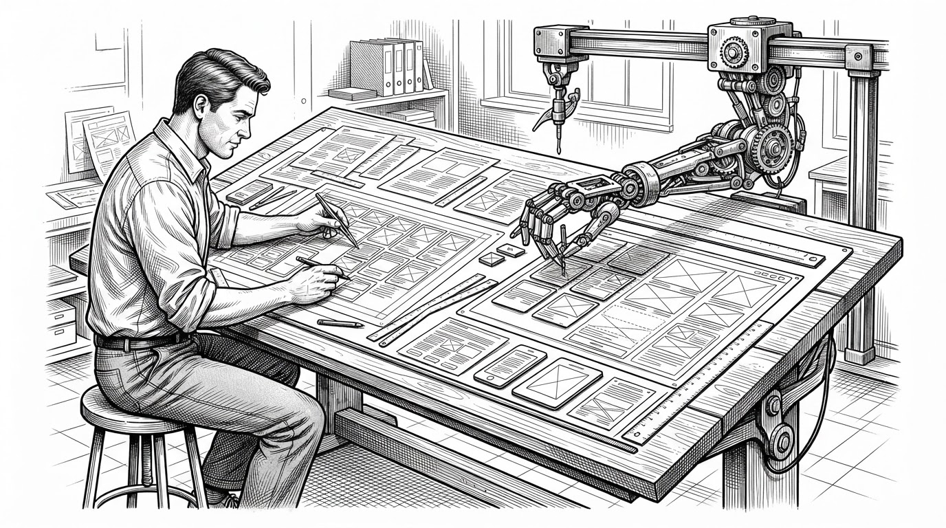
- Kargul Sales CRM is less a finished app than a production opinion encoded for both engineers and AI assistants.
- Its unusual value comes from treating conventions, review rubrics, and agent skills as part of the product surface.
- The repo’s strongest technical signal is discipline: asset loading, table layout, and design tokens all serve performance and consistency.
- This is aimed at teams building modern SaaS foundations, not buyers looking for a monolithic CRM platform.
A starter kit that teaches the coder
Most boilerplates try to be helpful after the fact. Kargul Sales CRM tries to shape the work before the first component lands. The unusual part is not just the CRM shell, but the presence of .agents/ and .claude/ as first-class project infrastructure.
That turns the repo into a kind of policy engine for development. The starter kit does not only tell you what to build. It tells the model what good code looks like, how the UI should behave, and which conventions are non-negotiable.
We take your product from Figma to production. Pixel perfect implementation, clean integration with your backend, and code written exclusively by senior developers.
Why the conventions matter
The repo’s conventions are not bureaucratic decoration. They are the thing that lets the system scale without turning into a pile of one-off choices. Typography rules, Supabase guidance, accessibility checks, and review rubrics all do the same job: they compress ambiguity.
That matters in a starter kit because every early decision becomes a precedent. If the defaults are thoughtful, contributors move faster. If the defaults are vague, every feature becomes a debate.
| Dimension | Kargul Sales CRM | Generic starter boilerplate |
|---|---|---|
| Coding guidance | Agent skills and conventions are embedded into the repo | Only basic setup instructions |
| UI standards | Opinionated typography, layout, and review rules | Left to each contributor |
| AI compatibility | Designed to guide LLM-assisted coding | No model-facing structure |
| Project effect | Constrains output to preserve consistency | Optimizes for initial convenience |
The UI is built like a product, not a demo
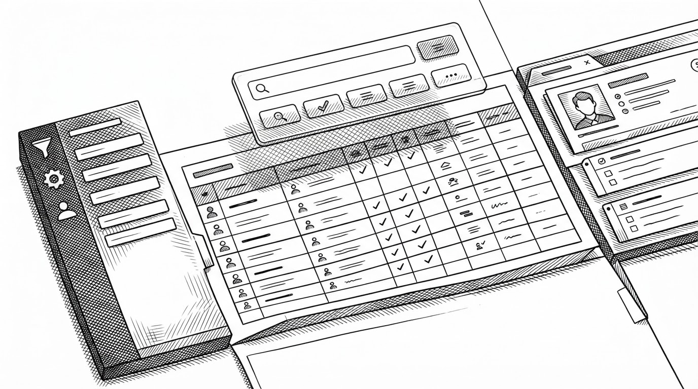
The visible CRM surface follows the same philosophy. Sidebar, command palette, detail panels, and tables are wired together as one design language, not as isolated widgets. That is what keeps the app from feeling like a showcase repo with a few polished screenshots.
The stack helps, but the bigger signal is restraint. The interface is trying to reduce the usual starter-kit smell by making the app feel inhabited, not assembled.
The asset pipeline is where the performance story gets real
This is where the repo stops looking like a style exercise and starts looking like engineering. The polymorphic asset layer handles Rive, Lottie, video, and images with enough discipline to avoid trashing the page experience. Heavy media is introduced on purpose, not by default.
That is the difference between motion as decoration and motion as product behavior. The repo treats loading strategy as part of design quality, which is exactly where most flashy starters cut corners.
Generating illustration...
Why the table matters more than it looks
The companies table is the cleanest proof that this repo prefers native browser mechanics over heavy abstraction. CSS subgrid keeps the columns aligned without dragging in a table framework that solves one problem by creating three more. It is a small implementation choice with a large product payoff.
That discipline matters because tables are where starter kits often start to fray. Once filtering, selection, and detail state show up, alignment bugs and layout hacks tend to multiply. Here, the table looks simple because the structure underneath is simple.
| Approach | What it optimizes for | Trade-off |
|---|---|---|
| CSS subgrid table | Alignment with minimal DOM depth | Requires careful layout discipline |
| Heavy table library | Feature breadth and rapid setup | More abstraction, more overhead |
| Custom grid + shared state | Tight product behavior | Less plug-and-play convenience |
Against large platforms like Twenty or ERPNext, Kargul Sales CRM is narrower by design. It is not trying to become a universal system of record. It is trying to be the sharpest possible foundation for teams that care about visual quality, performance, and code guidance from day one.
The project likely includes typical CRM features such as contact tracking, deal stages, and activity logging, all expressed in strongly typed modules. TypeScript also enables better IDE support, so contributors can navigate the code with autocomplete and type hints.
What this repo is really for
The real market position is clear once you strip away the CRM theme. This is a high-opinion development base for modern SaaS teams who want a design system, an AI-aware workflow, and performance rules baked into the starter itself. It is a foundation layer, not a finished suite.
That is why the repo feels unusually coherent. The AI instructions, the UI system, the asset pipeline, and the subgrid table all point in the same direction. They are not features competing for attention. They are one editorial stance about how software should be built.
| Product type | Best for | Not for |
|---|---|---|
| Kargul Sales CRM | Teams building custom SaaS with strong UI standards | Buyers who want a turnkey enterprise CRM |
| Twenty | Full open-source CRM platforms | Lightweight starter opinions |
| ERPNext | Broad enterprise process management | A modern frontend-first scaffold |
| Generic boilerplate | Fast initial scaffolding | Teams that want enforced conventions |