snap-bite: SnapBite: The AI Food Scanner That Treats Uncertainty as a First-Class Feature
A close look at the React Native, Expo, and Supabase stack behind a nutrition app that turns camera input into structured macro data, then gives users the final word.
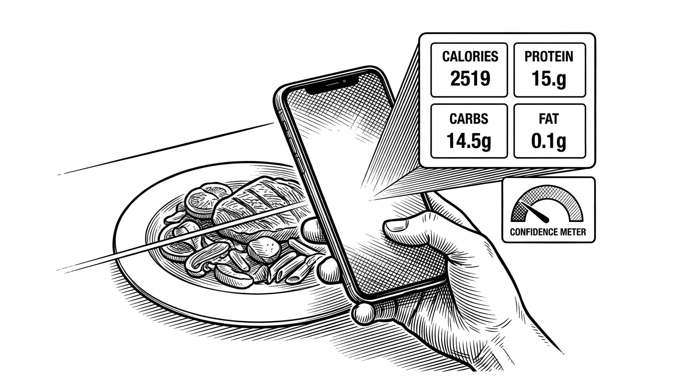
- SnapBite is interesting because it makes uncertainty visible instead of hiding it behind a fake sense of AI certainty.
- Its scan flow is designed as a correction loop, so the user can refine model output instead of restarting the task from scratch.
- The UI is not decorative chrome, because the glassy surfaces, scan animation, and custom navigation all help sell trust in a probabilistic result.
- The repo reads like a launchable mobile SaaS skeleton, with Expo, Supabase, React Query, RevenueCat, Sentry, and PostHog doing different jobs in one coherent stack.
The photo-to-macro promise
SnapBite tackles a familiar problem with a sharper idea than most food apps: the camera is the starting point, not the finish line. You point it at a meal, the app tries to infer the food, and the result lands as structured macro data instead of a vague label or a dead-end search result.
That matters because nutrition logging fails on friction. Manual entry is accurate but tedious. Generic AI scanners are fast, but they often act more certain than the underlying vision model deserves.

What SnapBite does differently
The key design choice is not just that SnapBite uses AI. It is that the app admits the model is uncertain. The research points to a strict JSON prompt, a `match_percentage` field, and a fallback food taxonomy for testability when the AI path is unavailable.
That combination changes the product posture. A generic scanner says, "trust me." SnapBite says, "here is my best guess, here is how confident I am, and here is how you can fix it." That is a better shape for health software.
| Approach | Speed | Accuracy posture | User effort | Error handling | Best for |
|---|---|---|---|---|---|
| Manual logging | Slow | High when the user knows the food | High | Errors are caught by the user | People who want exact control |
| Generic AI scanner | Fast | Overconfident | Low at first, then frustrating | Errors are often hidden | Demo-first experiences |
| SnapBite | Fast | Probabilistic and editable | Low to moderate | Errors are exposed and corrected in flow | Daily nutrition tracking with real-world ambiguity |
The comparison is simple: manual logging demands effort, generic AI demands trust, and SnapBite tries to reduce both by making ambiguity part of the workflow.
Inside the scan engine
The technical heart of the repo is `app/scan.tsx`. The flow is straightforward but disciplined. The app captures an image with `expo-image-picker`, converts it to Base64, and sends it to a Gemini-powered endpoint configured through `useAIConfig`.
The important part is the prompt shape. The model is instructed to return strict JSON with calories, protein, carbs, fat, and a confidence-like `match_percentage`. That is not cosmetic. It gives the app a schema it can trust, validate, and edit downstream.
// Conceptualized from the repository research
const payload = {
  image: base64Image,
  prompt: `Return strict JSON only with:
  calories, protein, carbs, fat, match_percentage`
}

const result = await fetch(aiEndpoint, {
  method: 'POST',
  headers: { 'Content-Type': 'application/json' },
  body: JSON.stringify(payload)
})

// App logic then stores the result as editable state
// so the user can correct any field before logging.
That editable state matters as much as the model call itself. The app is not trying to prove the AI was right. It is trying to keep the user moving while preserving a path to correction.
There is also a practical fallback story. The `PRESET_FOODS` taxonomy keeps the experience testable when the AI path is unavailable, which is exactly the kind of boring constraint that makes a feature survive outside a demo.

Why the UI feels premium instead of clinical
SnapBite’s interface choices are doing product work, not just decoration. The glassmorphism surfaces, gradient accents, laser sweep animation, and custom curved tab bar make the app feel intentional and polished, which is exactly what a nutrition product needs when it asks for daily attention.
That visual language softens the anxiety of being judged by numbers. A sterile form would make the app feel like a spreadsheet. SnapBite pushes toward something more reassuring, which helps the user accept a probabilistic result without feeling cheated.
The landing screen’s custom interactions and the tab bar’s sculpted shape also suggest a repo that values perceived quality. In a category full of utilitarian trackers, that matters because trust is partly emotional.
The rest of the stack is doing quiet work
The rest of the architecture makes the hero feature durable. Expo Router handles file-based navigation. Supabase covers auth and data. React Query manages server state and caching. Sentry catches crashes, PostHog tracks behavior, RevenueCat handles subscriptions, and i18n keeps the app ready for more than one language.
The interesting part is not any single dependency. It is the way they line up around a product surface that feels more complete than a typical hackathon build. The repository structure, including `app-walkthrough`, `supabase/migrations`, `components/ui`, `hooks`, and `lib`, looks like a template for a serious mobile SaaS rather than a one-off experiment.
| Layer | What it does | Why it matters |
|---|---|---|
| Expo Router | File-based navigation and app structure | Keeps the mobile shell simple to reason about |
| Supabase | Auth, database, and edge functions | Lets the app persist logs and user state without a custom backend |
| React Query | Server-state caching | Reduces repeat work and makes data refresh predictable |
| Sentry | Crash reporting | Makes a polished app survivable in production |
| PostHog | Product analytics | Shows what users actually do |
| RevenueCat | Subscription management | Turns the app into a monetizable product |
There is a second comparison worth making: this repo behaves less like a feature prototype and more like a launch scaffold. That is why it stands out.
The template angle, and who should care
SnapBite is best understood as a launchable skeleton for a narrow but useful category. It is specific enough to feel real, but broad enough that another builder could swap in a different AI workflow, a different wellness vertical, or a different monetization model without starting from scratch.
That makes it interesting to founders and product-minded engineers more than to people chasing novelty. The repo’s lesson is not "AI can read food." The lesson is that a good consumer AI product often wins by carefully managing uncertainty, not pretending to eliminate it.
On that score, SnapBite is thoughtful. It turns a shaky input into a structured output, exposes the confidence gap, and hands control back to the user. That is the kind of design that can survive contact with real life.