ip-as-logo-skill: The Prompt System That Makes AI Draw Brand Mascots Like a Design Team
A tiny Agent Skill that reads local repo context, narrows the aesthetic, and batches logo candidates until the model behaves less like an illustrator and more like a disciplined identity studio.
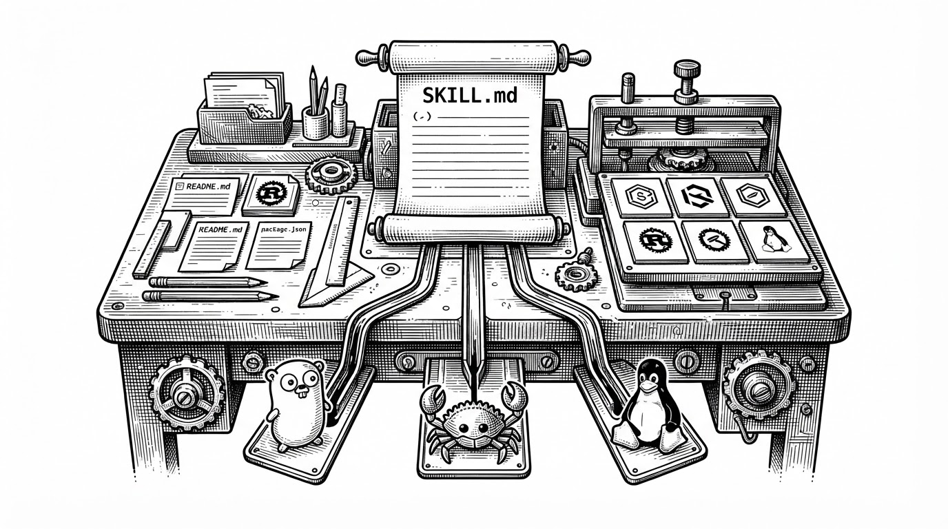
- ip-as-logo-skill is interesting because it treats taste as a workflow problem, not a prompt-writing problem.
- The repo wins by reading local context first, then narrowing the design space before it generates anything.
- Its constraints are the point: small shape counts, limited color, and corner-anchored composition keep the output brandable.
- The project hints at a larger shift where markdown-based skills become portable behavior packs for specialized AI tools.
Most logo generators optimize for novelty. This skill optimizes for recognizability. That difference matters if you need something that can live as a favicon, a profile image, or a product mark instead of a pretty one-off illustration.
The project comes from Sida, who ships it as an Agent Skill, not a SaaS app. That choice is the first clue: the repo is mostly instructions, and the instructions are the product.
Logo First, IP Second:首先保证它是一个简洁、清晰、易识别的Logo,其次才是一个可爱的IP 形象,避免复杂插画感。
Why this skill exists
Generic image models love detail. Logos do not. If you ask an unconstrained model for a mascot, it often returns a dense illustration with too many textures, too many shadows, and too little clarity at icon size.
This skill exists to stop that drift. It tries to make the model behave like a brand system, where every choice has to survive shrinkage, repetition, and visual sameness across a product surface.
That is why the project feels less like an art toy and more like a taste engine.
The repository is mostly policy, not code
The core file is SKILL.md. It does the work by defining behavior: read context, propose directions, constrain the shape language, then generate batches of candidates. There is no heavy runtime here, just a very opinionated instruction stack.
That matters because the model is no longer answering a vague creative prompt. It is being routed through a workflow with checkpoints, which is how the skill keeps output from collapsing into generic AI art.
1. Read local repo context
2. Infer brand personality
3. Propose design directions
4. Pick one branch
5. Enforce shape budget
6. Enforce palette budget
7. Generate six variants
8. Compare and refine
The best idea: make the model read the repo first
This is the repo's sharpest move. Instead of inventing a brand in a vacuum, the skill looks at local files such as README.md and package.json to pick up tone, product category, and rough audience signals.
That changes the entire design problem. A mascot for a developer tool should not feel like a consumer app mascot. A security product should not feel like a playful game icon. Context reading is how the skill reduces mismatch before generation starts.
That is the surprise here. The skill is not only prompting for a mascot. It is building a tiny decision layer in front of the image model.
| Approach | Reads repo context | Constraint level | Batching | Small-size legibility |
|---|---|---|---|---|
| Generic image prompt | No | Low | Usually one-off | Usually weak |
| Traditional AI logo tool | Sometimes | Medium | Often guided | Mixed |
| ip-as-logo-skill | Yes | High | Six-way variants | Explicitly optimized |
| Adjacent sprite skill | Usually yes | High | Variant packs for game assets | Different target, same discipline |
How the aesthetic is enforced
The style rules are doing most of the value creation. The repo pushes toward simplified rounded forms, subtle neo-skeuomorphism, and a composition that sits in a lower corner instead of dead center.
That combination makes the result feel like a product mark instead of a poster. The shapes are meant to survive 32-by-32 pixels, not just look good in a gallery.
A strict palette also matters. Fewer colors mean less ambiguity, less mush, and less chance that the model will spend its budget on decorative noise.
| Design rule | What it prevents | Why it matters |
|---|---|---|
| 4 to 7 primitive shapes | Over-rendered complexity | Keeps the silhouette readable |
| Three-color palette | Visual drift | Improves consistency and scaling |
| Corner anchoring | Dead-center stiffness | Adds energy and app-icon presence |
| Rounded neo-skeuomorphic forms | Harsh, spiky output | Feels friendly without becoming childish |
Why six variants matter
The six-way batch is clever because it creates controlled disagreement. You are not asking the model to be random. You are asking it to stay inside a branch while exploring enough surface area for judgment.
That is a better human workflow too. Designers do not need a hundred noisy outputs. They need a small set of candidates that differ in a way you can actually compare.
The A1 through C2 structure gives the user a grid, not a fog bank.
| Batch strategy | User experience | Failure mode |
|---|---|---|
| One image at a time | Slow and brittle | You overfit to one bad draft |
| Unlimited generation | Noisy and expensive | You drown in variation |
| Six controlled candidates | Fast and comparable | You can choose a direction deliberately |
What it replaces, and what it does not
This is not a replacement for a brand designer. It is a replacement for the first 30 minutes of wandering around with a generic prompt and no clear visual guardrails.
It also is not the same as a traditional logo generator. Those tools often ask you to declare a business category and then browse a catalog of styles. This skill sits closer to the work, inside the repo, with more technical context and less UI ceremony.
The niche is narrow, but that is the point. Narrow tools can feel surprisingly strong when the job is tightly defined.
| Tool type | Best for | Main weakness |
|---|---|---|
| Generic image model | Open-ended ideation | Too much style drift |
| Traditional logo SaaS | Fast web-based logo shopping | Thin context awareness |
| ip-as-logo-skill | Developer-centric mascots | Only works well inside its brief |
| Sprite generator skills | Game asset pipelines | Different visual goal |
AI product logos are quietly turning into characters. Grok, Coze, WorkBuddy, Doubao, and Kiro all use mascots as their logos. You don’t just remember the product—you remember its personality. @s1dashu turned this pattern into an open-source Logo Skill ↓ https://t.co/jO9gi0KDHu
The bigger shift: agents as taste machines
The broader story is not logos. It is portable behavior. A markdown skill can package taste, process, and output constraints into something another agent can execute with very little friction.
That is a real change in how software gets built around AI. The model stays general. The skill makes it specific.
If this pattern keeps spreading, the most useful open-source artifacts may not be apps in the old sense. They may be instruction systems that reliably turn generic models into narrow experts.