Travel-Recommendation-Website: Travel Explorer: The Vanilla JS Trip Planner That Pretends to Be a Framework App
A lean JSON data layer, a CSS-variable theme engine, and a cart-like trip planner turn a small static site into a surprisingly rich travel product.
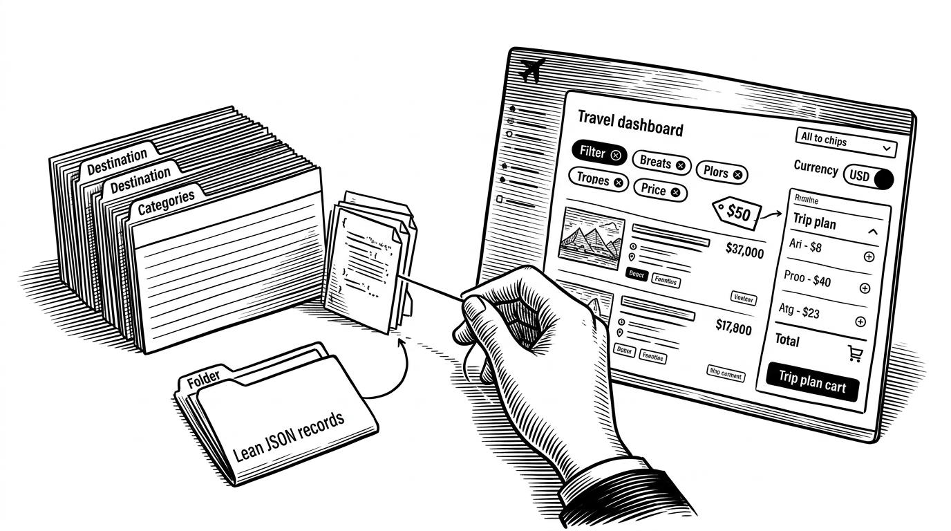
- Travel Explorer feels bigger than its stack because a small JSON dataset is enriched at runtime into a searchable, filterable, currency-aware catalog.
- Its strongest move is the decorator pattern in plain JavaScript, where ratings, prices, and best times stay out of the content file but still shape every card.
- The trip plan cart and localStorage persistence turn a brochure-style site into something that behaves like a lightweight product tool.
- The trade-off is clear: the architecture is elegant for a solo project, but hardcoded metadata makes it awkward for non-developers to maintain.
The Sleight of Hand
Travel Explorer does not look like a small project. It behaves like a polished product, with search, filters, currency switching, theme toggles, and a trip plan cart. That is the point: the codebase is plain HTML, CSS variables, and vanilla JavaScript.
The surprise is not that it works. The surprise is how little machinery it needs. What reads like a framework app is really a disciplined front-end built around a flat data file and a smart state layer.
A Lean Data Model, Then a Smart Overlay
The core idea is simple. Keep the destination data lean, then enrich it in JavaScript. The JSON file holds destination records, while lookup tables in the script add ratings, best times, pricing, and other metadata keyed by destination name.
const enriched = destinations.map((item) => ({
  ...item,
  rating: RATINGS[item.name],
  bestTime: BEST_TIME[item.name],
  price: currentCurrency === 'INR'
    ? PRICE_INR[item.name]
    : PRICE_USD[item.name]
}));

const visible = enriched.filter((item) => {
  const matchesSearch = item.name.toLowerCase().includes(query);
  const matchesCategory = currentView === 'all' || item.country === currentView;
  return matchesSearch && matchesCategory;
});
That pattern does two things at once. It keeps the source data easy to scan, and it lets the UI assemble richer cards without bloating the JSON itself. The cost is that content and metadata now live in two places.
What Actually Makes It Useful
The project crosses the line from gallery to utility when it adds trip planning. Destinations are not just displayed. They can be added to a plan, counted, and persisted in localStorage like a lightweight cart.
| Capability | Static brochure site | Travel Explorer |
|---|---|---|
| Search and filter | Usually absent | Built in |
| Theme switching | Rarely | Instant via CSS variables |
| Currency display | Not applicable | INR and USD toggle |
| Trip planning | Manual or missing | LocalStorage-backed plan cart |
| Maintenance model | Mostly content edits | Content plus JS metadata |
| User value | Browsing only | Browsing plus planning |

The Theme Engine Is the Quiet Win
The theme toggle is less flashy than the trip cart, but it shows the project’s discipline. Instead of rerendering a whole interface or leaning on framework state, it uses CSS variables and a data attribute on the root element to swap themes instantly.
That matters because the visual system stays decoupled from the data system. The same destination cards can be restyled without changing the underlying rendering logic, which keeps the code compact and the interaction snappy.
Why the Architecture Feels So Small
This is where the trade-off becomes obvious. The code is tidy, but the metadata lives in hardcoded lookup tables. That means the project is easy for a developer to control and awkward for a non-developer to update.
| Trade-off | Benefit | Cost |
|---|---|---|
| Vanilla JS instead of a framework | Small surface area, fewer dependencies | More manual DOM and state handling |
| Lookup tables in code | Fast enrichment and simple lookups | Metadata changes require code edits |
| Single-page structure | Easy to reason about | Harder to split across contributors |
| CSS variables for theming | Instant theme switching | Theme logic still lives in front-end code |
For a solo portfolio project, that is a sensible bargain. For a collaborative content workflow, it is a ceiling. The architecture is elegant because it stays small, not because it scales endlessly.
Where It Sits in the Travel Tool Landscape
Travel Explorer should not be judged against routing engines or AI itinerary generators. It sits in a different lane. Its value is educational and practical at the same time: a local-first, self-contained demonstration of how far a small front end can go.
| Project type | What it optimizes for | Where Travel Explorer differs |
|---|---|---|
| Framework-heavy travel app | Scale, modularity, team workflows | Travel Explorer wins on simplicity |
| AI itinerary planner | Personalization and generation | Travel Explorer is deterministic and transparent |
| Static destination brochure | Presentation only | Travel Explorer adds search, filtering, and planning |
| Routing or transit engine | Algorithmic path finding | Travel Explorer is about discovery, not navigation |
That makes its niche clear. It is not trying to solve travel itself. It is showing how much product behavior can emerge from a small amount of careful front-end code.
The Real Lesson
Travel Explorer is interesting because it refuses to confuse framework weight with product quality. The real work is in data flow, state handling, and interface discipline. Once those pieces are clean, a vanilla stack can go a long way.
That is the useful lesson here. Small front ends can still feel rich if the data model is lean, the enrichment layer is intentional, and the interactions are composed with restraint.