Stock_Price_Prediction_Project: When a Forecast Gets Smoothed Before You See It
A small FastAPI and LSTM stock app that makes one pragmatic choice over and over: it blends raw model output with the previous close so the chart looks usable, not just literal.
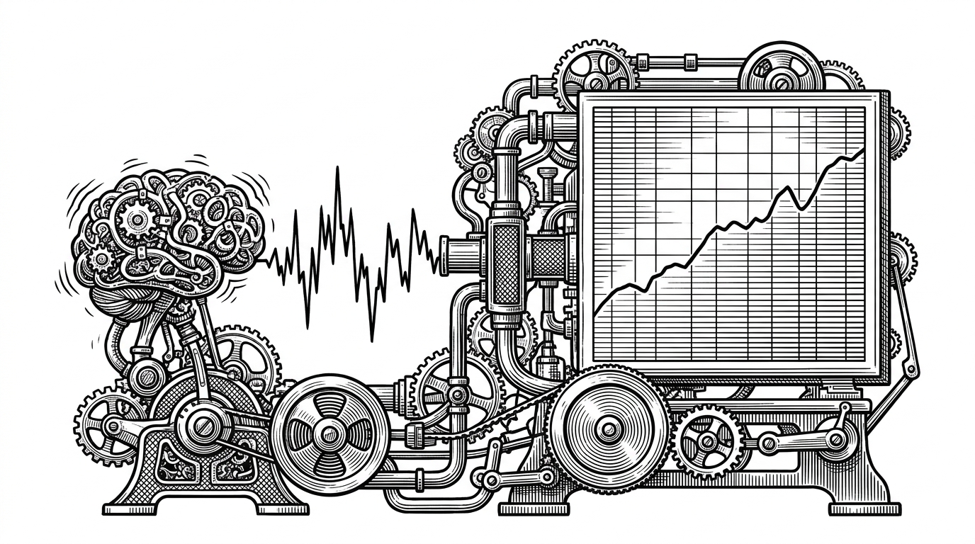
- The repo’s defining idea is not stock prediction, but presentation control, because it blends raw LSTM output with the previous close before drawing the forecast.
- Its backend turns a standard time-series demo into a full product loop by fetching history, scaling it, windowing it, and serving the result through FastAPI.
- The frontend stays intentionally light with vanilla JavaScript and Chart.js, which keeps the app understandable and easy to ship.
- This is a portfolio-grade forecasting project, not a production trading system, and the smoothing rule is about readability more than scientific purity.
The Forecast Is Not Raw
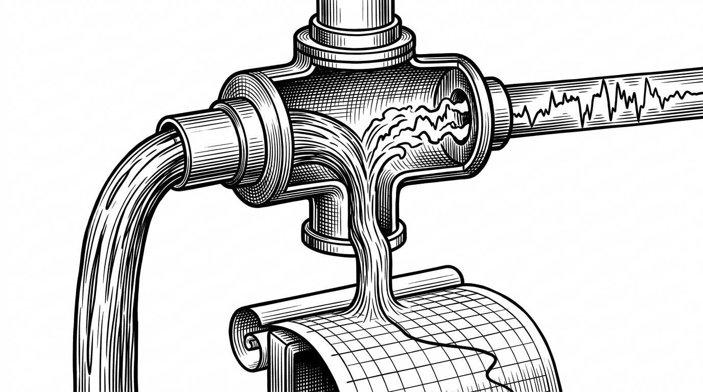
The most interesting line in this repo is not the model definition. It is the smoothing rule in main.py: the app blends the LSTM’s raw output with the previous close before it renders the forecast. That means the number you see is already a negotiated version of the model’s answer.
That is a small move with a big implication. The project is not trying to prove that an LSTM can out-forecast the market. It is trying to make a forecast line look believable enough that a user can trust the dashboard long enough to read it.
Stock Price Prediction using Long Short-Term Memory (LSTM) is a popular project that demonstrates the power of recurrent neural networks in time series forecasting. In this project, we will build a model to predict the closing price of a stock using historical price data.
Why the App Cheats a Little
Raw time-series forecasts often look jumpy, especially when the user sees them as a line chart. A technically honest line can still be a bad product line. This repo chooses readability over literalism, and it does so openly.
| Approach | Strength | Weakness | What it optimizes for |
|---|---|---|---|
| Raw LSTM output | Direct model signal | Often jagged or visually implausible | Model purity |
| Smoothed LSTM output in this repo | More readable forecast line | Less faithful to the raw prediction | User trust and dashboard clarity |
| Prophet | Fast seasonal forecasting | Less flexible for complex nonlinear patterns | Quick, interpretable time-series baseline |
| ARIMA / Statsmodels | Classical statistical rigor | Can be harder to tune for nonstationary data | Baseline forecasting discipline |
That comparison is the right lens. The project is not trying to beat Prophet or ARIMA on forecasting rigor. It is showing how a small, opinionated post-processing step can make a machine-learning demo feel like a product.
What Powers the Prediction
The backend flow is straightforward and intentionally modular. The API fetches about 240 trading days of history, scales the price series, builds a 60-day sliding window, sends that window through the LSTM, and then converts the result back into price space.
PREDICTION_SMOOTHING = 0.25
predicted_price = previous_close + (float(raw_prediction) - previous_close) * PREDICTION_SMOOTHING

# Typical flow in the API:
# 1. Download history
# 2. Scale close prices
# 3. Build 60-day sequences
# 4. Run model inference
# 5. Smooth the final value
# 6. Return chart-ready JSON
That 60-day window is the real memory of the model. It does not reason about companies or headlines. It only sees a moving slice of recent closes, and it learns a regression pattern over that slice.
The LSTM Under the Hood
The saved model is a standard Sequential LSTM stack. Two LSTM layers with dropout feed a linear output neuron, which is exactly what you would expect from a tutorial-grade regression setup for sequential data.
# Conceptual architecture
Input: (60, 1)
LSTM(50, return_sequences=True)
Dropout(0.2)
LSTM(50)
Dropout(0.2)
Dense(1, activation='linear')
That shape matters. The model is not forecasting a whole curve. It is making one next-step estimate at a time, then the app reconstructs a user-facing chart around that estimate.
A Dashboard Without a Framework
The frontend stays light: plain HTML, CSS, and vanilla JavaScript, with Chart.js doing the charting work. No React. No Vue. Just enough DOM logic to fetch data, format values, and render a two-line chart with actual versus predicted prices.
That restraint helps the project. The UI can look polished without dragging in a framework that would add more ceremony than the app needs. For a portfolio demo, that is a feature, not a compromise.
| Frontend choice | What you get | What you avoid |
|---|---|---|
| Vanilla JS + Chart.js | Simple data flow and fast load | Framework overhead |
| React dashboard | Component scale and ecosystem | More boilerplate for a small demo |
| Vue dashboard | Clean reactivity | Another dependency layer the app does not need |
What This Project Is Good At, and What It Is Not
This is a strong educational project because it closes the loop from data fetching to inference to presentation. It shows how an ML prototype becomes something a person can click.
It is not a production forecasting system. The model is serialized, not continuously retrained. The market changes. The smoothing makes the output easier to consume, but not more statistically grounded. And yfinance plus a CPU inference stack is a fine fit for a demo, not for heavy traffic.
That is the right boundary to draw. The repo’s value is in the engineering habit it teaches: when a prediction leaves the model, the product has already started editing it.