Inside `financial-transactions-analysis-`: How Excel Becomes a 100,000-Row Financial Engine
A CSV, a workbook, and a handful of formulas turn a spreadsheet into a disciplined ETL and BI system. The interesting part is not the dashboard. It is the data model hiding behind it.
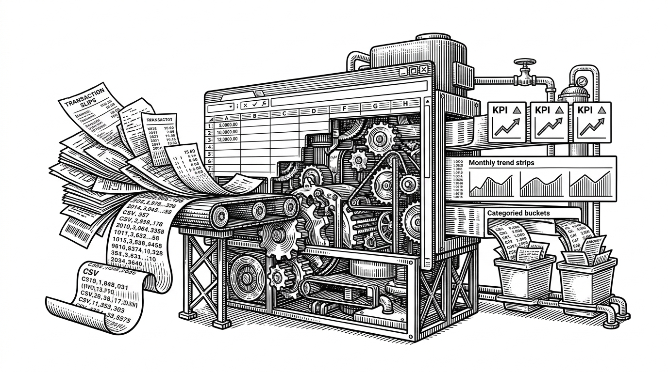
- This repo turns Excel into an analysis engine by separating raw CSV input from formula-driven reporting.
- Its most interesting move is bucketization, which converts transaction amounts into business logic that surfaces long-tail behavior.
- The workbook borrows the logic of SQL and ETL, then expresses it in formulas, PivotTables, and summary sheets that are easy to inspect.
- The project is persuasive because it treats handoff, transparency, and speed of review as first-class design goals, not spreadsheet afterthoughts.
The spreadsheet that behaves like a data pipeline
This repo is interesting because it refuses the usual spreadsheet stereotype. It is not a pile of ad hoc tabs. It is a deliberate analysis system built around a clean split between source data and analysis output, which is the same architectural instinct behind better data stacks.
The source is a CSV. The engine is a workbook. The result is a financial analysis flow that can absorb 100,000 rows without collapsing into chaos. That is the surprise: Excel is being used as a disciplined BI layer, not a convenience app.

What the workbook is actually doing
The workbook is not just displaying results. It is transforming data. A date becomes a sortable month key with TEXT(date, "yyyy-mm"). Repeated totals come from SUMIFS. Category counts come from COUNTIFS. PivotTables then compress those intermediate layers into summaries that read like a lightweight BI model.
=TEXT(B2,"yyyy-mm")
=SUMIFS($D:$D,$F:$F,$H2,$C:$C,$I2)
=COUNTIFS($E:$E,$K2,$B:$B,">="&$L2,$B:$B,"<"&$M2)Why bucketization is the smartest move in the file
Bucketization is the real analytical idea here. Instead of staring at a wall of individual amounts, the workbook converts continuous values into categories. That makes the long tail visible. It also makes the file easier to reason about, because business logic becomes explicit rather than hidden inside a chart.

That matters because the lower-value range can become an anomaly zone. The repo treats that zone like a diagnostic lens, not an accounting detail. In other words, the workbook is doing the work of business intelligence, not just reporting.
The long tail tells the real story
| Signal | What the workbook suggests | Why it matters |
|---|---|---|
| Balanced transaction types | Credit, debit, and transfer are roughly even | The dataset looks either synthetic or intentionally structured, which makes the workbook a stress test |
| Low-value bucket concentration | Many transactions cluster in the smallest ranges | Small amounts can hide operational noise, fraud patterns, or behavioral friction |
| Top customer rollup | Customer IDs behave like groupable entities | The file is set up for SQL-like ranking and account-level analysis |
| Monthly normalization | Dates collapse cleanly into yyyy-mm buckets | Time-series reporting stays stable without manual cleanup |
The shape of the data is as interesting as the dashboard. A balanced type distribution and a heavy low-value cluster suggest the workbook is being used as a diagnostic instrument. That is a stronger story than a pretty chart, because it exposes structure.
Excel versus the usual stack
| Dimension | Spreadsheet-first workflow | Python or SQL stack |
|---|---|---|
| Setup cost | Low | Higher |
| Transparency | High, because formulas are visible in cells | High if documented, lower if logic lives across files |
| Handoff | Easy for non-developers | Often requires tooling knowledge |
| Scale | Strong enough for this use case | Stronger for larger or more complex pipelines |
| Iteration speed | Fast for analyst-led changes | Fast once the environment is established |
| Best fit | Formula-driven reporting and inspection | Automation-heavy pipelines and repeated production jobs |
This repo does not prove Excel is better than code. It proves something narrower and more useful. For analysis-heavy work that needs to be handed off, audited, and understood quickly, Excel can be the right architecture if it is designed like a system.
Why this repo is more interesting than it looks
The project reads like a portfolio workbook, but it behaves like a miniature analytics stack. Source data stays separate from presentation logic. Transformations are explicit. Summaries are reproducible. The result is a spreadsheet that can hold its own against more formal tooling when the job is mostly classification, aggregation, and reporting.
That is the real lesson. Small tools are not weak tools. They become powerful when their structure is disciplined enough to make complexity legible.