dsh-web-ui: The Plugin That Turns a Chat Box Into a Safe AI Workspace
A DeepSeek Harness extension that gives agents a file tree, Git control, task surfaces, and hard security boundaries, without turning the UI into a brittle monolith.
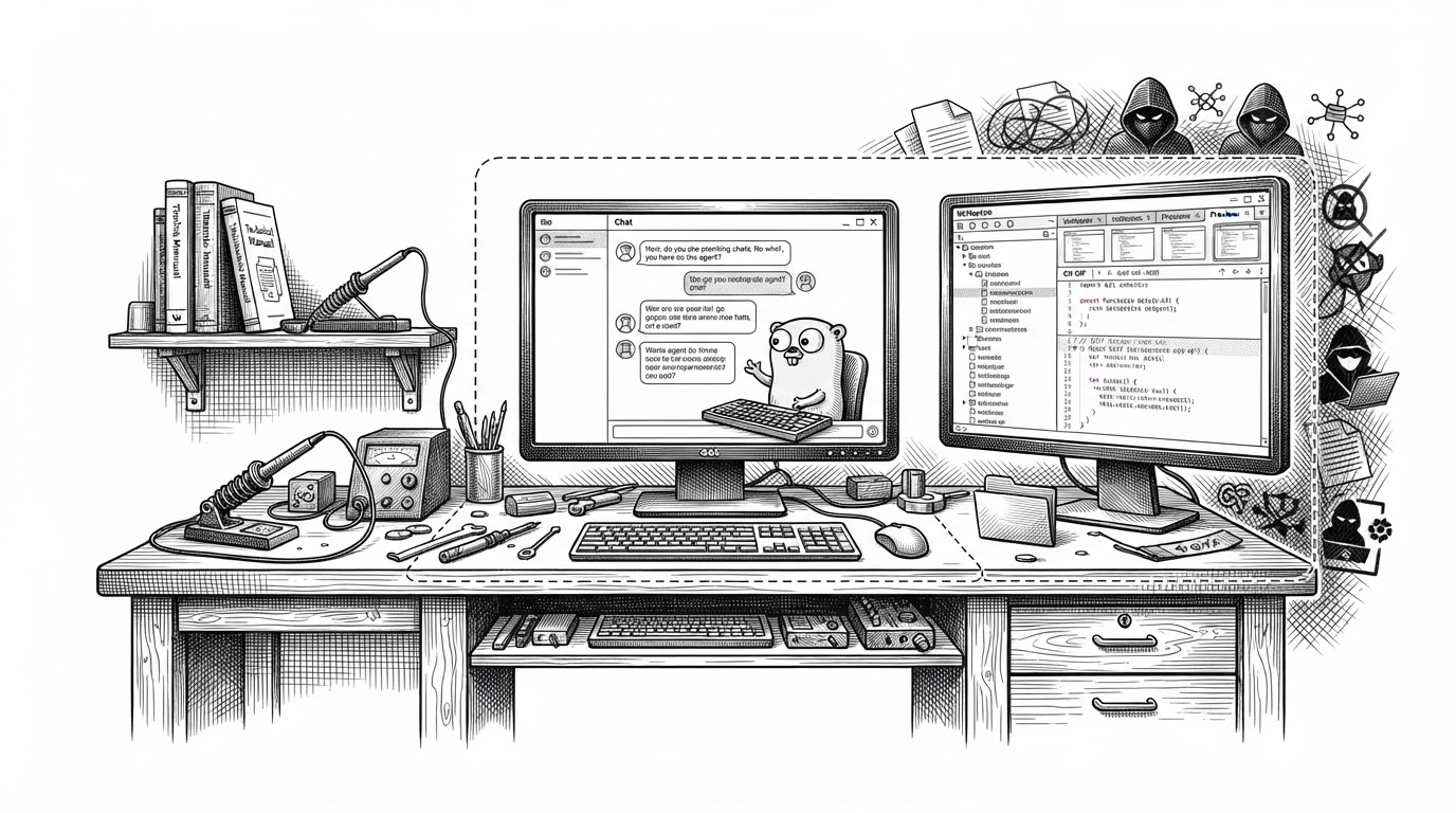
- dsh-web-ui matters because it turns a local LLM session into a workspace with files, Git state, previews, and tasks instead of a single chat surface.
- Its main technical idea is restraint: the agent gets access, but workspace scoping, loopback-only access, and symlink-safe path resolution keep that access bounded.
- The UI is agent-aware as well as human-facing, which makes the interface part of the model loop rather than just chrome around it.
- Compared with minimalist DSH interfaces and terminal-first tools, this project bets on a visual, persistent, operationally rich environment.
The chat box is no longer the product
Most AI interfaces still treat chat as the center of gravity. `dsh-web-ui` moves the center to the workspace itself. The agent can see a file tree, inspect diffs, browse previews, and keep track of tasks while the conversation stays available as one pane among several.
Plugin and skin collection for DeepSeek Harness (DSH) Web UI - task board, git graph, right-side panel, remote mobile UI, pet, live token stats, and skin center.
That sounds cosmetic until you notice what it changes. The model is no longer asked to reason in a vacuum. It is surrounded by the same objects a developer would use in a real session: files, source control, previews, and state.
What dsh-web-ui adds to DeepSeek Harness
The repo is a plugin bundle, but the useful way to read it is as a set of work surfaces. The right-side panel is the headline feature. Around it sit the file explorer, preview tabs, a source-control view, task tracking, mobile remote control, skins, and token telemetry.
| Surface | What it does | Why it matters |
|---|---|---|
| Right-side panel | Holds explorer, previews, and SCM in one workspace | Keeps the agent’s tools visible without burying the chat |
| File tree and previews | Lets the user inspect code, Markdown, HTML, PDFs, and Office files | Makes the session feel like a real project browser, not a message log |
| Git graph and SCM | Shows branch and change state inside the UI | Turns source control into a first-class part of the loop |
| Task board | Tracks agent work as discrete items | Shifts the interface from conversation to execution |
| Mobile remote control | Pairs a phone for session control and new actions | Extends the workspace beyond the desktop without changing the model |
| Skin center | Lets users swap visual themes | Signals that this is meant to be lived in, not merely used |
The important distinction is that these are not isolated widgets. They are coordinated surfaces around a single project boundary. That makes the UI feel less like an app and more like a cockpit.
The real trick is the trust fence
This is where the repo becomes more interesting than a typical AI skin. The file system logic is not just about convenience. It is built to keep the agent inside the project root, even when symlinks or local services try to make the boundary fuzzy.
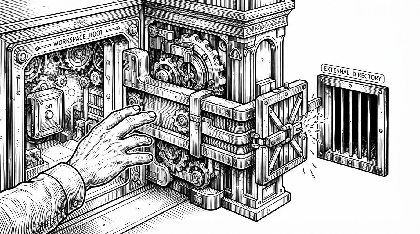
The repo’s host-side code treats this as an operational problem, not an abstract security posture. There is workspace scoping, loopback-only access for local trust, and symlink-safe resolution using realpath ancestry checks. That combination is what makes file access feel usable instead of reckless.
How the UI stays responsive under real work
The client side is built to keep the interface light even while the workspace is noisy. Instead of leaning on a heavyweight state library, it uses a custom external store that fits React’s `useSyncExternalStore` pattern. That is a small design choice with a big consequence: the UI can stay in sync without turning into a state-management project.
// Simplified from the store pattern
interface StateHandle<S> {
  getSnapshot(): S
  subscribe(listener: () => void): () => void
}

// React can read from the store without owning it
const snapshot = useSyncExternalStore(
  store.subscribe,
  store.getSnapshot,
  store.getSnapshot
)

// Panel widths are clamped so chat never collapses
const MIN_CHAT_PANEL_PX = 360
The same discipline shows up in the layout logic. Explorer width and preview width are clamped in order, so resizing one pane does not quietly break another. The central chat area has a floor, which means the interface can absorb complexity without becoming unusable.
This is not flashy engineering. It is the kind that keeps a workspace from feeling brittle after the first real session.
Why this feels different from other AI UIs
Compared with the official DSH web UI, `dsh-web-ui` adds more operational surface area and more personality. Compared with sidebar-first plugins, it goes further by integrating task surfaces, skins, telemetry, and mobile control into the same system. Compared with terminal-first tools, it gives up some austerity in exchange for a clearer visual model of what the agent is doing.
| Product | Interaction model | Workspace model | Security posture | Best fit |
|---|---|---|---|---|
| dsh-web-ui | Chat plus panels | Persistent visual workspace | Explicit trust fence and root scoping | Users who want a guarded AI IDE |
| Official DSH Web UI | Minimal chat-first UI | Lightweight shell around the agent | Basic harness defaults | Users who want simplicity |
| Sidebar-oriented plugins | Primary chat with side tools | Partial workspace extension | Usually narrower in scope | Users who want incremental upgrades |
| Terminal-first agent tools | Keyboard-first command loop | Filesystem-centered terminal flow | Depends on shell and local discipline | Power users who prefer text and speed |
That difference is philosophical. `dsh-web-ui` does not aim to be the cleanest interface in the category. It aims to be the one that can hold up when the agent is doing real work inside a real project.
A plugin ecosystem with a personality
The repo also treats customization as part of the product, not an afterthought. Skins, live token stats, and remote pairing make the environment feel inhabited. Even the playful parts matter, because they tell you the maintainers are designing for repeated use, not a one-off demo.
That is why the project lands as more than a UI bundle. It is a product thesis about agent work: make the workspace legible, make the boundary firm, and let the rest of the interface stay modular.