Synent-Technology-Task6-Superstore-Data-Visualization: How K-Means Turns Mall Shoppers Into Marketing Segments
A compact Python notebook uses income, spending score, scaling, and the elbow method to expose the most valuable customer group: people who can spend but do not.
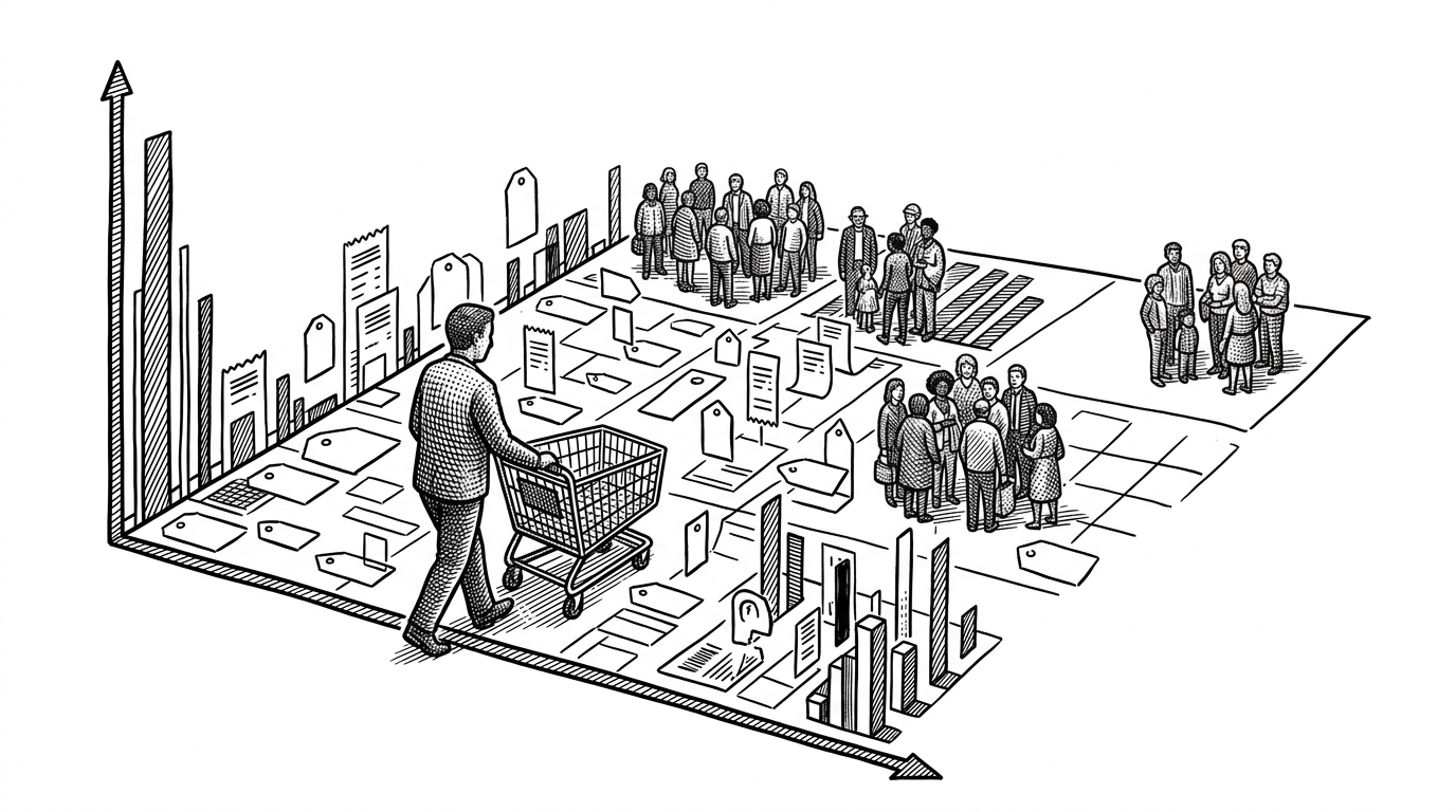
- The notebook’s strongest idea is not clustering for its own sake, but finding a high-income group that spends too little.
- By using income and spending score instead of age or gender, the project favors behavior over identity.
- StandardScaler is the quiet step that makes K-Means believable, because distance only works when the axes are comparable.
- The repo is a clean proof of concept that turns a simple dataset into a usable retail segmentation story.
The customers who can spend, but do not
The sharpest signal in this notebook is not the obvious premium buyer. It is the cluster with high income and low spending. That is the group with room to grow, which makes it more interesting than a generic best-customer segment.
That is also why this repo works as a business story. It does not just draw dots. It finds a monetization gap hiding inside a mall dataset and gives marketing a place to start.
Why this repo ignores age and gender
The dataset includes age and gender, but the notebook chooses not to lead with them. That is the important editorial decision here. For retail segmentation, identity can be less useful than behavior, especially when the real question is who spends, not who someone is.
The notebook is built around a narrow feature set on purpose. By selecting only income and spending score, it keeps the model focused on the relationship that actually matters for retail action.
How the notebook builds the clusters
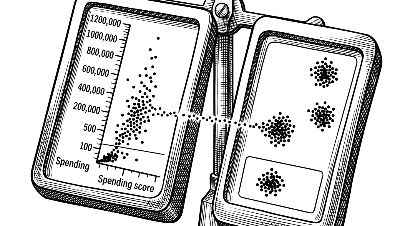
The pipeline is straightforward. The notebook loads the mall customer CSV, isolates the two behavioral features, and applies StandardScaler before running K-Means. That scaling step matters because K-Means uses distance, and raw income would otherwise overpower spending score.
From there, the elbow method helps choose K = 5 by looking for the point where adding more clusters stops paying off. It is a simple selection rule, but it keeps the segmentation from becoming arbitrary.
| Demographic segmentation | Behavioral segmentation |
|---|---|
| Starts with age, gender, and broad assumptions | Starts with income and spending score |
| Depends on manual persona guesses | Depends on measured cluster structure |
| Can be easy to explain but hard to act on | Directly supports targeting and merchandising |
| Often stays static | Changes when customer behavior changes |
| Useful as context | Useful as a segmentation engine |
What scaling fixes
Without normalization, the model would treat income as the louder signal simply because its numeric range is larger. With scaling, the geometry changes, and K-Means can separate groups based on the actual relationship between both features.
That is the hidden technical win in the repo. The clusters look meaningful only because the notebook makes the two axes comparable before asking the algorithm to group them.
What the five clusters actually mean
The notebook turns the chart into business language. Premium shoppers are high income and high spending. Impulsive shoppers spend heavily despite lower income. The most important group is the potential customer cluster: high income, low spending, a clear target for conversion work.
| Cluster meaning | Business reading |
|---|---|
| Premium | Already valuable and engaged |
| Impulsive | High spend, lower income, worth understanding |
| Potential | Can spend more than they currently do |
| Careful | Moderate income and measured spend |
| Standard | Baseline customers with average behavior |
That translation is why the notebook feels useful instead of academic. It does not stop at cluster labels. It suggests where a marketing team might focus budget, offers, or retention efforts.
Why this is a proof of concept, not a product
This repo is strong because it stays small. It is a notebook-led project with a single CSV, a focused pipeline, and a clear outcome. That makes it ideal as an educational artifact and as a demonstration of analytical judgment.
A production version would need more than a static file and a few plots. It would need stronger data ingestion, repeatable refreshes, validation, and a way to track whether those clusters still predict behavior after the dataset changes.
Even so, the core idea is durable. If a team can turn raw customer behavior into segments that reveal missed revenue, the notebook has already done its job.