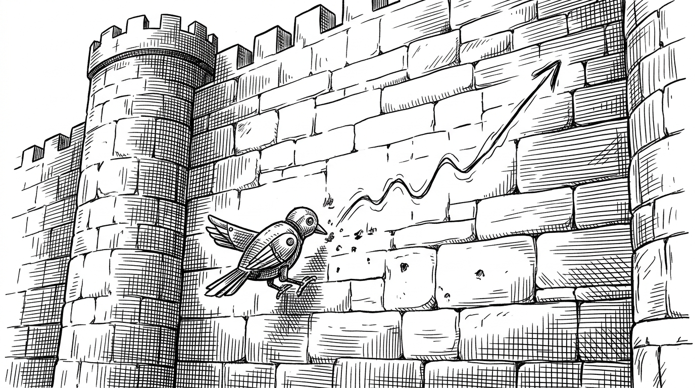
handy-todo: Handy To-Do: The macOS Checklist That Disappears Into the Menu Bar
A tiny Swift 6 app that uses AppKit, SwiftUI, and careful state handling to feel native, keyboard-first, and almost impossible to notice.
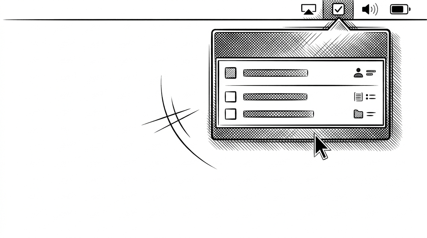
- Handy To-Do treats restraint as a feature, using macOS conventions to make a checklist feel like a system utility instead of another windowed app.
- Its core engineering is all about behavior, from accessory activation to a keyboard-focusable panel and event monitors that make dismissal feel native.
- The app leans on AppKit where precision matters, especially for panel control and text editing, while SwiftUI handles the rest of the surface area.
- Persistence stays deliberately small, which keeps the app useful without turning it into a heavyweight productivity platform.
The App That Refuses to Look Like an App
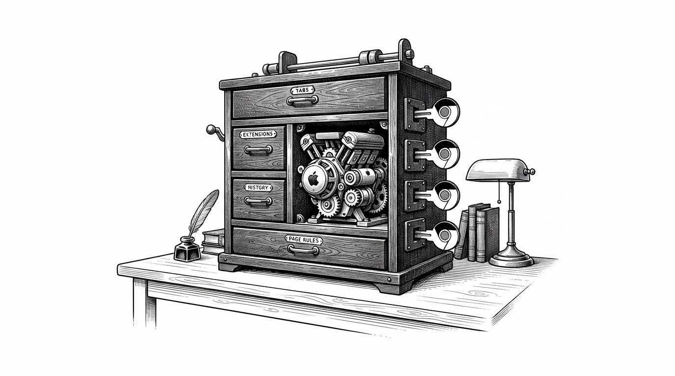
Handy To-Do is interesting because it spends so much effort on seeming effortless. It lives in the Menu Bar, stays out of the Dock, and opens only when you need it. That makes it less like a traditional task manager and more like a native macOS utility with a memory for your list.
That is a hard trick to pull off. A normal windowed app can be minimal, but it still feels like a guest. Handy To-Do is trying to feel like part of the house.
Fast Todos is a minimal task manager for developers. Three statuses, priorities, and full keyboard navigation. No extra features.
Why .accessory and a Custom NSPanel Matter
The repo’s first important choice is not visual, it is behavioral. Setting the app to .accessory keeps it out of the Dock and the app switcher, which immediately changes how it feels in use. It becomes a utility you summon, not a destination you visit.
The other key piece is a custom NSPanel. Standard borderless panels are not a great fit when you want keyboard input to feel immediate and native. Handy To-Do solves that with a keyboard-focusable panel, which is exactly the sort of AppKit detail SwiftUI alone tends to hide rather than expose.
NSApp.setActivationPolicy(.accessory)

final class KeyablePanel: NSPanel {
    override var canBecomeKey: Bool { true }
    override var canBecomeMain: Bool { true }
}
The Hidden Plumbing: Event Monitors and Panel Geometry
The app’s most convincing trick is that it behaves like it always knew where it belonged. It calculates panel position relative to the status item, so the checklist opens under the icon instead of roughly near it. That tiny bit of geometry is what keeps the interface from feeling bolted on.
It also listens for the right kinds of interruptions. Local event monitors handle shortcut behavior inside the app, while global monitors watch for clicks elsewhere so the panel can dismiss itself. That is the sort of polish users notice only when it is missing.
let localMonitor = NSEvent.addLocalMonitorForEvents(matching: [.keyDown, .flagsChanged]) { event in
    // Handle shortcut behavior inside the panel
    return event
}

let globalMonitor = NSEvent.addGlobalMonitorForEvents(matching: [.leftMouseDown]) { _ in
    // Dismiss when the user clicks outside
    closePanel()
}
That combination is why the app feels native instead of merely minimal. It does not just open a window. It behaves like macOS expects a transient surface to behave.
Why SwiftUI Stops Short Here
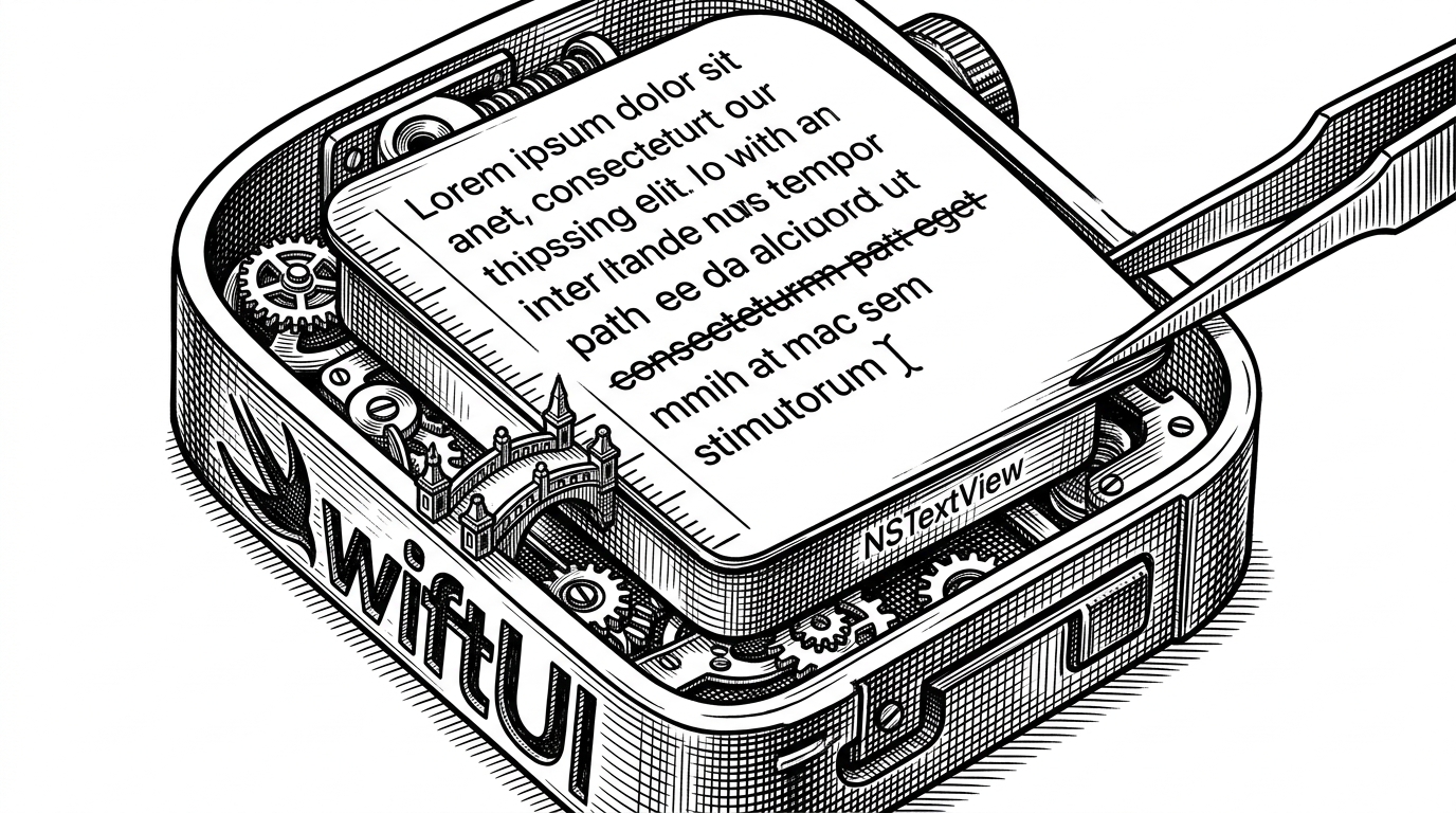
The UI bridge is the other place where the code shows restraint. Instead of forcing everything through SwiftUI, the app wraps NSTextView where the platform details matter most. That gives it precise control over typing behavior, line height, and editing feel.
This is not an anti-SwiftUI argument. It is a reminder that macOS still rewards using the best layer for the job. SwiftUI gives the structure, AppKit supplies the sharp edges.
| Approach | What it buys | What it costs |
|---|---|---|
| SwiftUI-only text input | Fast to build, easy to read | Less control over native macOS editing details |
| NSTextView bridge | Precise keyboard and layout behavior | More code, more platform knowledge |
| Handy To-Do’s hybrid | A simple interface with native-feeling editing | A little AppKit complexity up front |
That trade-off is visible in the editor experience. The app is not trying to be fancy. It is trying to be exact.
Persistence Without Ceremony
The data layer follows the same philosophy. The store is observable, changes are persisted with a simple didSet path, and the list is serialized with JSONEncoder into UserDefaults. No database schema. No migration story. No infrastructure tax.
For a small checklist, that is exactly right. The app needs enough memory to stay useful, not enough machinery to become another project to maintain.
@Observable
final class ChecklistStore {
    var items: [ChecklistItem] = [] {
        didSet { persistItems() }
    }

    private func persistItems() {
        let data = try? JSONEncoder().encode(items)
        UserDefaults.standard.set(data, forKey: "items")
    }
}
A Small App With a Strong Distribution Mindset
The repository also reads like something meant to be shipped, not just admired. The presence of build scripts and DMG packaging says the developer is thinking beyond a local run. That matters, because utility apps win or lose on distribution as much as on code quality.
The project’s shape reinforces that. A small source tree, clear separation between store, view, and lifecycle code, and just enough automation to get a packaged app out the door. That is a mature stance for a compact tool.
| Category | Handy To-Do | Heavier todo apps |
|---|---|---|
| Launch surface | Menu Bar utility | Full windowed app |
| Interaction model | Keyboard-first, transient | Persistent, dashboard-like |
| State storage | UserDefaults plus JSON | Database or cloud sync |
| Maintenance burden | Low | Higher |
| Best use case | Quick capture and lightweight tracking | Large-scale planning and team coordination |
That comparison is the real story. Handy To-Do is not trying to out-feature a project manager. It is trying to disappear so task capture becomes frictionless.
What Handy To-Do Gets Right
The project works because it treats platform conventions as a design language. Menu Bar placement, accessory activation, a keyboard-friendly panel, and AppKit bridges are not embellishments. They are the product.
That is the useful lesson here. If you want a macOS utility to feel native, do less everywhere except the parts that control presence, focus, and dismissal. Handy To-Do spends its complexity budget exactly there.