CinematicOnboardingView-SwiftUI: How Plain SwiftUI Becomes a Premium Motion System
A deep look at the layered onboarding stack, the frame-sequence animation trick, and the state-driven choreography that makes a simple iOS flow feel expensive.
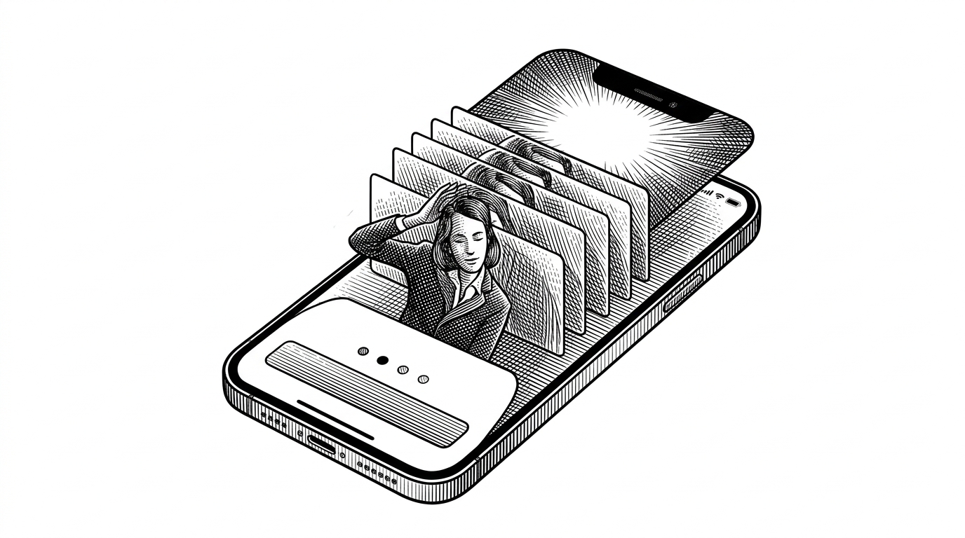
- The repo treats onboarding as a proof of polish, not a tutorial.
- Its cinematic feel comes from layered SwiftUI staging, not heavier animation infrastructure.
- Separating logical step state from visual animation state keeps the flow smooth.
- Frame sequences let teams ship premium motion while staying inside native SwiftUI.
The onboarding screen that looks more expensive than it is
This repo is not trying to teach users everything up front. It is trying to make the first swipe feel intentional. That matters because onboarding is where a product earns permission to be taken seriously.
On a utility or AI app, the opening screen is a promise. If the motion feels polished, the whole product feels more trustworthy. If it feels generic, the rest of the experience has to fight uphill.
Why this repo exists at all
The repository is built by Adam Lyttle and stays inside native SwiftUI, with no external animation stack to install or maintain. That choice is the point. It keeps the flow portable, inspectable, and easy to ship, and the example integration uses `.fullScreenCover` so the onboarding feels self-contained.
It is aimed at apps that want a cinematic identity on first launch, especially consumer products where taste is part of the value proposition. Think AI apps, premium utilities, and any flow where a standard page-turner would understate the brand.
The stage is the architecture
The screen is built like a stage set. A `ZStack` holds the background header, the animated subject layer, and the foreground copy and progress UI. Each layer can move differently, which is how the view gains depth without leaving SwiftUI.
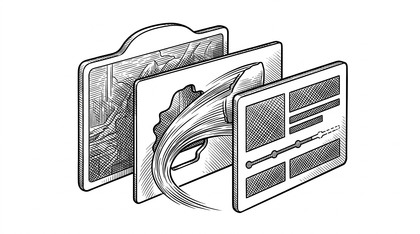
That separation is more than aesthetic. It lets the background stay calm while the foreground changes, so the transition reads as composed rather than as a hard swap.
The clever part: two clocks, not one
The real trick is that the repo tracks logical progress and visual progress separately. One state variable decides which step the user is on. Another animates the presentation so the UI does not jump when the content changes.
That split is what makes the motion feel cinematic. The screen can advance immediately, while the visuals settle into place on their own timing.
Why frame sequences beat video here
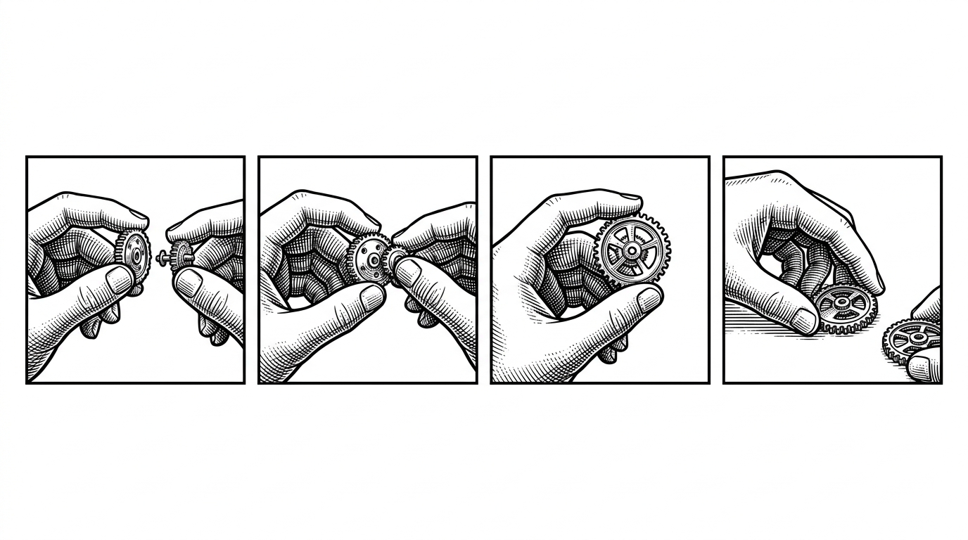
The motion is driven by image sequences rather than one long video file. That gives the template precise control over timing and composition, while keeping the animation native to SwiftUI.
Frame sequences are also easier to tune. If a product team wants to swap one pose, one accent, or one beat of motion, they change a frame, not a timeline.
| Approach | Runtime weight | Motion control | Editing flexibility | Best fit |
|---|---|---|---|---|
| Native `TabView` paging | Very light | High for navigation, low for mood | Simple page content, limited art direction | Standard walkthroughs |
| Video onboarding | Heavier assets | Strong if well produced | Edit the whole file to change one beat | Short branded intros |
| Frame-sequence SwiftUI | Light and native | Strong, because each frame stays composable | Swap individual frames or timings | Premium onboarding with motion control |
| Lottie-style animation | Moderate, adds a runtime | Strong for design-led motion | Easy if the motion already lives in design tools | Teams already committed to Lottie |
What it gives you that TabView does not
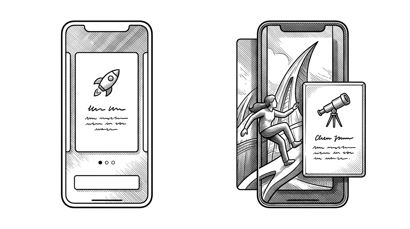
`TabView` with page style is the obvious baseline. It handles paging cleanly, but it rarely feels authored. You get structure without the sense that the whole screen has been art-directed.
This repo is for teams that want the onboarding itself to carry brand weight. The payoff is not just animation. It is a first impression that feels more like product design than boilerplate.
Who should use this template
Use it when the first 30 seconds matter more than the last five minutes. It fits apps that sell trust, taste, or premium utility, and it benefits teams that are willing to treat onboarding as part of the product, not a wrapper around it.
- Consumer apps that need a premium launch moment.
- AI products that have to look credible fast.
- Teams that want native SwiftUI, not another animation runtime.
- Products with enough design support to make the motion feel intentional.
Skip it if the job is plain explanation, minimal chrome, or the fastest possible setup. This template is strongest when it can make a brand feel more finished than the rest of the market.