Paywall-PurchaseView-SwiftUI: The SwiftUI paywall that turns friction into a feature
A compact subscription screen that choreographs attention, delays dismissal, and leaves the real billing logic up to you.
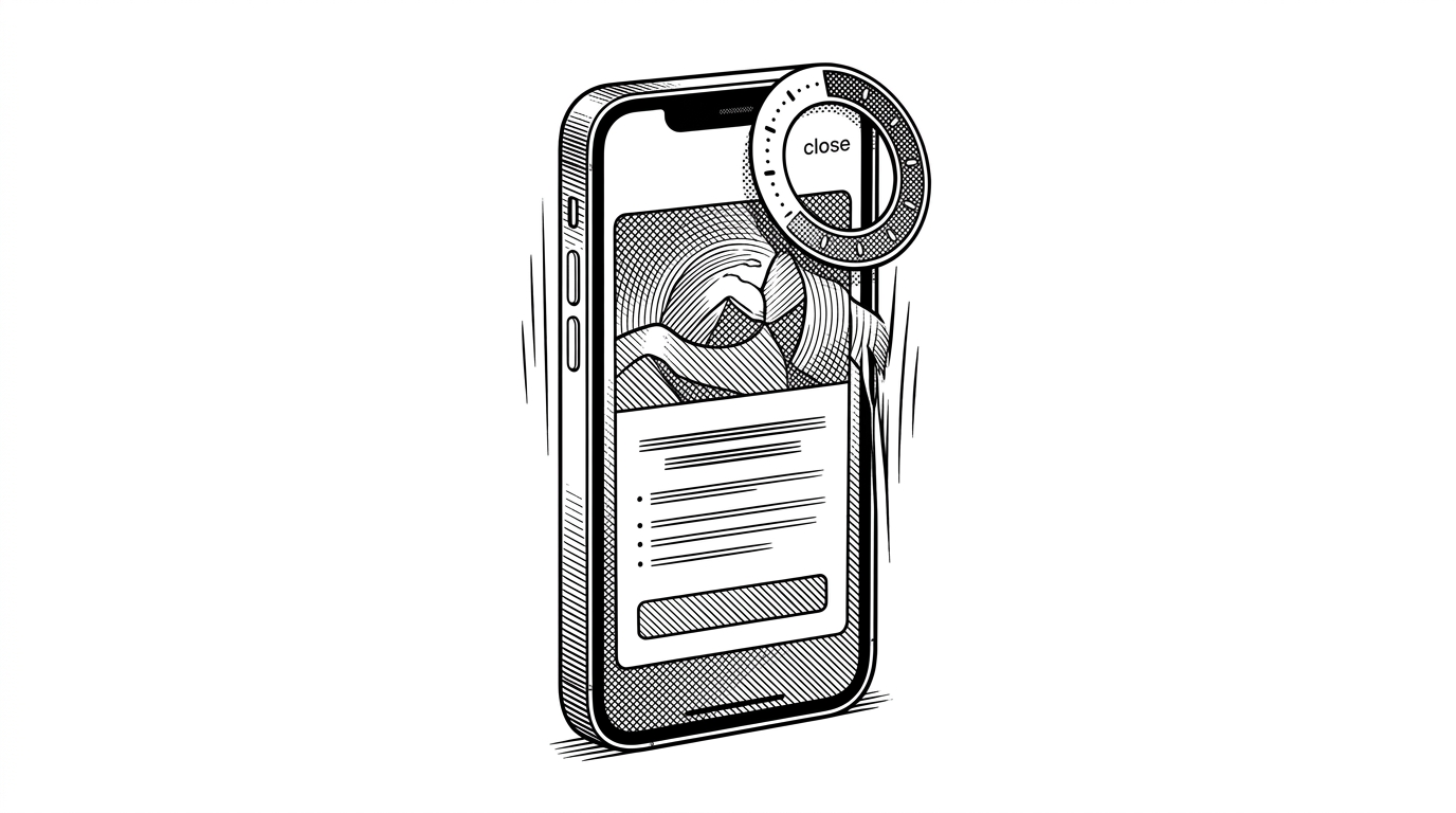

PurchaseView is a SwiftUI view for implementing a premium access purchase screen in your iOS app. This screen offers a user-friendly way to present subscription options, handle purchase transactions, and restore purchases.
- This repo treats a paywall as a timed sequence, not a static screen.
- Its real contribution is the split between polished SwiftUI presentation and intentionally thin purchase plumbing.
- The cooldown timer and savings badge are persuasion mechanics, not decorative extras.
- It sits between Apple StoreKit Views and RevenueCat by prioritizing control over infrastructure.
A paywall that hides its close button for a few seconds can read as manipulation. In this repo, that friction is the point. Paywall-PurchaseView-SwiftUI turns a subscription screen into a timed sequence, so the offer lands before the user can vanish.
The paywall that makes you wait
That matters because monetization UI is rarely won by layout alone. It is won by pacing, by deciding when to explain value, when to show savings, and when to let the user exit. This project makes that logic visible instead of hiding it inside a giant SDK.
Why a tiny paywall repo exists at all
The audience here is not a team that wants a full monetization platform on day one. It is the indie developer, or the small product team, that wants a polished paywall without committing to a heavy backend contract. The repo lives in the gap between Apple-native simplicity and platform-level subscription infrastructure.
Adam Lyttle's broader open-source work follows the same instinct. Build a reusable piece, keep it small, and leave room for the app owner to own the last mile. That makes this repo feel less like a product and more like a strong opinion about where the boundaries should be.
The sale is choreographed, not just designed
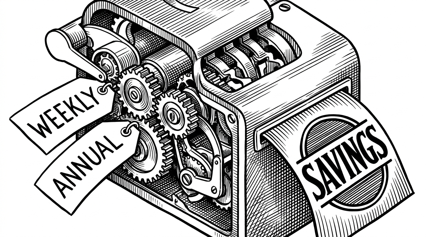
The interesting move is not just the offer itself. The hero image shakes, the annual plan is framed as the smarter choice, and the savings badge is derived from the underlying prices rather than pasted on top. Together, those pieces make the screen feel like a conversion sequence instead of a static card.
Viewed this way, the repo is not really about animation. It is about sequencing attention. The screen reveals value first, withholds dismissal second, and leaves the billing mechanics to the app developer's own implementation.
Inside PurchaseView and PurchaseModel
The architecture is lean. PurchaseView owns presentation, animation, and the cooldown logic that delays dismissal. PurchaseModel is the bridge for subscription state, product fetching, and purchase actions, while the concrete billing wiring is left open for StoreKit 2 or a service like RevenueCat.
That split matters because it keeps the repo honest about what it is. It is a UI-first template, not a full monetization backend. The upside is control and portability. The trade-off is that the app team still has to supply the real transaction logic and entitlement handling.
How it compares to StoreKit Views and RevenueCat
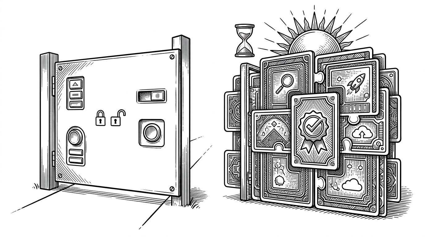
The most useful way to place this repo is by fit. Apple's StoreKit Views win on native simplicity. RevenueCat wins on infrastructure and subscription management. This project wins when you want to own the front end, tune the timing, and avoid importing a bigger system than the problem requires.
| Dimension | Paywall-PurchaseView-SwiftUI | StoreKit Views | RevenueCat Paywalls | Hand-built paywall UI |
|---|---|---|---|---|
| Customization | High. You control layout, timing, and feature framing. | Low to medium. Native and opinionated. | Medium. Configurable, but inside a platform. | Highest, but every detail is yours to build. |
| Backend required | Yes, but the repo keeps that layer thin. | Not necessarily beyond StoreKit. | Yes, RevenueCat handles the heavy lifting. | Yes, entirely your responsibility. |
| Native feel | Strong, because it is SwiftUI-first. | Strongest by definition. | Strong, though platform-specific. | Depends on the team's design skill. |
| Time to integrate | Fast if you already know SwiftUI. | Fastest for a basic paywall. | Fast for full subscription infrastructure. | Slowest, because everything is custom. |
| Dismissal control | Explicitly controlled by the cooldown logic. | Limited by Apple's pattern. | Usually configurable, but platform-led. | Whatever you implement. |
| Best fit | Indie apps that want a persuasive front end and own the rest. | Apps that want the shortest path to a native paywall. | Teams that want paywalls plus subscription ops. | Teams with time, design bandwidth, and billing expertise. |
The table is the point. This repo is not trying to beat Apple's views on polish or RevenueCat on backend reach. It is trying to sit in the middle, where the UI can be sharp, the stack can stay small, and the product team can keep control of the moment that matters most.
The real lesson
The deeper idea here is that monetization UI is product strategy. A paywall is not only a checkout surface. It is a negotiation over attention, timing, and trust. This repo makes that negotiation explicit, which is why it feels more interesting than a generic subscription screen.
There is also a practical lesson in restraint. The repository hints at App Store review pressure, including a code comment about toning down the word "FREE." That is the reality layer underneath the polish. Good paywall design has to survive both user psychology and platform rules.