OnboardingView-Swift: The Tiny SwiftUI Library That Hides an App State Machine
A single-file component that looks like a polished iOS welcome screen, but actually gates first launch, persists state, and presents itself from inside the view tree.


A simple onboarding screen for SwiftUI that mimicks the iOS onboarding screen
- OnboardingView-Swift is really a tiny state machine disguised as a SwiftUI screen, because it owns launch timing, presentation, and persistence from inside the component.
- Its appeal comes from narrowing the problem to one native-feeling flow with almost no setup, not from offering a broad onboarding framework.
- The same simplicity that makes it easy to drop in also limits it, especially when an app needs multiple onboarding variants or more complex state.
- This is the kind of micro-library that makes sense when polish matters more than configurability and the app only needs one clean first-run path.
The onboarding screen that quietly runs the app
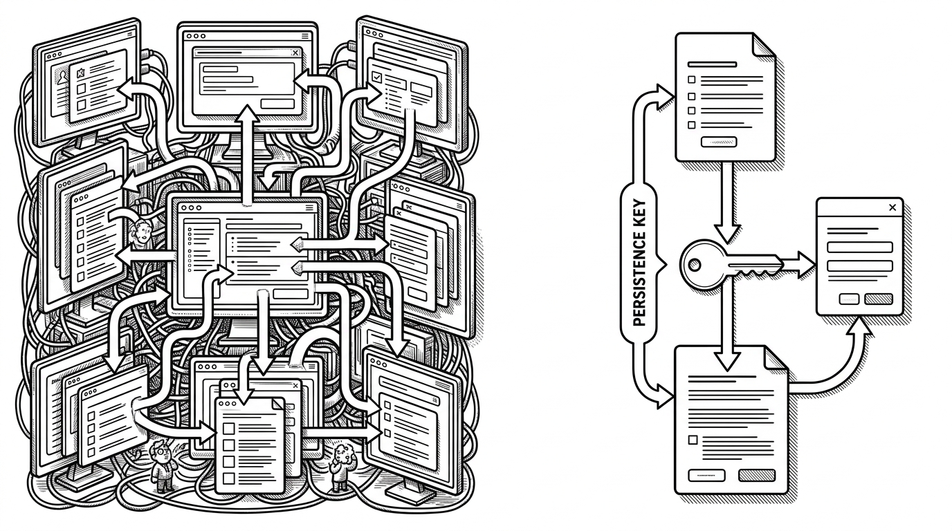
Most onboarding libraries start with slides. OnboardingView-Swift starts with absence. The component hides a trigger view, checks a single persistence flag, and decides whether the onboarding sheet should appear at all. That means the screen is not just content. It is also control flow.
struct OnboardingView: View {
    @State private var showingOnboarding = false

    var body: some View {
        VStack { }
            .hidden()
            .onAppear {
                if !UserDefaults.standard.bool(forKey: "OnboardingSeen") {
                    showingOnboarding = true
                }
            }
            .sheet(isPresented: $showingOnboarding) {
                OnboardingSheet()
            }
    }
}

Button("Continue") {
    UserDefaults.standard.set(true, forKey: "OnboardingSeen")
    showingOnboarding = false
}Why it feels like Apple built it
The UI is the easy part, but it is still doing important work. The layout leans on SF Symbols, generous spacing, large type, and simple feature rows, which makes it feel like a native system screen instead of a third-party package. That matters because trust follows familiarity.

That visual restraint is what makes the component feel expensive. There is no carousel, no tutorial maze, no extra settings page. It is one screen, one action, one job. The package gets out of the way and lets the app keep the center of gravity.
The charm, and the cost, of hardcoding simplicity
The trade-off is baked in. A fixed OnboardingSeen key is wonderfully simple, but it also assumes there is only one onboarding history that matters. If your app needs an initial welcome flow, a versioned "what's new" flow, and a feature-specific education path, this pattern starts to feel tight.
| Project | What it optimizes for | Flow model | Persistence | Best fit |
|---|---|---|---|---|
| OnboardingView-Swift | Zero-dependency drop-in simplicity | Hidden view triggers a sheet | Single UserDefaults key | One native-feeling first-run flow |
| OnBoardingKit | Apple-like presentation styles | Configured screens and styles | Structured state handling | Teams that want richer variants |
| OnboardingKit | Welcome and what's new slides | TabView-based multi-step flow | Helper-driven seen-state logic | Apps that need multiple screens |
Where it sits among heavier onboarding kits
This repo is not trying to out-configure larger onboarding packages. It is trying to win a narrower category: one native-looking screen, one persistence rule, one drop-in component. That is why it makes sense for indie apps and focused utilities, and less sense for products that treat onboarding as a full content system.
The comparison is not about which library is "better" in the abstract. It is about the shape of the problem. If you need choreography, branching, and reusable onboarding programs, the larger kits are more appropriate. If you need a polished welcome sheet that behaves like part of the app, this project is the cleaner answer.
A micro-library built from a real app
The origin story is practical, not theatrical. Adam Lyttle built a reusable SwiftUI component out of a real app pattern, then published it as a tiny library for other developers who want the same first-run experience without bringing in a heavier package. That kind of open source is useful because it comes from friction, not theory.
That line says almost everything. It is modest, specific, and honest about the goal. The code follows the same philosophy, which is why the project reads less like a framework and more like a polished extraction from a working app.