Compositor: The Native Mac Image Editor Built Like a Serious Tool, Not a Suite
A look inside the Swift, C, and SwiftUI architecture that powers a focused, non-destructive compositing workflow on macOS.
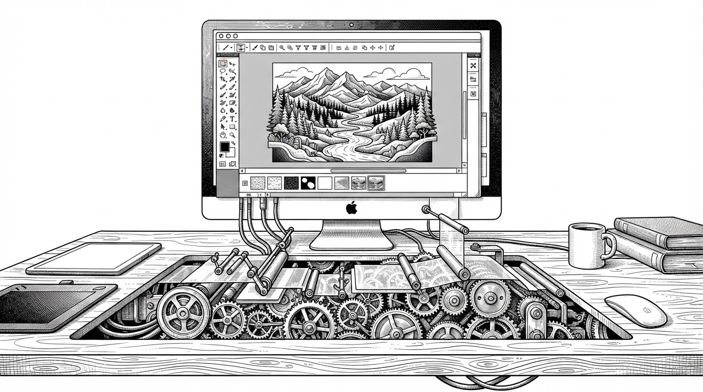
- Compositor is compelling because it treats narrow scope as a strength, not a limitation, and that focus shapes both the product and the code.
- Its architecture separates the native UI, document state, and pixel engine so the app can feel modern without giving up performance.
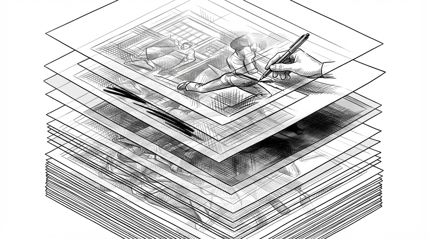
- The undo system is the hidden centerpiece because it reuses unchanged image buffers instead of behaving like a naive command log.
- Compositor competes best when judged as a focused compositing tool, not as a bloated all-purpose creative suite.
Compositor is not trying to be everything. It is trying to be the right kind of image editor for one job: compositing and non-destructive adjustments on a Mac, with enough polish that the app feels native rather than improvised.
Adobe Photoshop costs too much and tools like GIMP don't feel familiar enough for me to stay in flow. That's why I built Compositor. The goal was to create a full-featured image editor that is completely free and open source.
Why This Editor Exists
The pitch is simple: if you want a Photoshop-style workflow without the subscription tax, the UI friction, or the feeling that the app was bolted together from another platform, Compositor makes a case for a different path. It is narrow on purpose. That narrowness is the product strategy, not a missing feature list.
That matters because image editors tend to fail in one of two ways. They either chase every possible creative workflow and become unwieldy, or they stay small but feel amateur. Compositor aims for a third lane: a focused desktop tool with serious rendering and a familiar Mac feel.
The Unusual Stack: SwiftUI on Top, C Underneath
Compositor does not pretend one layer can do everything. The repo is split cleanly: the app shell and interaction layer live in SwiftUI, the document and state model act as the brain, and the rendering hot path drops down into lower-level pixel work where performance matters most.
struct ContentView: View {
    @Environment(EditorSession.self) private var session

    var body: some View {
        ZStack {
            EditorCanvas(document: session.document)
            if session.tool == .brush {
                BrushCursorOverlay()
            }
        }
    }
}
That shape is more important than the syntax. SwiftUI handles orchestration, the document model owns truth, and the rendering layer owns speed. In a pro app, those responsibilities should not blur together.
| Approach | What it stores | Memory behavior | Failure mode |
|---|---|---|---|
| Naive command log | A list of user actions | Cheap at first, but can require expensive replay | History becomes fragile when actions are hard to reverse |
| Full document copy | A complete image state for each step | Simple to reason about, but quickly bloats | Undo depth gets expensive as files get larger |
| Compositor snapshot history | Document snapshots with shared CGImage buffers | Retains only the changed pixel data when possible | Requires careful identity tracking, but stays efficient |
The trick is identity. If a layer has not changed, Compositor does not need to invent new pixels just to say that history moved forward. It can reuse what already exists. That is why the undo stack feels like a product feature instead of a memory tax.
Non-Destructive Editing Without the Usual Drag
The app keeps original image data intact while applying transforms and adjustments at render time. That means moving, scaling, or tuning a layer does not destroy the source pixels. You get immediate visual feedback, but the underlying document stays editable.
This is where the architecture pays off in user experience. A move handle or levels control may look lightweight in the UI, but behind it is a disciplined rendering strategy that keeps the edit reversible and the canvas truthful.
Technical takeaway: adjustments are stored as metadata, then applied during rendering. That is the difference between a destructive filter chain and a document model that can still breathe.
Why the UI Feels Native Instead of Generic
The interface does not try to be invisible. It tries to be Mac-like in the ways that matter: tool headers, floating panels, unified toolbar behavior, and the kind of layout decisions that make a pro app feel lived in rather than ported in.
Because it's open source, you can download the Xcode project and add, remove, or modify any feature to fit your workflow.
That is the real difference between native and merely functional. Compositor uses macOS conventions to support serious work, not as decoration. The UI stays out of the way because the underlying model is already doing the hard part.
What It Beats, What It Doesn't
| Tool | Platform | Business model | Best fit | Where Compositor differs |
|---|---|---|---|---|
| Photoshop | macOS, Windows | Subscription | Broad professional imaging | Compositor is far narrower, smaller, and open source |
| GIMP | Cross-platform | Free and open source | Open-source image editing | Compositor feels more native and more aligned with Photoshop-style flow |
| Affinity Photo | macOS, Windows, iPad | One-time commercial purchase | Polished pro editing | Compositor is free, open source, and easier to modify |
| Pixelmator Pro | macOS | Commercial | Native Mac creative work | Compositor is open source and more explicitly compositing-first |
The honest read is that Compositor is not a suite, and it should not be judged like one. Its edge is focus. If your workflow lives in compositing, non-destructive transforms, and native Mac ergonomics, that focus starts to look like discipline rather than compromise.
The Bigger Lesson
Compositor is a reminder that serious software does not need to be sprawling software. A focused scope, a native shell, and a rendering architecture that respects the hot path can produce something that feels both modern and exacting.
That is the broader lesson here: the most credible alternative to a giant creative suite may be a smaller tool that knows exactly what it is for.