`my-girlfriend-jingtian-latex`: When a Personal Story Becomes a Reproducible Book
A XeLaTeX repository that turns private narrative into a print-ready artifact, with obsessive typography, bundled fonts, and the surreal authority of GitHub.
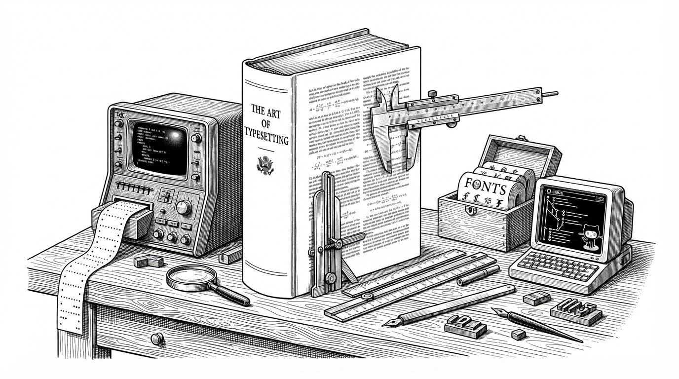
- This repo uses professional XeLaTeX craft to make a personal narrative feel permanent, inspectable, and serious.
- Bundled fonts, fixed geometry, and strict spacing are not cosmetic choices here. They are the mechanism that turns tone into authority.
- GitHub is not just the host. It is part of the work, because the repository format invites forks, translations, and commentary.
- The project’s most unusual move is to borrow the discipline of academic publishing for a story that is deeply personal and culturally volatile.
The strange power of a book that ships like code
At first glance, this looks like a narrow LaTeX project: one `main.tex`, a bundled font set, a cover PDF, and a compiled book. But the artifact is doing something stranger than typesetting. It turns a personal narrative into a buildable object, then publishes that object on GitHub as if it were software.
That shift matters. A story in a repo feels reproducible, inspectable, and forkable. The medium borrows authority from engineering, while the subject matter pushes in the opposite direction, toward gossip, confession, and performance.
I uploaded the XeLaTeX autobiography to GitHub and ignited the whole internet!
This is publishing, not just typesetting
The repo’s purpose is not to teach LaTeX basics. It is to produce a controlled literary artifact with a professional surface. That is why the repository matters as much as the PDF. It is a distribution system, a provenance trail, and a public performance space all at once.
The structure reinforces that point. The output is not hidden behind a packaging layer or a cloud editor. It sits next to the source, the fonts, and the cover. That keeps the process visible and makes the act of publishing feel like a technical release.
xelatex -interaction=nonstopmode -file-line-error main.texThe build is tuned like a print shop
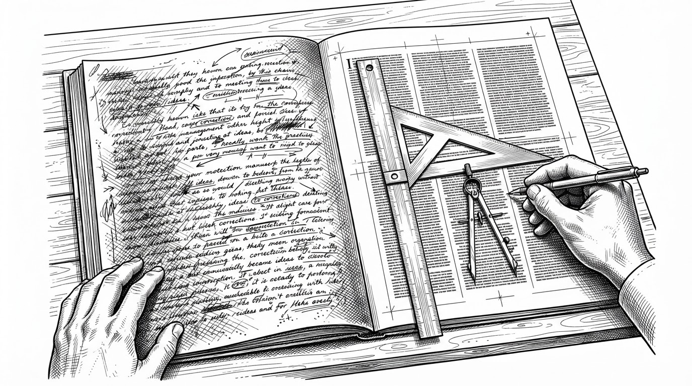
The technical heart is `main.tex`, and it reads like a miniature production system. `geometry` fixes the page to a 5x8 inch format. `fontspec` and `xeCJK` handle Unicode and Chinese text. The bundled Source Han fonts make the layout stable across machines.
The interesting part is how much editorial judgment is encoded in the preamble. Line spacing, widow and orphan penalties, paragraph wrappers, and narrative separators all shape the reading experience before a single sentence of the story appears on the page.
\usepackage{fontspec}
\usepackage{xeCJK}
\usepackage{geometry}
\geometry{paperwidth=5in,paperheight=8in,inner=0.5in,outer=0.5in}
\setstretch{1.3}
\clubpenalty=10000
\widowpenalty=10000
Those choices do more than make the PDF clean. They create a sense of inevitability. The page blocks, the rhythm, and the font pairing make the work feel settled rather than improvised.
Why the typography is the argument
This repo’s typography is unusually exact. The body size and leading are tuned with numerical care, and the Chinese text handling is not left to defaults. That level of control signals that the book is meant to read as formal literature, not a casual paste-in of prose.
There is also a cultural layer here. Chinese type, Western TeX tooling, and a GitHub repo all meet in one artifact. The result is not neutral. It says the story deserves the same production seriousness as a thesis, a technical manual, or a small press book.
We have the courage to say no to attempts to exploit an artiste's reputation for personal gain.
Why GitHub is the right stage for this performance
GitHub changes the meaning of the book. A PDF can be read, but a repository can be cloned, translated, annotated, and remixed. That makes the work social in a way a standalone document is not.
This is where the project becomes more than a private publication tool. The repo format invites community response, and the subject matter practically guarantees it. Forks become commentary. Pull requests become interpretation. The source tree becomes part of the narrative.
| Model | Purpose | Structure | Typography control | Distribution | Social meaning |
|---|---|---|---|---|---|
| Generic LaTeX template | Reusable formatting | Modular class and examples | Medium | Download and adapt | Utility-first |
| Academic thesis or technical book | Formal publication | Rigid sections and references | High | Institutional or institutional-like | Credentialing and authority |
| This repo | Personal narrative as artifact | Monolithic source with bundled assets | Very high | GitHub repo plus PDF | Performance, permanence, and public inspection |
What this repo borrows, and what it rejects
The project borrows discipline from academic publishing and technical documentation. It rejects their usual restraint. Instead of using format to hide the author, it uses format to amplify the authorial presence.
That is why the comparison with ordinary LaTeX projects only goes so far. Standard templates optimize for reuse. This repository optimizes for a single, highly specific reading experience, then makes that experience portable.
- It treats a narrative like a release artifact.
- It treats typography like an editorial argument.
- It treats the repository itself as part of the work.
The real takeaway
The lasting lesson is simple. Formatting is never neutral. A story set with this much discipline does not just look different. It reads differently, circulates differently, and feels harder to dismiss.
That is the repo’s core novelty. It uses the authority of professional typesetting to make a personal narrative feel permanent, formal, and publicly inspectable.