polaris-components: The Copy-Paste Layer Shopify App Developers Actually Need
A deep look at the repo that turns Polaris gaps into reusable patterns, and keeps its code samples synced by generating them from the source itself.
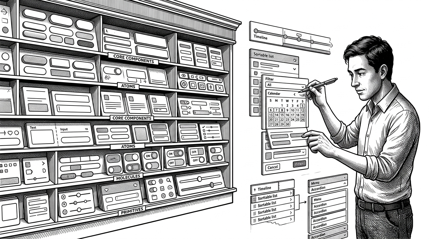
- polaris-components is not trying to be a general-purpose UI library, it is a portability layer for Shopify patterns that Polaris leaves unfinished.
- Its real advantage is trust, because the docs are generated from the actual source files instead of hand-maintained snippets.
- The repo makes copy-paste an asset rather than a compromise, which gives developers more freedom than an install-first package.
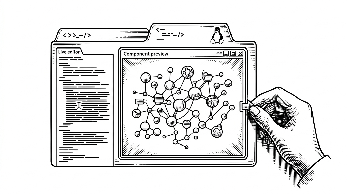
- The documentation viewer is part gallery, part lab, so developers can inspect, edit, and resize components before they copy them into production.
The missing layer above Polaris
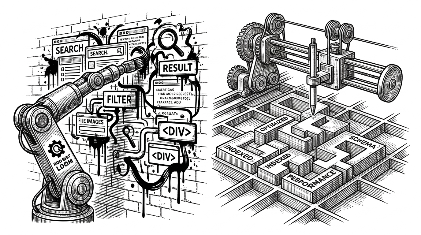
Polaris gives Shopify app developers a solid foundation, but foundations are not finished rooms. The everyday work is in the missing layer above the primitives: the date filters, accordions, timelines, sortable lists, and other composite patterns teams need when they build real apps.
That is where polaris-components lands. It does not compete with Polaris. It translates Polaris into the shapes developers actually ship, then makes those shapes easy to lift out of the repo and adapt.
Why copy-paste beats installation here
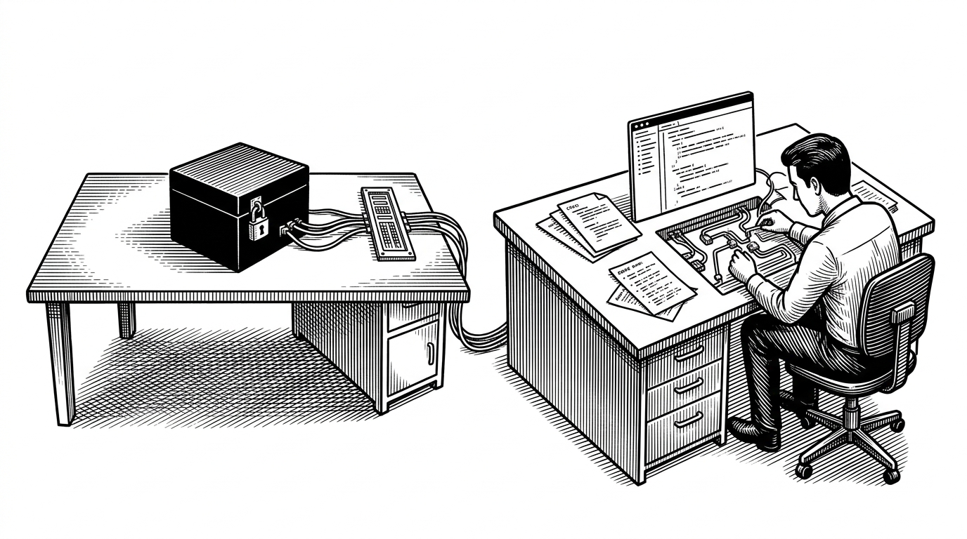
The repo’s thesis is simple: a raw component file is more useful than a black-box package when your job is to adapt patterns quickly. You can inspect it, fork it, trim it, and wire it into your app without waiting on a new release or negotiating with an API surface.
| Distribution model | What the developer gets | How customization works | Docs freshness | Best fit |
|---|---|---|---|---|
| Traditional UI package | An abstracted dependency | Changes happen through the package API | Often drifts from source | Teams that want stable abstraction |
| polaris-components | Copy-pasteable source files | Edit the implementation directly | Generated from source files | Shopify app teams that need editable patterns |
That tradeoff is the whole point. The repo values portability and transparency over centralized abstraction, which is why it feels closer to a pattern cookbook than a packaged library.
The secret sauce lives in generate-tabs.js
The project’s smartest move is not in the UI. It is in the build step. generate-tabs.js scans component folders, reads the actual source files, and emits tab data so the docs viewer always renders the real implementation instead of a stale copy.
// Conceptual flow inside generate-tabs.js
// 1. Read tabs.config.json for each component
// 2. Load the referenced source files
// 3. Emit tabs.ts with file contents as strings

for (const componentDir of componentDirs) {
  const config = readJSON(`${componentDir}/tabs.config.json`);
  const tabs = config.files.map((file) => ({
    label: file.label,
    code: readFile(`${componentDir}/${file.path}`),
  }));
  writeFile(`${componentDir}/tabs.ts`, serializeTabs(tabs));
}
The documentation viewer is a component laboratory
The dynamic route at pages/components/[component].tsx loads each component by slug, which keeps the site scalable and the bundle focused. Then RenderComponent.tsx adds the useful parts: variant switching, live editing, and browser resizing.
That makes the docs feel less like a catalog and more like a workbench. You are not just reading about a pattern. You are testing how it behaves before you copy it.
| Docs mode | What it does | Why it matters |
|---|---|---|
| Static example page | Shows a component once | Easy to publish, easy to drift |
| polaris-components viewer | Loads real source, supports edits, resizes, and variants | Lets developers inspect the pattern as it will behave in their app |
One pattern, many surfaces
Accordion is the clearest proof of the model. It is built as a copyable composite pattern using Polaris primitives, internal state, and minimal styling, so the implementation stays small enough to understand and flexible enough to reuse.
export function Accordion({ title, children }) {
  const [expanded, setExpanded] = useState(false);

  return (
    <Box>
      <InlineStack align="space-between" blockAlign="center">
        <Button onClick={() => setExpanded((v) => !v)}>{title}</Button>
      </InlineStack>
      <Collapsible open={expanded}>
        <Box paddingBlockStart="200">{children}</Box>
      </Collapsible>
    </Box>
  );
}
The code matters because it shows the philosophy in one glance. This is not a deeply abstracted API that hides the work. It is a practical pattern that exposes just enough structure for teams to move fast.
Why this matters for Shopify app developers
The target audience is narrow, and that is the strength. Shopify app teams care about consistency with Polaris, speed of implementation, and the freedom to reshape edge-case patterns without fighting a library boundary.
That is why the repo makes sense as a copy-paste layer instead of a package. It gives developers editable implementation, living documentation, and a narrower surface area than a generic UI kit would need to support.
| Polaris primitives | polaris-components |
|---|---|
| Buttons, forms, layout, and base tokens | Composite patterns like accordions, timelines, and sortable lists |
| Ideal when you want building blocks | Ideal when you want the missing room built already |
| API-first abstractions | Source-first implementation you can edit directly |
The result is not a competitor to Polaris. It is a practical companion for the places where official primitives stop and product work begins.