solid-glass: Solid Glass Gives AI Agents a Visual Grammar
Twelve components named after the thing agents actually do, shipped as one stylesheet over shadcn/ui.
- Solid Glass is a design system whose component list is its argument: twelve names that read like a transcript of an agent thinking.
- The material is not a framework or a package. It is one stylesheet that overrides shadcn/ui's variables, distributed as source you copy into your own tree.
- It is the only entry in its field where the material and the agent vocabulary are the product, not a runtime and not a generic primitive set.
- The specialization is also the cost: React 19, Tailwind 4, shadcn/ui, and Base UI, or nothing.
Twelve Names That Read Like a Transcript
Most design systems hand you the same nouns. Button. Card. Input. Dialog. Solid Glass hands you a different set entirely: status-glyph, turn-status, composer, tool-steps, diff-view, ask-card, context-ring, task-notice, reasoning, panel, tag, dot-loader. Read that list out loud and it sounds less like a component library and more like a transcript of an agent mid-task.
That is the interesting thing. The names are not decoration. They are a claim about what an AI interface is made of. A context-ring implies the model's context window is a thing you watch, the way a fuel gauge is a thing you watch. An ask-card implies that the moment an agent stops and needs a human decision is a first-class UI state, worthy of its own component the way "a user is logged in" once was. A diff-view implies the agent's output is a patch to be reviewed, not a message to be read. A reasoning component implies the thinking is part of the interface, not hidden behind it.
You can build all of this out of generic primitives. Teams do, badly, one product at a time, and every team rediscovers the same six surfaces. Solid Glass's bet is that those surfaces are reusable, and that naming them is the first step.
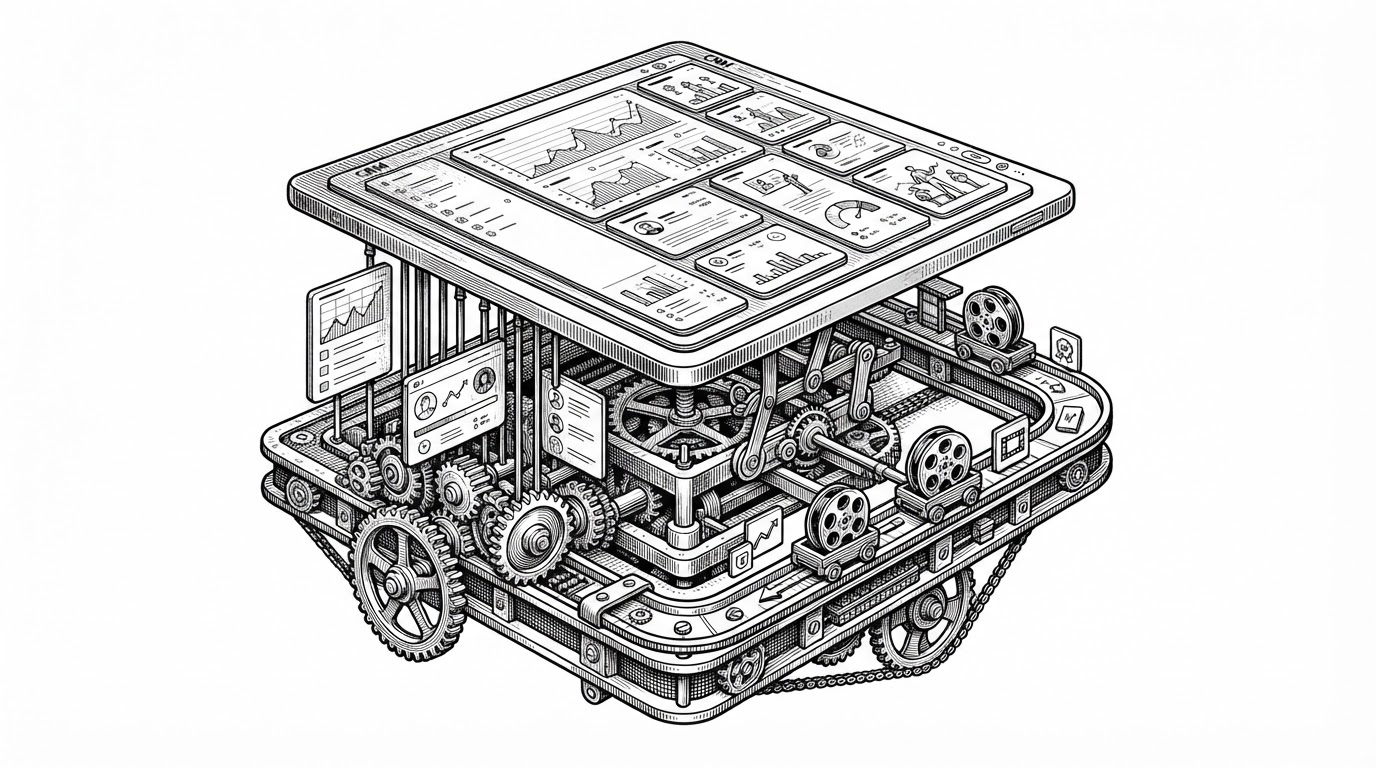
Designed for AI applications: thick, smoky panes with the weight of a solid surface and the clarity of glass.
Opaque and Clear at the Same Time
The name is a contradiction, and resolving it explains the whole design thesis. Flat design hides depth: it strips shadow and edge until surfaces read as paper. Liquid glass hides text: it makes the surface so transparent that the content behind it competes with the content on top of it. Both fail the same way when the screen is mostly words.
Solid Glass keeps only an outline. Fine borders, edge highlights, soft shadows. Enough material to read as glass, not so much that the text underneath fights the text on top. The README positions the project squarely "between flat design and liquid glass," and that phrasing is doing real work. It is not a compromise between two aesthetics. It is a claim that text-heavy AI surfaces need a third treatment, because the two existing ones were designed for chrome and photographs, not for paragraphs of reasoning.
This matters more for agent UIs than for ordinary apps. A chat product shows a message and a cursor. An agent product shows a status glyph next to a running tool, a context ring draining toward a limit, a diff waiting for approval, and a reasoning trace you can expand. That is a lot of small text in a lot of small containers. Any material that softens the container also softens the container's contents, and the contents are the product.
The Whole Material Is One File
Here is the part that surprises people who assume "design system" means "npm package." Solid Glass is not published as a library. package.json sets "private": true and "version": "0.1.0". Nobody is installing it as a dependency.
The material itself is a stylesheet, src/solid-glass.css, that defines shadcn/ui's variable names with a new visual treatment. The README calls it "the whole material in one file." The rest of the repository is documentation and showcase code: roughly 330 KB of MDX against about 57 KB of CSS. Most of the project is the explanation of a decision, not the decision itself.
/* The material is a set of variable overrides. */
:root {
  --background: /* the surface */;
  --foreground: /* the text on it */;
  --border:     /* the outline that does the work */;
  --ring:       /* the focus edge */;
  /* ...plus the rest of shadcn/ui's variable names */
}
You Do Not Install It. You Copy It In.
Solid Glass uses shadcn's registry model, and the model is the clever part. You do not add a dependency. You run a command and source files land in your own tree:
npx shadcn@latest add deeplethe/solid-glass/<name>The registry manifest lists thirteen items: the twelve agent components above, plus the stylesheet. Each one arrives as readable source you own, sitting next to your other components, editable in place. This is the opposite of the usual library relationship, where the code lives in node_modules and you configure it from outside. Here the code lives in your project and you change it directly.
For a material, that choice is not just philosophical. A theme is exactly the kind of thing every team ends up editing anyway, and copying it in makes the edit official instead of a patch on top of someone else's package. The trade is obvious too: you get no version bumps, no upstream fixes, and no single place to upgrade.
Where It Sits in the Field
The nearest neighbors split into two camps. Some give you generic primitives. Others give you a runtime plus a chat surface. Solid Glass is the only row where the material and the agent vocabulary are the product.
| Project | What it is | Install model | The agent surfaces |
|---|---|---|---|
| Solid Glass | A material plus an agent component registry | Source copied via the shadcn registry | Yes: status, turns, context, diffs, approval |
| shadcn/ui | Source-distributed primitives | Source copied | Generic only |
| assistant-ui | React chat and agent UI with integrations | Package | Chat-centric |
| Vercel AI Elements | AI interface components | Package | AI-ecosystem components |
| CopilotKit | Copilot and agent embedding framework | Package | Runtime plus UI |
Read the last column as the real dividing line. The package-based projects want to be the thing your app talks to. Solid Glass just wants to be the skin and the shelf, and it assumes you already have a runtime you like. That is a narrower pitch, and a more honest one.
What the Narrow Stack Costs You
Solid Glass is built for one stack: React 19, Tailwind CSS 4, shadcn/ui, and Base UI rather than Radix. If you are not on that stack, this is not for you, and no amount of visual appeal changes that. There is no Vue port, no plain-CSS build, no framework-agnostic package.
The project is also young. A third-party guide that covers it recommends that adopters independently evaluate accessibility and stability rather than taking either on faith, and that is the right posture. The commit history shows active work, including a fix to keep a light theme's first chart color readable and distinct from the second, but recent commits do not establish long-term maintenance. The right way to read a project like this is as a well-argued opinion with source attached, not as a settled dependency.
Which is, in the end, the most interesting thing about it. The component list is the argument. The stylesheet is the delivery. You either agree that agent work has its own vocabulary worth naming, or you keep reinventing ask-card in your own codebase, one product at a time.