`guizang-social-card-skill`: The AI Design System That Refuses to Wing It
A deep look at how this skill uses seed templates, layout recipes, and rendered-image validation to turn raw content into polished Xiaohongshu and WeChat graphics without letting the model freestyle.
- `guizang-social-card-skill` treats AI design as a constrained production pipeline, not a creative free-for-all.
- Its real breakthrough is the visual linter, which forces the rendered result to pass geometry checks instead of trusting prompt quality.
- The seed template matters more than the prompt because it locks in layout grammar, typography, and allowed structures before composition starts.
- By narrowing the aesthetic range to Swiss and Editorial, the repo produces more reliable platform-safe graphics than general-purpose image generation.
The smartest thing here is what it refuses to do. `guizang-social-card-skill` does not ask a model to invent a beautiful card from scratch. It hands the model a narrow visual corridor, then checks the output like production software. That is the real thesis: not AI art, but AI under discipline.
Create polished social card packages for Xiaohongshu/Rednote, WeChat Official Account, article covers, and platform thumbnails. This skill is self-contained. It borrows visual principles from the Guizang PPT style system, but it must not edit the original PPT skill, its templates, or its references.
Why social cards are harder than they look
Social graphics look trivial until you make them at scale. Every card has to solve typography, hierarchy, aspect ratio, image placement, and platform rules at once. Miss one constraint and the result feels cheap, cramped, or off-brand.
| Problem | Why it hurts | What the repo does |
|---|---|---|
| Layout density | Small cards break quickly when copy runs long | It forces content into predefined skeletons |
| Platform fit | Xiaohongshu and WeChat have different publishing shapes | It targets both output formats directly |
| Visual consistency | AI style drift makes every card feel unrelated | It limits style to Swiss and Editorial |
| Quality control | Good prompts still produce bad geometry | It validates rendered output before shipping |
The point is not that the work becomes automatic. The point is that the failure modes become predictable.
Inside the workflow: from brief to rendered PNG
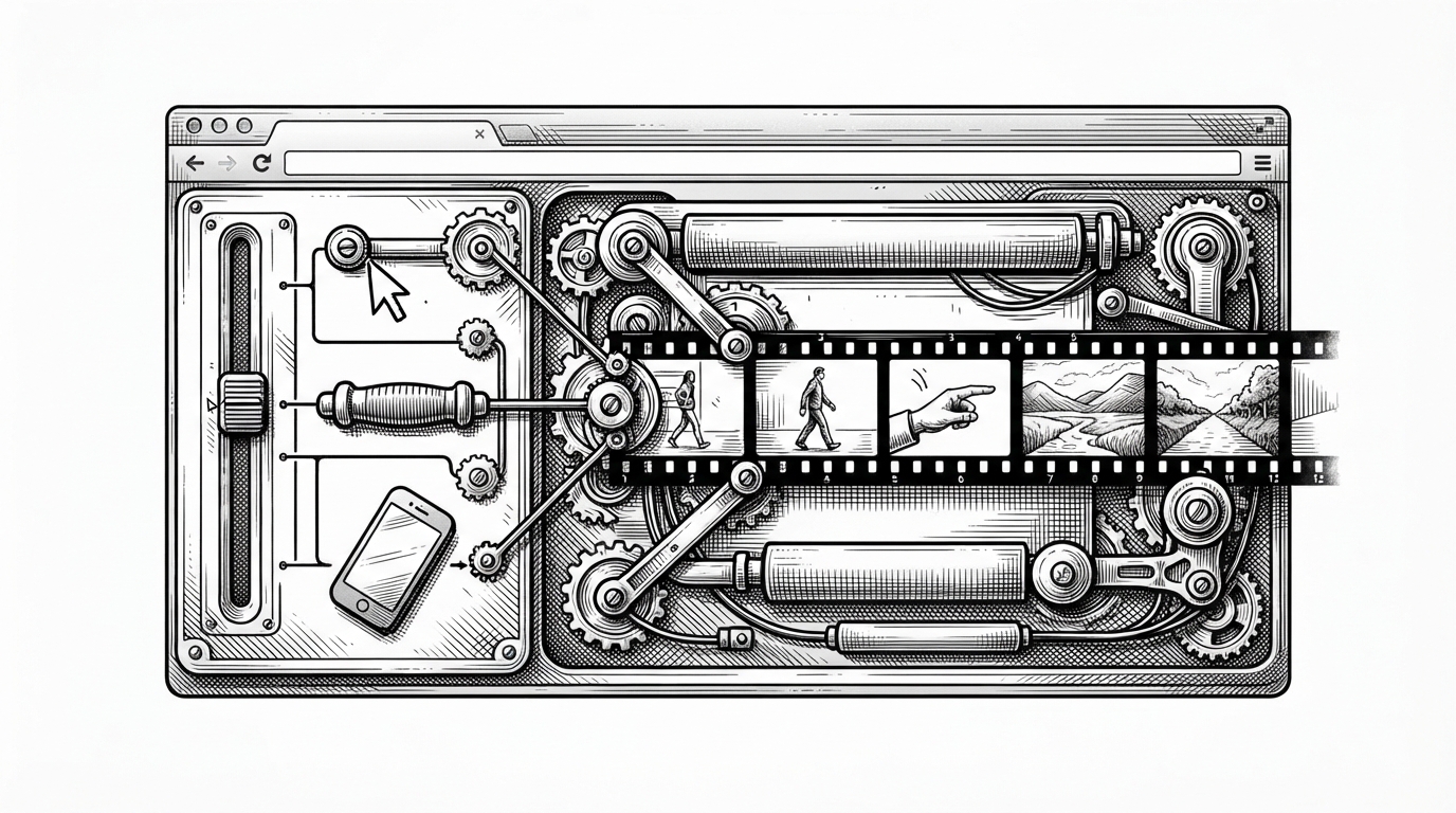
The repo’s workflow is a funnel. Raw content enters at the top. Style selection, layout choice, asset prep, composition, rendering, validation, and iteration remove degrees of freedom one by one until the only thing left is a compliant image.
That structure matters because the agent is not “drawing.” It is making structured decisions inside a fixed production chain. The final PNG is the last step, not the creative beginning.
The seed template is the real product
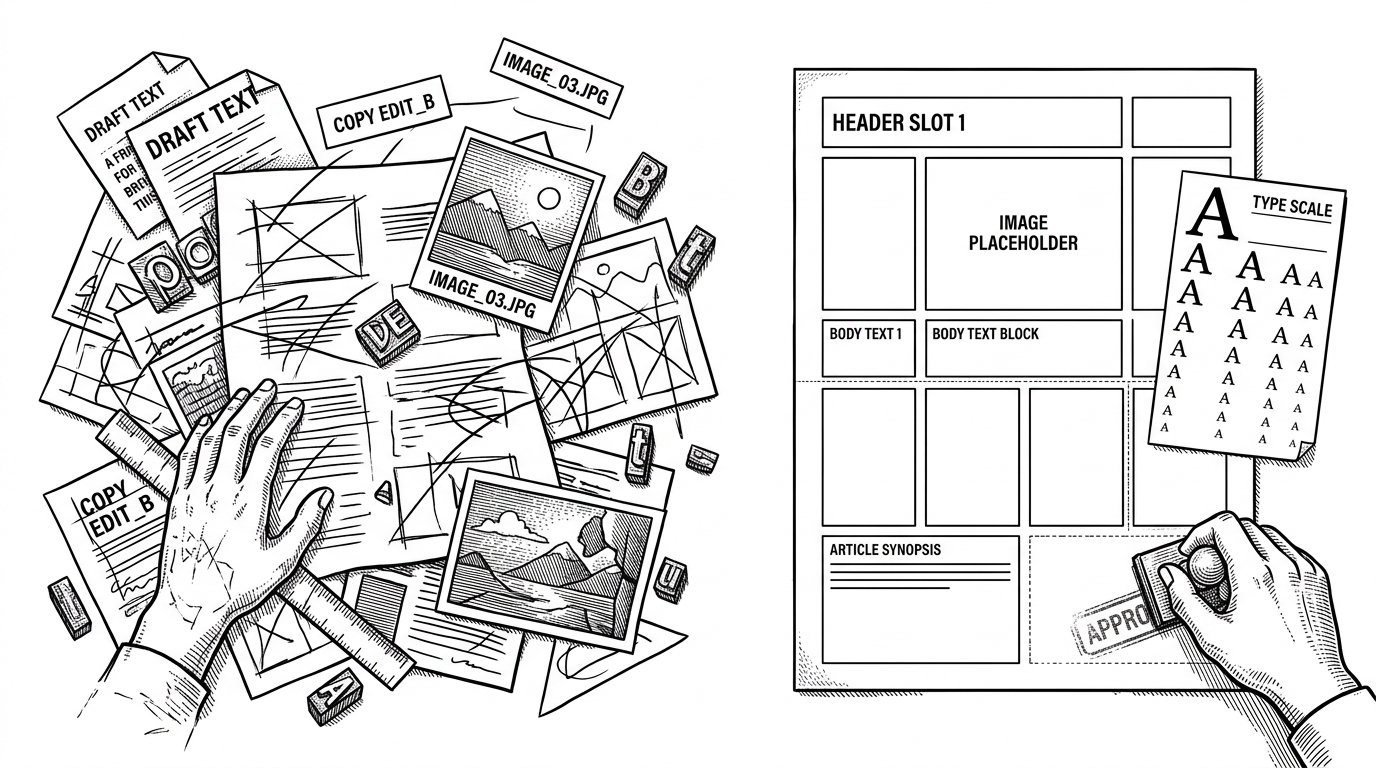
The most important design choice is the seed template pattern. Instead of letting the model write CSS from scratch, the repo starts from a known HTML shell and tells the agent to fill a predefined structure. That keeps the system inside a visual grammar the author already trusts.
<!-- POSTERS_HERE -->
<section class="card card--m01">
  <div class="hero-slot"></div>
  <div class="body-slot"></div>
  <div class="footer-slot"></div>
</section>

<!-- M01 to M16 skeletons define the allowed composition space -->
That sounds restrictive, and that is exactly why it works. The template carries the layout logic, the CSS variables, the type scale, and the class names. The model fills blanks. It does not invent the system.
Validation turns taste into rules
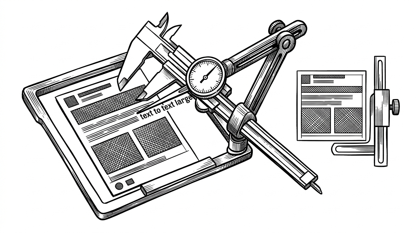
This is the section that changes the whole reading of the repo. `validate-social-deck.mjs` is not just a build script. It is a visual linter that checks the rendered result, then rejects outputs that fail geometry or sizing constraints. The system prefers a hard failure to a soft compromise.
| Approach | What it optimizes | Weakness | Why this repo differs |
|---|---|---|---|
| Shrink the text until it fits | Avoiding overflow at any cost | The card gets ugly fast | This repo treats the design rule as fixed |
| Trust the prompt | Creative flexibility | Bad geometry survives to the end | This repo validates the render, not the intention |
| Manual redesign | Human judgment | Slow and repetitive | This repo automates the repetitive decisions without loosening standards |
That is the anti-slop move. The system does not rescue weak output by shrinking the font or relaxing the frame. It sends the agent back to revise the content.
Why Swiss and Editorial are the only two styles that matter here
The repo’s aesthetic discipline is part of its technical strength. Swiss handles data-heavy, product-like content. Editorial handles narrative, lifestyle, and story-led cards. Together they cover most of the real publishing use cases without exploding the style surface area.
| Style | Best for | Visual grammar | Failure mode if overused |
|---|---|---|---|
| Swiss | Reviews, product notes, structured info | Grid-first, rigid hierarchy, clean spacing | Feels sterile if pushed into storytelling |
| Editorial | Essays, features, narrative covers | Magazine-like composition, richer image use | Can become decorative if asked to carry dense data |
A lot of AI design tools sell breadth. This repo wins by narrowing the aesthetic range until the output becomes dependable.
The platform-specific tricks are the real moat
The cleverness is not limited to layout. The repo bakes in practical content types, including travel maps, subject-aware overlays, and real photo sourcing. That turns the skill into something closer to a publishing operator than a generic image generator.
- Travel content can place routes and annotations onto a real map base.
- The system can keep text away from faces and other sensitive regions.
- Real photographs anchor the card in recognizable publishing conventions.
- Aspect ratios are chosen for Xiaohongshu and WeChat, not for abstract image beauty.
Those choices matter because they map directly to the way people actually publish. The repo is not trying to be everything. It is trying to be useful in the few places where social graphics repeat endlessly.
How it compares to Canva, Midjourney, and manual design
| Approach | Strength | Weakness | Best use case | Why this repo is different |
|---|---|---|---|---|
| Manual design tools | Full human control | Slow and repetitive | One-off polished assets | It automates the repetitive decisions |
| Direct AI image generation | Fast visual variety | Hard to constrain and validate | Concept art and exploration | It avoids pixel generation entirely |
| Generic agent prompting | Flexible prompting | Template drift and inconsistent output | Experimental workflows | It binds the model to a visual system |
| `guizang-social-card-skill` | Repeatable, platform-safe output | Less open-ended than freeform tools | High-frequency social publishing | It treats design as a constrained pipeline |
That middle position is the point. It is not trying to replace human taste. It is trying to make taste executable, inspectable, and repeatable.
What this repo suggests about the next design stack
The bigger lesson is simple. The next generation of design tools will not be based on unlimited generative freedom. They will be built from systems that can be filled, checked, and rerun. AI becomes the operator. The design system becomes the law.
`guizang-social-card-skill` is compelling because it shows how little freedom a good production system actually needs. Constraint is not the tax here. It is the product.