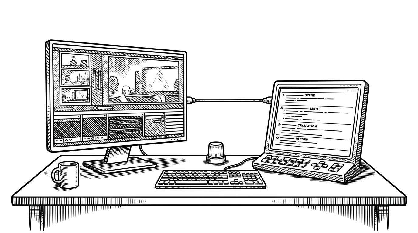
helloianneo/ian-xiaohei-illustrations Turns Abstract Ideas Into a Visual System
A Codex Skill that uses a recurring black character, low-tech metaphors, and strict style rules to generate consistent hand-drawn editorial art for Chinese technical writing.
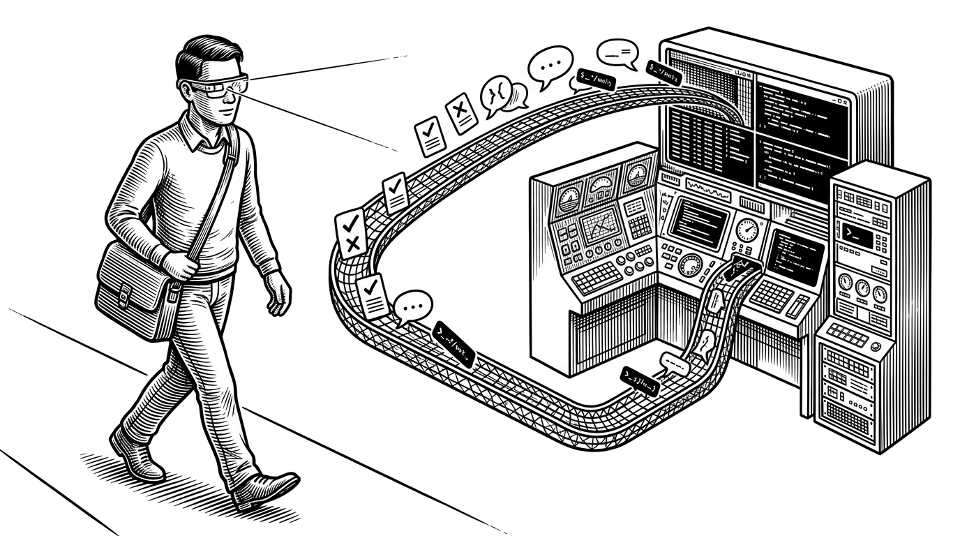
- This repo is less a prompt pack than a control system for visual metaphor, with each file enforcing a different layer of discipline.
- Its strongest idea is that a useful illustration should survive the removal of any decorative character and still communicate the concept.
- The low-tech aesthetic is not a limitation here, because boxes, pulleys, funnels, and bridges make abstract ideas easier to read at a glance.
- The project feels like infrastructure because it turns repeatable editorial art into a production workflow instead of a one-off image request.
A Visual Language, Not Just an Image Prompt
The repo’s real promise is not better-looking AI art. It is a more reliable way to turn prose into a recognizable editorial style. That matters if you publish technical writing, where the image has to clarify the argument instead of competing with it.
That is why the project leans on a recurring black character, low-tech physical metaphors, and hard constraints around composition. The result is not expressive freedom for its own sake. It is repeatability.
中文小黑怪诞正文配图生成 Skill | 16:9 白底手绘 | 少量红橙蓝批注 | Codex Skill
Why Low-Tech Wins
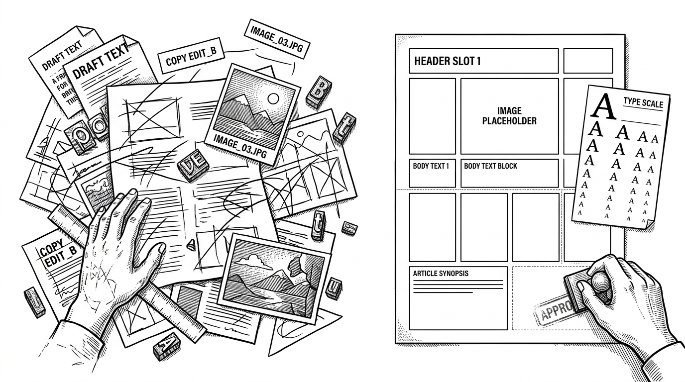
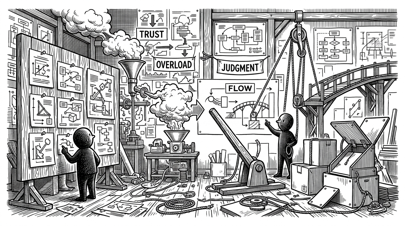
Most image prompts drift toward glossy interfaces, stock-product sheen, or decorative nonsense. This repo goes the other way. It forces the model to think in boxes, funnels, ropes, levers, and other objects that have obvious physical logic.
That matters because abstraction becomes legible when it behaves like something you can touch. A clogged funnel reads as information overload. A bridge reads as trust. A lever reads as a decision with mechanical consequences.
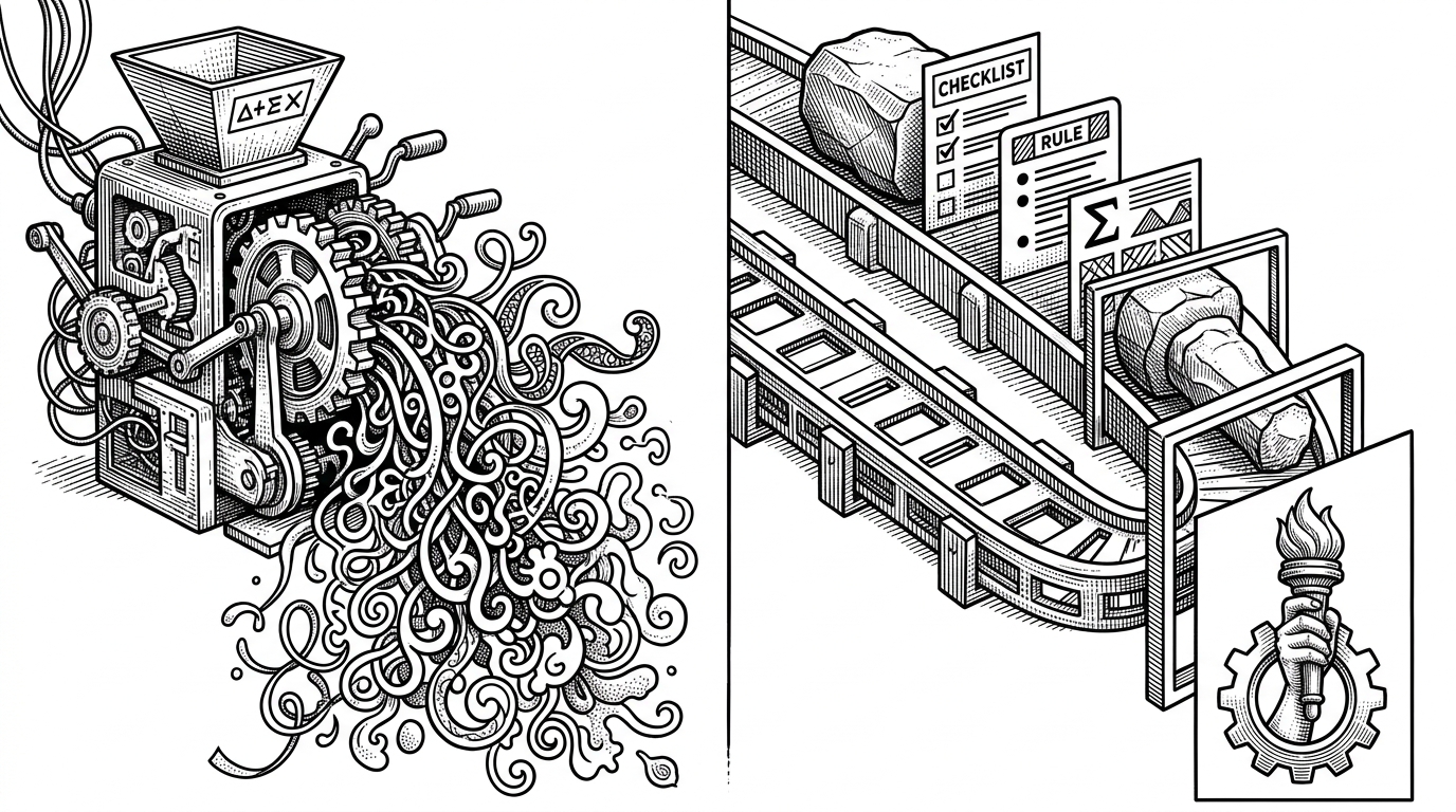
read more: the project’s value is not that it makes images. It is that it makes images easier to trust.
The Xiaohei Rule: If the Character Disappears, the Diagram Failed
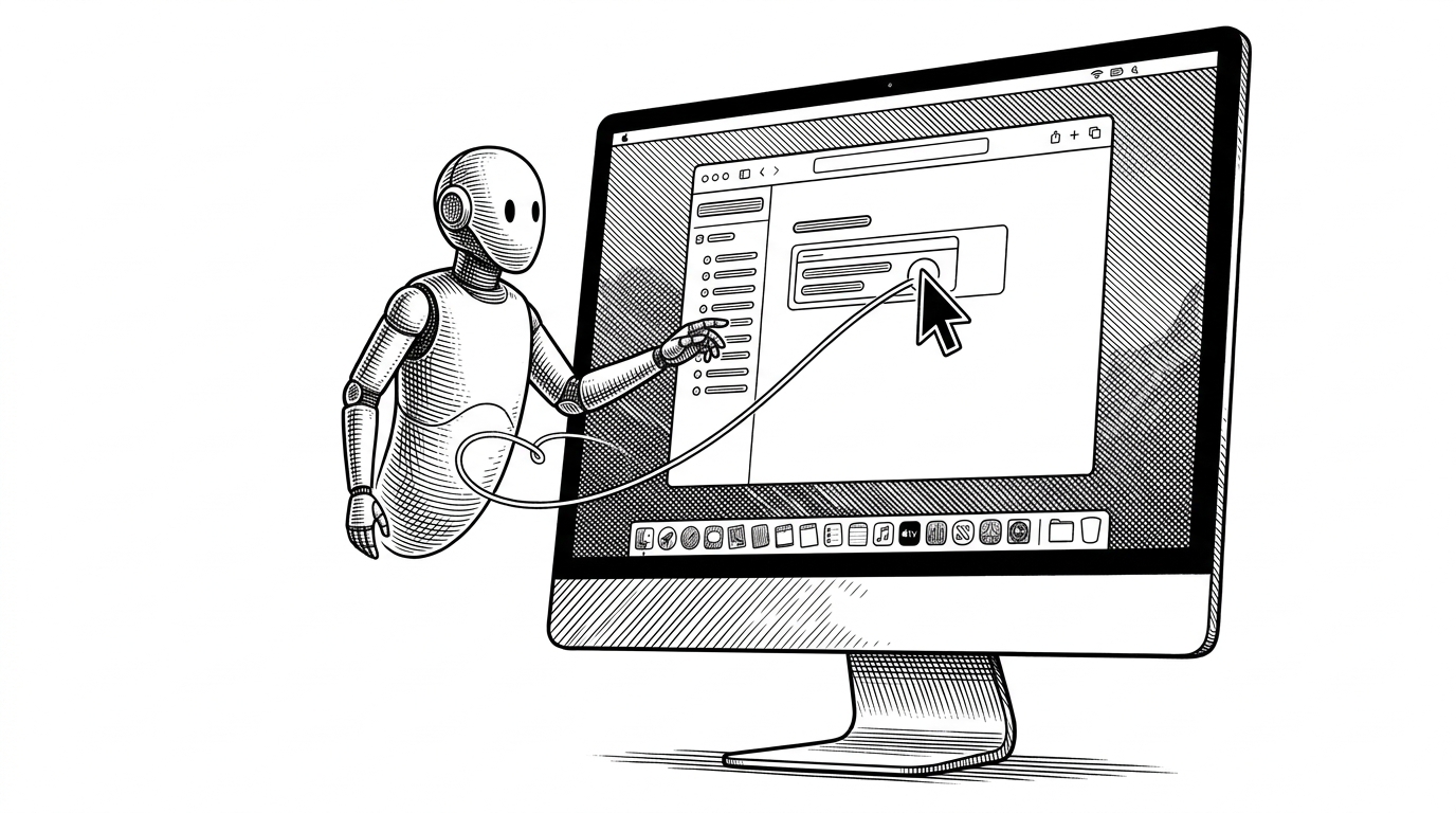
The most interesting design rule in the repo is also the simplest. The character is not decoration. The character has to do work inside the image. If you remove Xiaohei and the idea still lands, the composition is too weak.
That rule pushes the system away from mascot art and toward functional storytelling. Xiaohei becomes a participant in the metaphor, not a sticker on top of it.
Judgment Standard:
If you remove the character and the diagram still makes sense, the character is too decorative and the prompt failed.In practice, that means the character and the object need each other. Xiaohei is the agent that makes the metaphor feel enacted. The object is the thing that makes Xiaohei necessary.
How the Skill Is Modularized
The repo’s structure is what makes the system durable. Instead of one giant prompt, it splits labor across small files. `SKILL.md` orchestrates the workflow. Style reference files define the visual grammar. Character and composition notes keep the model from wandering.
That modularity matters because each layer can fail differently. One file can correct style drift. Another can correct narrative drift. Another can catch generic output before it escapes into the final image.
| Approach | Consistency | Setup effort | Style control | Reuse |
|---|---|---|---|---|
| General-purpose image generators | Low to medium | Low | Loose | Low |
| Manual illustration workflow | High | High | High | Medium |
| helloianneo/ian-xiaohei-illustrations | High | Medium | High | High |
The key advantage is not raw image quality. It is that the same visual language can be reused across articles without starting from scratch every time.
What It Beats, and What It Does Not
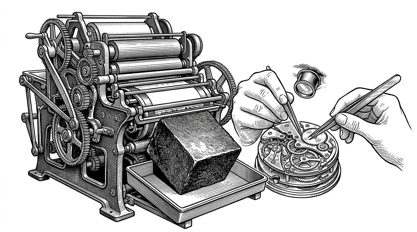
Compared with general-purpose generators, this repo gives up freedom in exchange for reliability. That is the trade-off. You are not asking the model to invent a fresh style every time. You are asking it to stay inside a narrow lane.
Compared with hand-drawn illustration workflows, it removes a lot of manual labor. But it also removes some nuance. This is a production system, not an illustrator replacement.
这个好有意思 可以给文章配图,而且不是那种千篇一律的PPT信息图。 Ian Xiaohei Illustrations专门给中文文章生成正文配图。风格很特别,纯白背景、黑色手绘线稿、少量红橙蓝中文手写批注,16:9横版。 https://t.co/CfXrqgBFAx https://t.co/JZeE4aj0cZ
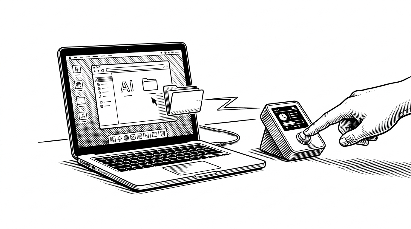
That is why the project feels useful rather than flashy. It solves a narrow but real problem: how to give long-form Chinese writing a stable visual identity without sinking time into bespoke art direction every time.
Why This Feels Like Infrastructure
The strongest signal here is not novelty. It is repeatability. The repo packages a creative judgment system into something another writer or agent can use again, which is exactly what infrastructure looks like when it is doing its job well.
That makes the project interesting beyond illustration. It is a small model for how AI tools will become more useful: not as open-ended generators, but as constrained production systems with opinions.