Hackcosmic10website: The Hackathon Landing Page That Behaves Like a Launch Sequence
A React and Tailwind v4 build that uses scroll-linked motion, masked space layers, and Figma-first component work to turn an event page into a miniature mission control experience.

- Hackcosmic10website sells the event through atmosphere and motion first, which makes the page feel larger than a standard hackathon flyer.
- Its depth effect works because background layers, foreground content, and the Earth horizon each obey different movement rules.
- Tailwind v4 and motion make the aesthetic tunable, so the cinematic feel stays editable instead of brittle.
- The repo reads like a Figma-first build where component structure serves the brand experience as much as the UI.
Most hackathon sites try to earn attention with more cards, more logos, and more copy. Hackcosmic10website goes the other way. It treats the page like a launch sequence, where motion and depth do the selling before the user reaches the registration details.
The page works because the background never stops being a stage
The core trick is simple, but the effect is not. The cosmic backdrop is not decorative wallpaper. It behaves like a fixed stage while the foreground content scrolls across it, which is why the page feels like you are moving through space instead of just down a webpage.
That is why the page feels cinematic instead of merely animated. The motion is not everywhere at once. It is assigned, with each layer moving at its own speed so the eye reads distance, mass, and perspective.
const { scrollYProgress } = useScroll({ target: heroRef });
const earthY = useTransform(scrollYProgress, [0, 1], [0, 140]);
const textY = useTransform(scrollYProgress, [0, 1], [0, -40]);

return (
  <section ref={heroRef}>
    <motion.div
      style={{
        y: earthY,
        maskImage: 'linear-gradient(to bottom, black 72%, transparent 100%)'
      }}
    />
    <motion.div style={{ y: textY }} />
  </section>
);
Why Tailwind v4 and motion are the right pairing here
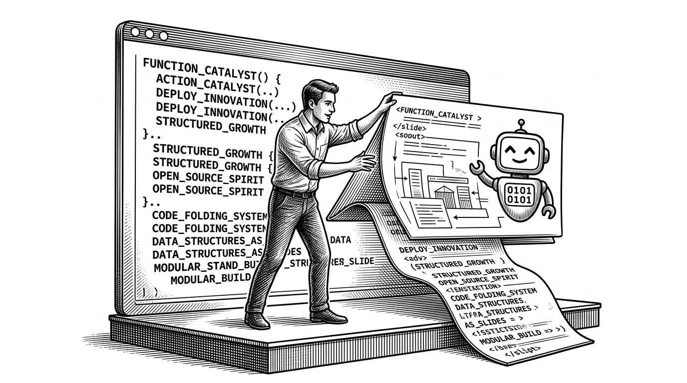
This repo's stack fits the visual ambition. Tailwind v4 gives the page a fast, themeable surface for spacing, color, and responsive structure. Motion handles the scroll-linked behavior in a declarative way, which matters when the design depends on tuning timing and distance rather than just toggling effects on and off.
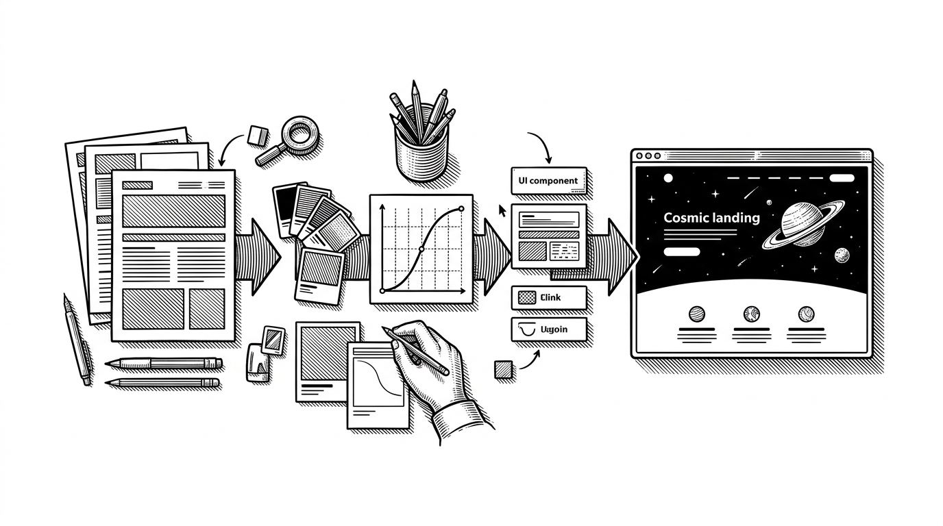
The component tree reinforces that point. The background elements live outside the main content flow, the navigation reacts to scroll state, and the hero section treats the Earth horizon like a masked layer rather than a static image. That is a clean way to build a page that wants the user to feel progression, not just read information.
A Figma-first workflow shows up everywhere
The repo reads like it came from a design system rather than a blank editor. The layout is tightly composed, the UI primitives are broad enough to suggest future surface area, and the visual polish is consistent enough that each section feels planned before it was coded. Even without seeing the original boards, the fidelity suggests a design-to-code mindset.
10x Hackathon Winner (Google GenAI,IIT B,IIT Delhi, BITS Goa) | OSS Contributor (5000+ GitHub) | LeetCode 2250| 4★ CodeChef |3x International Hackathon Winner|
That bio fits the project's tone. It is ambitious, competitive, and built for presentation. The page mirrors that energy by making the event feel consequential before the reader has even reached the schedule.
Compared with a normal hackathon landing page
| Dimension | Conventional hackathon page | Hackcosmic10website |
|---|---|---|
| Visual approach | Flat flyer with stacked sections and generic event icons | Layered launch sequence with a cosmic stage and depth cues |
| Motion model | Light hover states and a few decorative transitions | Scroll-linked parallax, masked seams, and moving foreground layers |
| Information hierarchy | Copy-first, details-first, utility-first | Atmosphere-first, then details |
| Emotional tone | Practical and promotional | Cinematic and aspirational |
| Build style | Simple section assembly | Componentized motion system with theme control |
| Memorability | Low after one scan | High because the page feels like branded media |
| Best use case | Basic event announcement | Events that need excitement, identity, and perceived scale |
That contrast is the real story. This repo is not trying to be the clearest possible flyer. It is trying to be the most compelling possible entry point, and it uses motion, composition, and layered control to get there without losing structure.