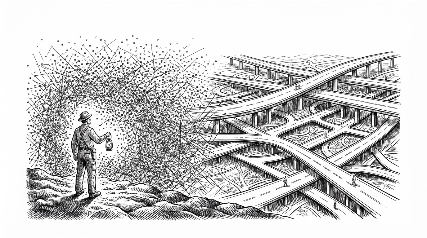
Signal_coverage_With_ML_Model: Signal Coverage Prediction System with ML Model: When a Heatmap Has to Respect the Earth
This project blends geocoding fallbacks, multi-resolution spatial grids, and Gaussian Process regression to turn sparse measurements into signal maps that know when they are guessing.
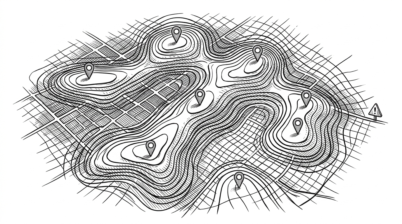
- The repo’s real contribution is not a heatmap, but a pipeline that tries to make spatial prediction honest about uncertainty.
- Its strongest idea is to treat geocoding, grid generation, and model choice as part of the same geographic problem.
- Gaussian Process regression gives the project a credible interpolation story, while the distance-based warning layer keeps it from pretending confidence it does not have.
- The codebase feels transitional, but the core math and product thinking point in the same direction: estimate coverage only where the data can support it.
A heatmap is only useful if it admits what it does not know
Most signal maps are persuasive for the wrong reason. They turn a few measurements into a smooth surface, then leave you to guess how much of that surface is real. This repo takes the harder route: it tries to predict coverage while still showing where the data is thin.
That is the interesting move here. The project is not just plotting signal strength. It is building a geographic estimate from sparse points, then layering in enough context that the map can say, in effect, this is my best guess, not a fact.
The repo’s real trick is spatial honesty
The code does not collapse the problem into a single score. It treats download, upload, latency, and signal strength as separate surfaces, which matters because each one can fail for different reasons. A strong radio signal does not guarantee good throughput, and the repo keeps that distinction intact.
That pipeline matters because the model is only one part of the story. If the city center is wrong, the grid is wrong. If the grid is naive, the surface is misleading. If the surface ignores distance to the nearest data, the user gets a clean lie instead of a useful estimate.
| Dimension | Generic signal dashboard | This repo |
|---|---|---|
| Input handling | Usually shows raw points or a single metric | Tracks download, upload, latency, and signal strength separately |
| Spatial realism | Often a flat or rectangular overlay | Uses distance-aware grids that respect geographic scale |
| Prediction method | May just color points or interpolate naively | Uses Gaussian Process regression or Random Forest |
| Uncertainty handling | Rarely explicit | Adds nearby-data warnings when predictions are far from observations |
| Regional geocoding | Usually not a product concern | Handles India-specific naming differences and fallbacks |
| Best fit | Dense, well-instrumented datasets | Sparse measurements that still need a trustworthy map |
class SignalStrengthModel:
    def __init__(self, model_type='gpr'):
        self.model_type = model_type

    def fit(self, X, y):
        # X = [latitude, longitude]
        # y = metric values
        ...

    def predict(self, grid_points):
        ...
How the prediction engine turns coordinates into signal estimates
The heart of the repo is the `SignalStrengthModel` abstraction. Its job is simple to describe and harder to do well: take latitude and longitude, then estimate what the network metric should look like at the unmeasured points in between.
Gaussian Process regression is a smart fit for that kind of spatial interpolation. It naturally models the idea that nearby places are more alike than faraway ones, and it gives the map a smoother, more geographic shape. Random Forest is the plainer fallback, useful when the goal is robustness over elegance.
That tradeoff is practical, not academic. GPR is the better narrative for coverage mapping because it treats space as continuous. Random Forest is the easier operational choice when the data or setup makes a more statistical surface less attractive.
# Conceptual flow
coordinates -> model fit -> grid points -> predicted surface -> distance warning

# The key idea is not just prediction.
# It is prediction with spatial context attached.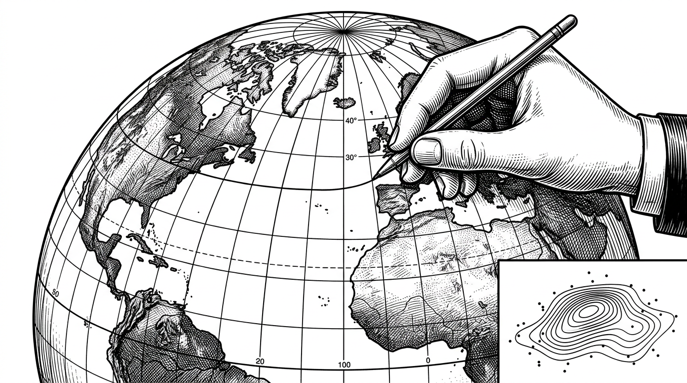
The grid matters as much as the model
This is where the repo gets mathematically satisfying. The grid generator is not treating the Earth like a spreadsheet. It uses distance logic, including a Haversine-style approach and longitude correction with latitude, so the mesh does not become geographically distorted as it spreads outward.
That sounds like a detail, but it is the kind of detail that decides whether a map feels credible. A square in degrees is not a square in meters. If you ignore that, your coverage surface starts drifting away from reality before the model even runs.
In other words, the repo understands that interpolation happens on a planet, not an abstract plane.
def meters_to_deg(dx_m, dy_m, lat_ref):
    dlat = dy_m / 111320.0
    dlon = dx_m / (111320.0 * math.cos(math.radians(lat_ref)) or 1e-9)
    return dlat, dlon
Why India-specific geocoding is not a side detail
The geocoding layer is part of the product, not a setup script. The repo handles naming variations like Bangalore and Bengaluru, plus other region-specific cases, because a coverage map is only as good as the place it thinks it is mapping.
That fallback chain is a quiet reliability feature. If geocoding breaks, the grid center breaks. If the center breaks, the model predicts the wrong neighborhood. This is why location normalization belongs in the core architecture, not on the edge of it.
| Geocoding step | Why it matters | Failure mode if ignored |
|---|---|---|
| Normalize city names | Different spellings often refer to the same place | The map centers on the wrong coordinates |
| Fallback providers | APIs can fail or rate-limit | Prediction cannot start |
| Regional variants | Local naming conventions are real data | The system misses the intended city entirely |
| Resolved map center | Everything downstream depends on it | Grid generation and predictions drift |
A full-stack split that looks like a project in transition
The repository has the shape of a system that grew up in stages. You can see Flask-era pieces, a newer backend API, and a React frontend living alongside each other. That is not unusual, but it does tell you something about the project’s maturity: the idea is coherent, while the implementation is still settling.
There is a useful distinction here. The older parts look like a monolithic mapping tool. The newer pieces suggest a move toward a cleaner frontend-backend split. That evolution is a sign of ambition, even if it leaves some duplication behind.
| Layer | What it suggests | What it implies |
|---|---|---|
| `web_app.py` | All-in-one app logic | Fast prototyping and direct control |
| `backend/app.py` | API-first backend | A more modular frontend integration |
| `frontend` | Separate client UI | A shift toward product-like structure |
| `templates` and `static` | Legacy Flask rendering | A transitional architecture |
Where this sits among map dashboards and geospatial ML tools
Compared with a generic map dashboard, this repo is doing more work on the back end and being more careful about the story it tells on the front end. A dashboard can show where measurements were taken. This project tries to infer what is happening between them.
That makes it more useful for sparse data, but also more demanding. The more the map estimates, the more important it is to show the assumptions around that estimate. The repo’s warning layer is the right instinct here.
| Approach | Strength | Limitation |
|---|---|---|
| Raw point map | Simple and truthful about observations | Does not estimate the gaps |
| Static coverage dashboard | Easy to scan | Often hides confidence and distance |
| Basic interpolation | Fills space quickly | Can ignore geography and uncertainty |
| This repo | Combines prediction, grid logic, and warnings | Still feels prototype-shaped in its code organization |
What the project gets right, and what still looks prototype-shaped
The strongest thing here is conceptual discipline. The repo keeps returning to the same good question: how do you estimate coverage without pretending that every cell of the map deserves the same confidence? That question shows up in the model choice, the grid math, and the warning logic.
What feels less finished is the codebase shape. There is duplication, and the stack looks like it is part migration, part experiment. But that does not weaken the core idea. If anything, it makes the repo feel like the kind of project where the architecture is still catching up to the insight.