photo-search: The Pre-Hooks React App That Searches as You Type
A small Pixabay browser becomes a snapshot of 2018-era React: class components, controlled inputs, old Material-UI, and a live-search pattern that feels great until you ask what happens at scale.

- photo-search turns live search into the main event, using every keystroke to make the UI feel immediate and alive.
- Its core lesson is architectural, not visual: a single class component owns search state, fires requests, and drives the results flow.
- The app looks polished because the component split is clean, but the request pattern is intentionally naïve for production use.
- The repo captures a narrow front-end era when class components, older Material-UI patterns, and demo-friendly live search were still the default instincts.
The best thing about photo-search is not that it searches photos. It is that the app feels like it is listening. Type a letter, and it reacts immediately, replacing the quiet act of search with a running conversation between your keyboard and the Pixabay API.
That sensation is the whole article. Beneath it is a small, tidy React app built in the pre-Hooks era, with class components, controlled inputs, and Material-UI conventions that now read like a time capsule.
A Search Box That Behaves Like a Living Thing
Open the app and the first thing you notice is the tempo. Each change in the search field triggers a request, so the page responds before your hands leave the keyboard. It is the kind of interaction that feels premium in a demo and slightly reckless in production.
That trade-off is the point. The repo makes live search look effortless because the surface area is small: one input, one API, one gallery, one modal. There is no search button, no submit state, no buffering layer between thought and result.
onTextChange = e => {
  this.setState(
    { [e.target.name]: e.target.value },
    () => {
      axios
        .get(`https://pixabay.com/api/?key=${process.env.REACT_APP_PIXABAY_API_KEY}&q=${this.state.searchText}&image_type=photo&per_page=${this.state.amount}&safesearch=true`)
        .then(res => this.setState({ images: res.data.hits }))
        .catch(err => console.log(err));
    }
  );
};
That callback matters. The component waits for setState to settle before issuing the request, which keeps the query aligned with the latest input. It is a classic class-component move: explicit, slightly ceremonial, and very much of its era.
The Brain Lives in One Class Component
Search.js is the center of gravity. It owns the query string, the requested result count, and the image array that gets rendered below the fold. It also decides when the gallery exists at all, using conditional rendering so the results component stays out of the tree until there is something to show.
That keeps the architecture simple. ImageResults only appears after results arrive, and the gallery itself handles a separate concern: local modal state for the enlarged image. The search component is the fetch engine. The results component is the viewer.
{this.state.images.length > 0 ? (
  <ImageResults images={this.state.images} />
) : null}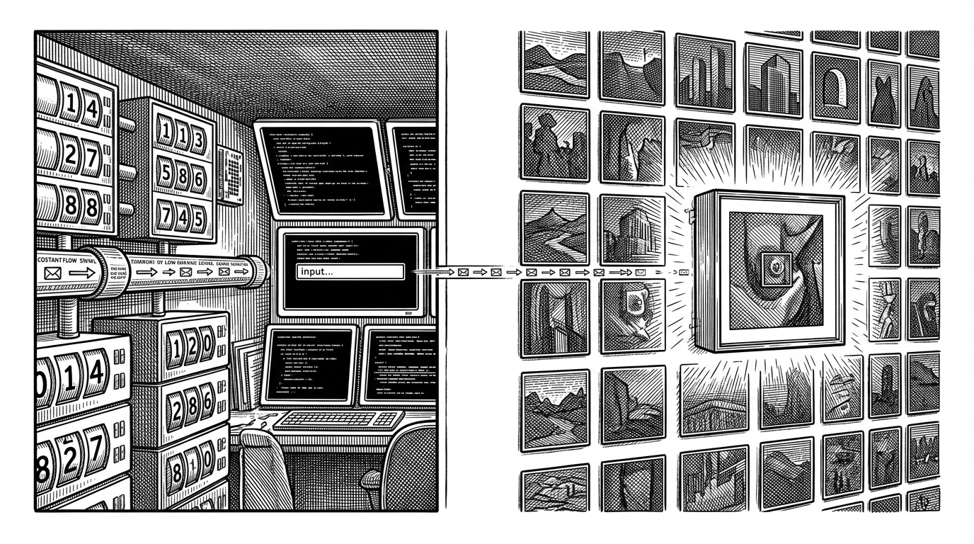
Why This Looks Like 2018
The repo reads like a frozen front-end moment. Class components carry state. Material-UI v0.x sits beside Bootstrap. MuiThemeProvider wraps the app because that was the way to make the component library behave.
None of that is sloppy. It is just historically legible. You can see the ecosystem in transition: Create React App boilerplate, old styling conventions, a separate service worker file, and the assumption that a polished interface could be assembled from a few well-chosen libraries rather than a framework stack.
That is what makes the project interesting. It is not a museum piece because it is old. It is a museum piece because its choices map so cleanly to a specific set of front-end assumptions that have since moved on.
The UI Is Simple Because the Data Model Is Simple
Pixabay returns a predictable JSON payload. The app turns that payload into a grid, then turns one selected image into a modal. There is no heavy transformation layer, no client-side indexing, no search engine of its own. The UI stays light because the data contract stays light.
That split is smart. Search resolves the query. ImageResults decides how the gallery should look. The result is a pleasant separation between network work and interface work, which is why the app can feel more polished than its internals suggest.
In practical terms, the gallery is doing two jobs at once: it renders the thumbnail wall and manages zoom state. That is fine here because the interaction surface is tiny, but it also shows the limits of the pattern. The component is easy to read because the problem is small.
| Dimension | This repo | A modern photo search app |
|---|---|---|
| Search trigger | Every keystroke fires a fetch | Debounced input, submit, or intent-based search |
| State model | Class component state and callbacks | Hooks, reducers, or query libraries |
| UI system | Old Material-UI plus Bootstrap | Current component systems with cleaner theming |
| Request handling | Direct Axios call from the input handler | Cached queries, aborts, retries, and debounce |
| Production readiness | Great for a demo, thin for scale | Built for rate limits, latency, and partial failure |
| Ecosystem signal | Pre-Hooks React habits | Composable, hook-first front-end norms |
The Fast Path Has a Cost
The app’s biggest weakness is also its most visible strength. No debounce means more requests, more churn, and more chances to hit API limits or waste bandwidth on intermediate keystrokes. If the user types quickly, the network does too.
That is acceptable in a portfolio project because the experience is the pitch. The app is showing you that live feedback can feel better than a button click. But the missing guardrail is impossible to ignore once you think about scale, cost, or rate limiting.
| Question | Live search here | Production-safe approach |
|---|---|---|
| When does search run? | On every input change | After a short pause or explicit submit |
| How many requests happen? | Potentially one per character | Fewer, coalesced requests |
| What happens to stale queries? | They can still complete | They are often canceled or ignored |
| What does the user feel? | Instant feedback | Intentional feedback with a small delay |
| What does the backend feel? | Pressure from bursty traffic | Less noise and lower waste |
This is the difference between a demo and a system. A demo asks whether the interaction feels good. A system asks whether the interaction survives contact with real users.
What Modern Photo Search Would Do Differently
A newer photo search tool would probably move in one of two directions. It would either narrow the scope and keep everything local, or it would go bigger and add semantic search, embeddings, caching, and more defensive request handling.
That is where projects like Immich, PhotoPrism, PictoPy, or local AI search tools diverge from this repo. They are not just showing images. They are trying to make photo retrieval smarter, safer, or more private. photo-search is simpler than that. It is a clean browser over an external API, and that simplicity is its identity.
So the comparison is not about feature count. It is about philosophy. This repo optimizes for immediate visual feedback. Modern tools optimize for trust, scale, and relevance.
The Small Repo That Explains a Big Shift
photo-search is tiny, but it explains a lot. It shows a moment when React apps were often stateful classes, when library choices were less standardized, and when the fastest way to make something feel alive was to wire input directly to fetch.
That design still works as a demo because the code is straightforward and the interaction is legible. But the same simplicity also exposes what the ecosystem later learned to hide: the cost of immediacy, the value of debounce, and the usefulness of more composable component patterns.
In that sense, the repo is less a photo app than a before-and-after slide. It shows how much front-end practice changed without needing to say so out loud.