Food-Website: How a Restaurant Landing Page Becomes a React System
A template-style storefront rebuilt with granular components, manual sliders, and hook-driven interactions that show what modernizing a static site actually looks like.
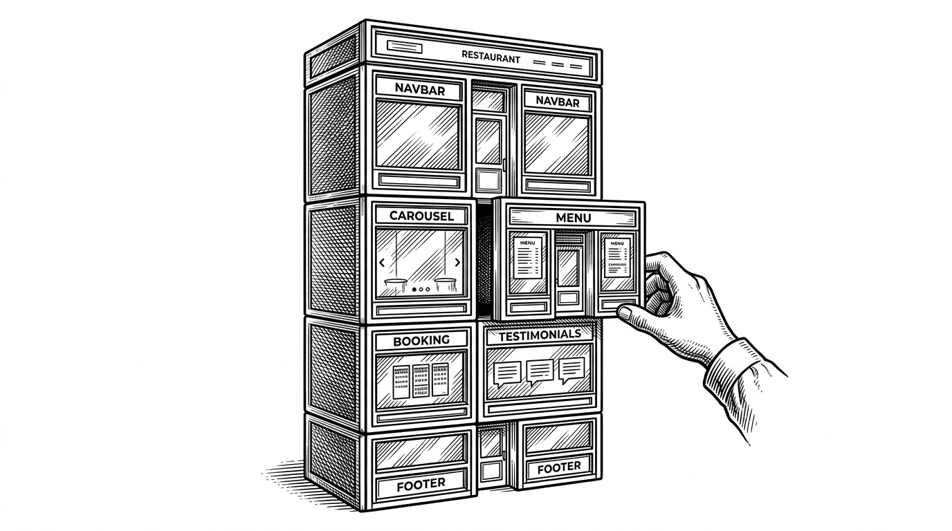
- Food-Website is most interesting as a refactor story, because it turns a static restaurant template into a React page with clearer boundaries and less structural drift.
- Its strongest idea is locality of behavior, with each section living in its own folder alongside its CSS and JSX.
- The app avoids dependency bloat by handling common UI jobs like the mobile nav and carousel with plain React hooks and simple lifecycle cleanup.
- The template heritage still shows through in the assets and placeholders, which makes the repo feel more like a disciplined prototype than a finished product.
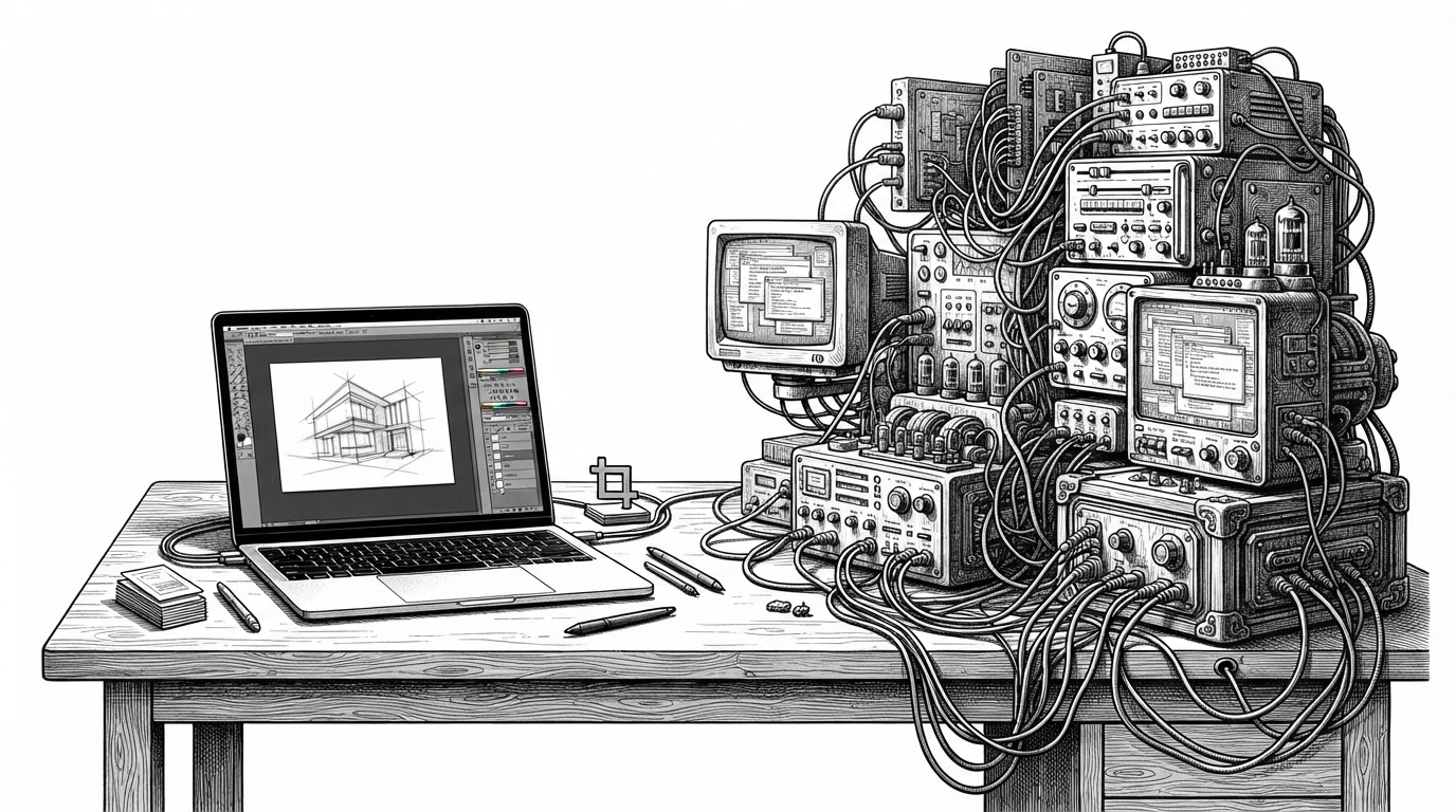
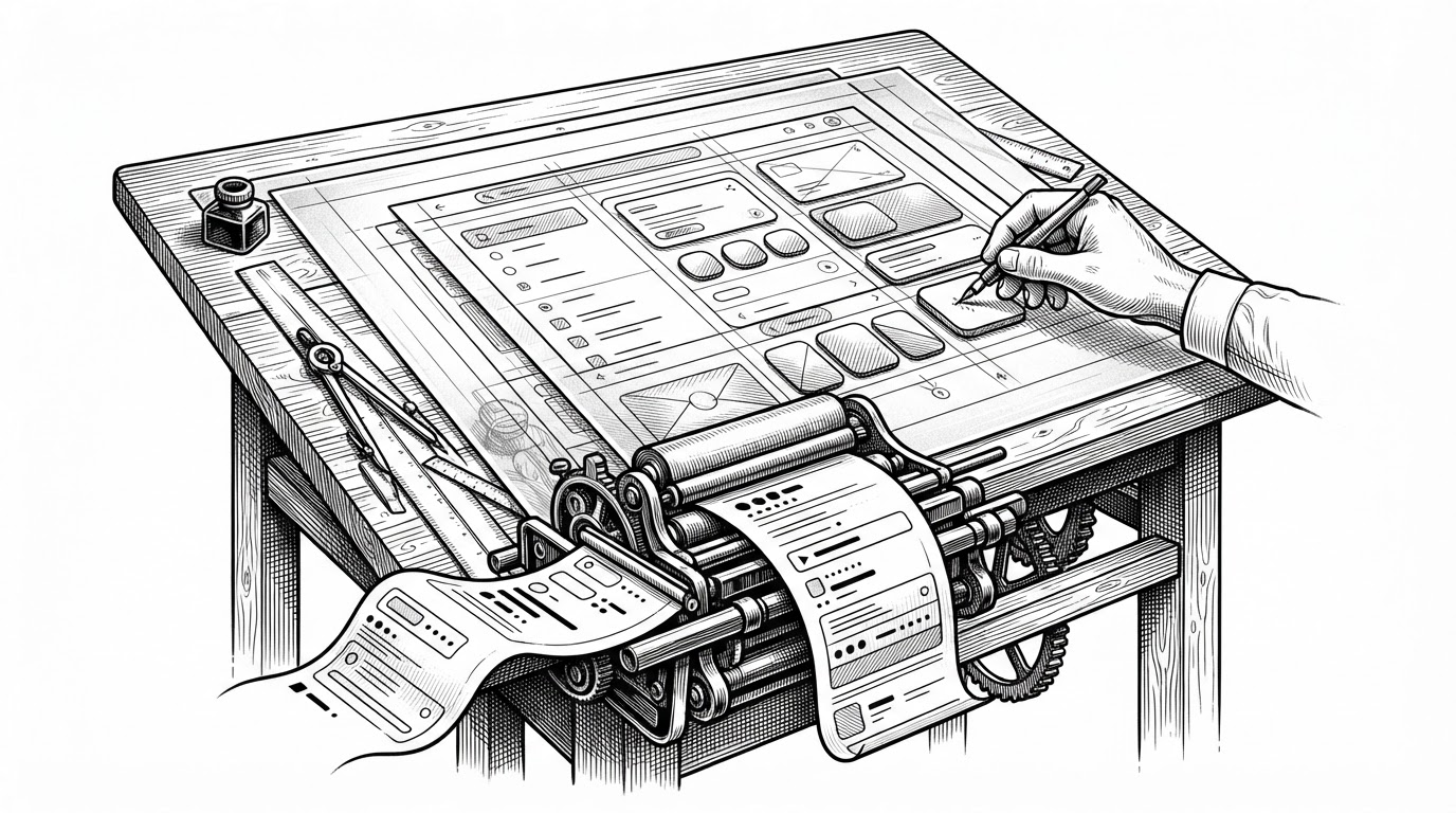
The best way to read this repo is as a port, not a restaurant site. The food theme is almost a distraction. The interesting part is the translation layer: a static template mindset rebuilt as a React component tree, with each section pulled apart into its own file and its own styling surface.
That matters because most brochure sites fail in the same way. They accrete markup, logic, and styling until every change feels risky. This repo pushes in the opposite direction: smaller surfaces, explicit sections, and UI behavior that stays close to the component that owns it.
A Folder for Every Thought
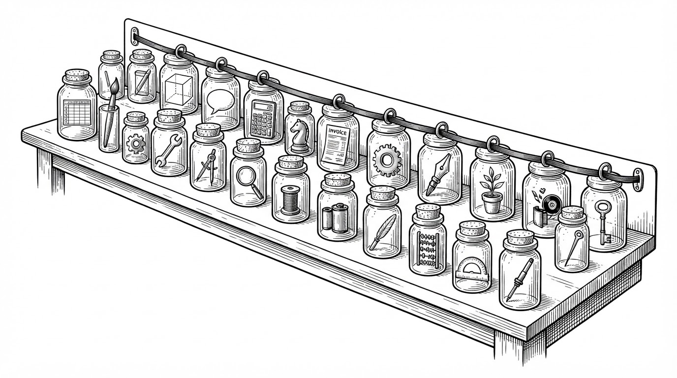
The directory structure is the first clue. Instead of one large pile of UI, the project uses dedicated folders for major sections like Navbar, Menu, ChefPage, Booking, and Footer. Each folder carries both the JSX and the CSS for that section, which keeps changes local and makes the codebase easier to scan.
| Flat template HTML | Folder-per-component React |
|---|---|
| One file holds markup, behavior, and layout decisions. | Each section owns its JSX and CSS in one place. |
| Changes are easy to start and hard to contain. | Changes are a little more verbose but easier to isolate. |
| UI behavior tends to sprawl across the page. | UI behavior stays near the component that uses it. |
| Good for quick handoff, brittle as it grows. | Better suited to incremental maintenance. |
| Often hard-coded from top to bottom. | More ready for data-driven rendering later. |
The Page Is the Router
`App.jsx` is doing more than rendering a homepage. It acts as the page-level conductor, stacking `Navbar`, `Carousel`, `HomePage`, `ComponentBanner`, `ComponentMenu`, `ComponentTestimonial`, `ChefPage`, and `Footer` into a single vertical experience. The navigation model is simple on purpose: anchor links jump to sections instead of handing control to a router.
That choice fits the product. This is a storefront, not an application with deep stateful navigation. The architecture keeps the mental model honest. The page reads like a brochure, but it is built like a composed React system.
The Clever Parts Are Simple
The strongest implementation choices are the least dramatic ones. The mobile nav uses `useState` to toggle an `isOpen` flag. The carousel uses `useEffect` with `setInterval`, then clears the timer on cleanup. Nothing here depends on a heavy slider package or a UI framework that would hide the mechanics.
useEffect(() => {
  const interval = setInterval(() => {
    setCurrentImage((prev) => (prev + 1) % images.length);
  }, 3000);

  return () => clearInterval(interval);
}, [images.length]);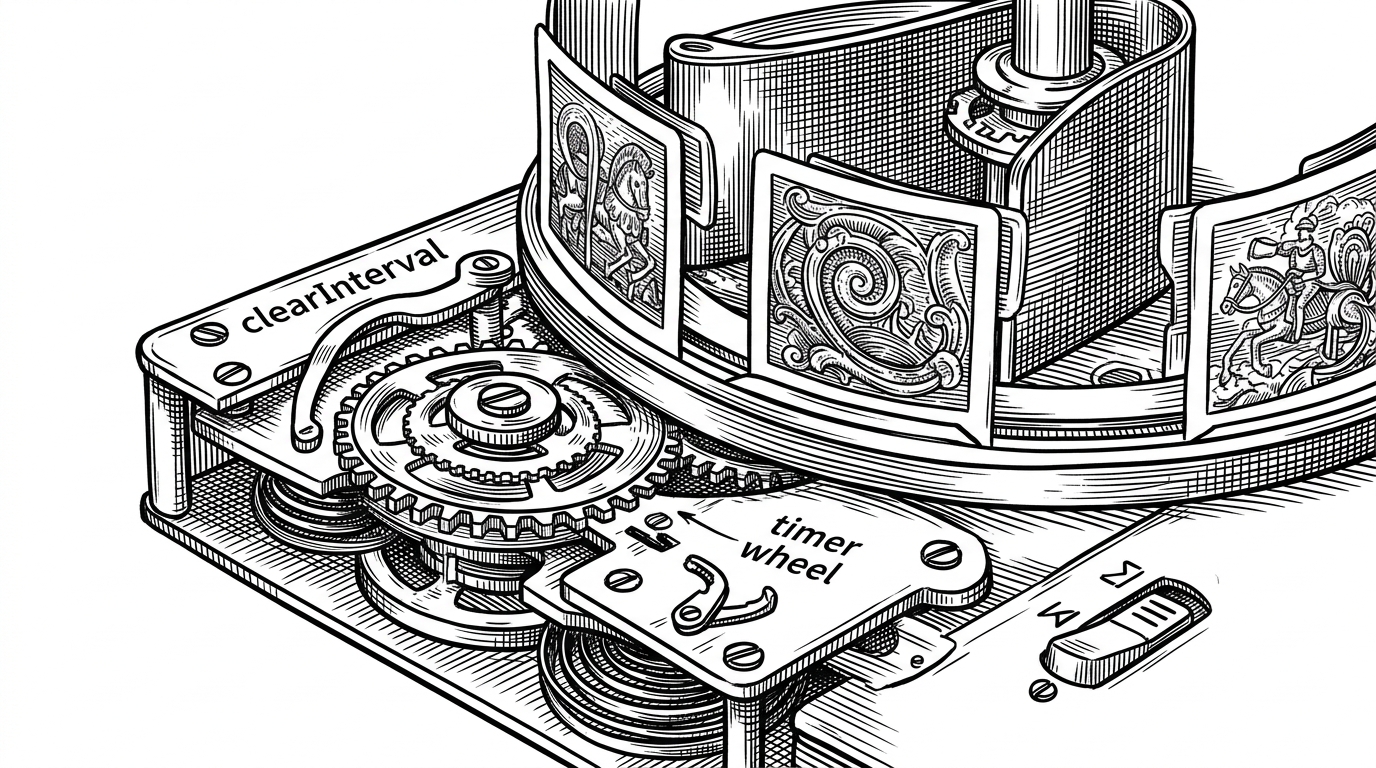
Data Lives in Arrays, Not in Markup
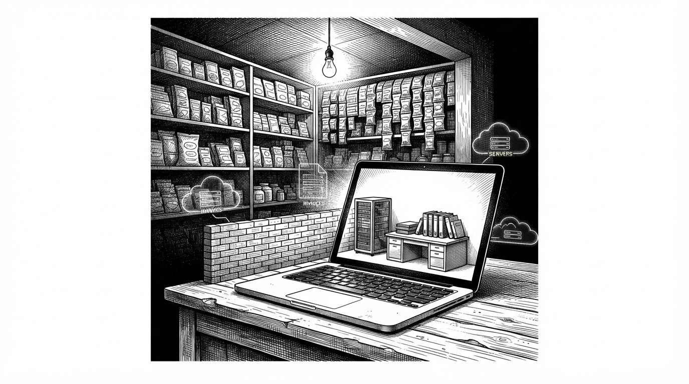
`ComponentMenu.jsx` shows the next step in the repo's maturity. Menu content is represented as data first, then rendered through nested `.map()` calls. Breakfast, lunch, and dinner are not stitched into the DOM by hand. They are structured as collections, which makes the page easier to extend and easier to imagine as CMS-backed later.
{menuItems.map((category) => (
  <section key={category.title}>
    <h3>{category.title}</h3>
    {category.items.map((item) => (
      <article key={item.name}>
        <img src={item.image} alt={item.name} />
        <h4>{item.name}</h4>
      </article>
    ))}
  </section>
))| Hard-coded markup | Data-driven rendering |
|---|---|
| Every menu card is manually duplicated in JSX. | The same card pattern is generated from arrays. |
| Content changes require structural edits. | Content changes can stay inside the data object. |
| Scaling means more template repetition. | Scaling means more items, not more layout code. |
| Useful for a static mockup. | Useful for a system that expects to grow. |
Where the Template Heritage Still Shows
The repo is clean, but it is still clearly in transition. Some assets are hot-linked from external template sources, which suggests the project is carrying forward a template-era dependency on existing imagery. Other files hint at placeholder work and incomplete polish. That does not hurt the article. It sharpens it.
Because the repo is not pretending to be finished, you can see the real shape of the refactor. It is more maintainable than a one-file landing page, but it is not yet a deeply productized frontend. That middle ground is the useful lesson.
What This Repo Teaches
If you are building a landing page, the big decision is not whether to use React. It is whether you separate structure, state, and data on purpose. Food-Website shows how far a small team or solo builder can get with that discipline: clearer sections, simpler UI logic, and a codebase that still feels navigable after the novelty wears off.
That is the real modernizing move here. Not adding more machinery. Removing enough friction that the page can keep changing without turning into a tangle.