MM2-0/material_weather_icons: How a Weather Pack Fakes Depth With Flat SVGs
A tiny icon library that bakes shading into paths, ships the same source as SVG and PNG, and treats performance as part of the aesthetic.
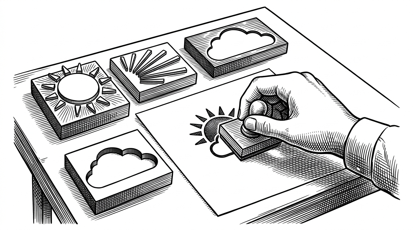
- The repo's depth is composited into the SVG itself, which lets the icons look layered without filter-heavy rendering.
- A tiny shell export step keeps the SVG folder authoritative and the PNG outputs reproducible.
- The pack's real strength is restraint, because a narrow Material palette can travel cleanly across apps and themes.
- Against broader sets like Weather Iconic, it trades breadth and packaging convenience for a tighter visual language.
This is not a story about weather. It is a story about how a small asset repo turns flat SVG primitives into icons that feel dimensional, consistent, and durable. The trick is not flashy rendering. It is geometry, layering, opacity, and a very small build step doing exactly what it should.
A free and open source weather icon pack, designed to work well with Material Design components. While many icon packs are over simplified (e.g. Google's weather icons) these icons aim to strike a balance between simplicity and detail. They utilize large, flat shapes and the Material Design color pallet.
The trick: depth without filters
The repo's signature move is to fake depth with plain SVG building blocks. Sun, cloud, shadow, and occlusion are separate shapes, so the icon reads as layered before the viewer even notices the details. That keeps the files light, portable, and easy to render anywhere that understands basic SVG.
In the clear-weather icons, the sun is not one object. It is a set of circles and rays that overlap in a way the eye reads as volume. In the cloudy variants, the shadow is another path with reduced opacity, which is a clever way to suggest weight without asking the renderer for help.
The source of truth is the SVG folder
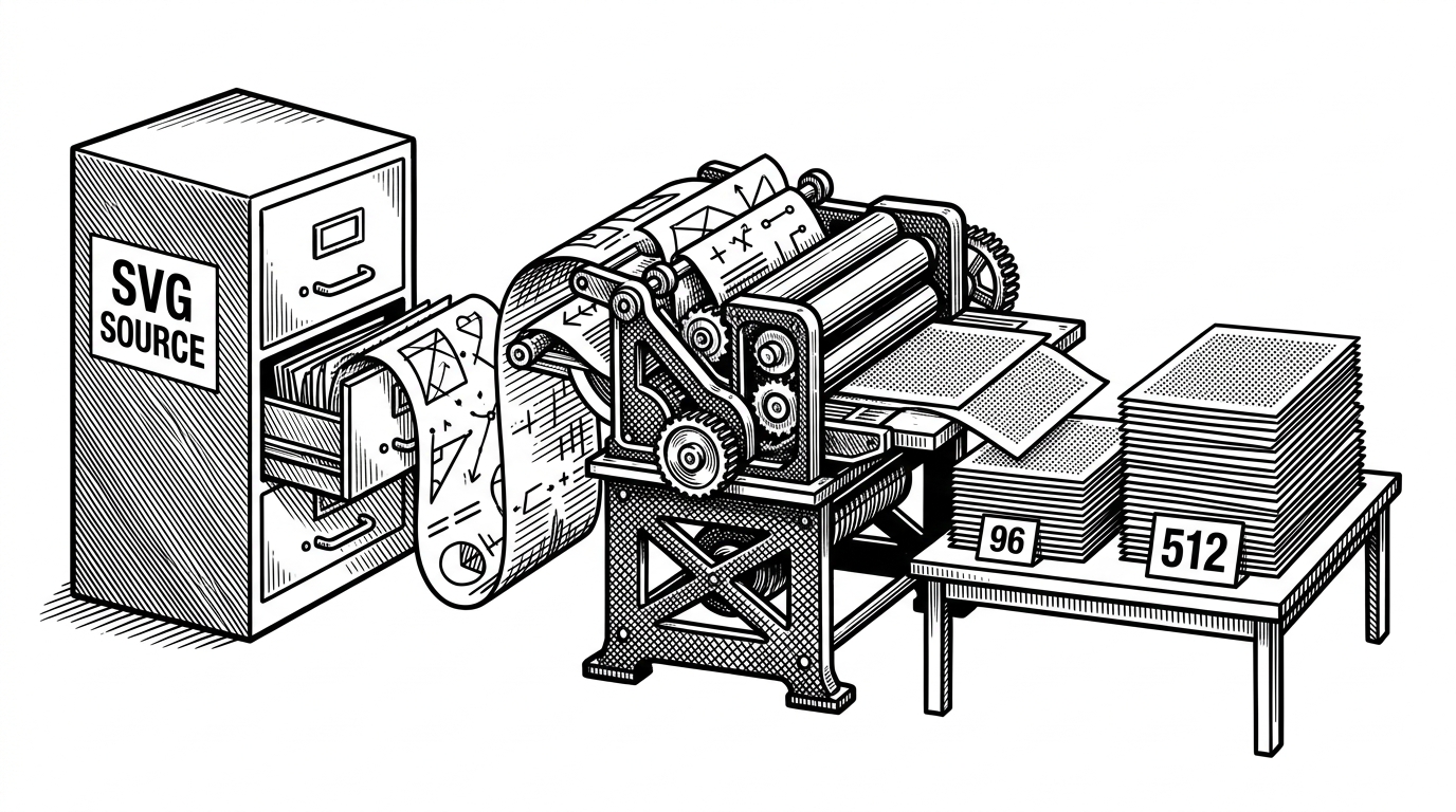
The repository is organized like a tiny production system. `svg/` holds the source files, while `96/` and `512/` hold raster outputs. That matters because it makes SVG the canonical asset, not one format among many.
The build step is just as disciplined. A shell script calls Inkscape from the command line and exports the same source into multiple sizes, which means one edit can flow through the whole pack without hand exporting each file. That is not glamorous, but it is exactly the kind of boring machinery that keeps an icon library coherent.
Why a small weather pack still matters
The obvious use case is a weather app, but the broader appeal is visual consistency. Designers and developers reach for packs like this when they need a Material-friendly look without taking on a larger icon system or a more elaborate toolchain. The value is not breadth. The value is that the style stays stable from source to export.
That stability also makes the repo easier to trust. If you need a small, predictable set of weather glyphs for a dashboard, a desktop theme, or a product UI, there is comfort in a pack that does one job and keeps the pipeline simple.
How it compares with a broader icon set
| Project | Style philosophy | Source format | Outputs | Best use case |
|---|---|---|---|---|
| MM2-0/material_weather_icons | Material-first, flat shapes with baked-in depth | SVG | SVG source plus raster PNG exports | Small, consistent weather UI with a light toolchain |
| Weather Iconic | Broader and more feature-rich, with stronger packaging flexibility | SVG, sprites, webfonts, TypeScript support | Multiple distribution formats and PNG exports | Teams that want wider format coverage and easier integration options |
| Default platform weather icons | Functional and minimal, usually tuned for the host OS | Platform-specific assets | Native formats only | Basic system UI where branding is secondary |
The comparison makes the trade-off clear. A bigger icon system buys convenience and coverage, but a smaller one can be cleaner, easier to reason about, and less likely to drift. This repo chooses coherence over feature sprawl, and that choice is the point.
What this repo teaches
Good asset pipelines reduce visual complexity without adding technical complexity. Here, the icon files stay legible because the shadows are paths, the exports are automated, and the source stays central. That is the real lesson: a disciplined, low-friction workflow can make a small design system feel bigger than it is.