flutter-timeline-sample: The Small Flutter Repo That Gets Vertical Progress Right
A clean, stateful timeline component shows how to build an expandable workflow UI with `IntrinsicHeight`, local item state, and almost no dependency overhead.
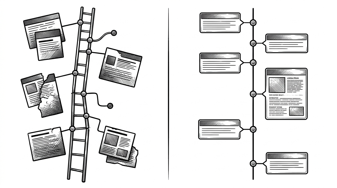
- This repo is valuable because it turns a common Flutter timeline into a lesson in layout discipline, not because it adds a new abstraction.
- The widget’s biggest choice is to own expansion state locally, which makes it easy to drop into a screen but less convenient for parent-driven control.
- `IntrinsicHeight` is the quiet trick that keeps the connector line honest when content grows taller than the step marker.
- The sample is best read as a reference implementation, while production packages still make more sense when you need shipped features fast.
Vertical timelines are supposed to be simple. A line, a node, a card, done. In practice, they break the moment one step expands, another wraps text, and the connector line has to pretend that layout chaos is a design system.
That is why MatthiasMRC/flutter-timeline-sample is more interesting than its size suggests. It is a compact Flutter sample, but it solves a real UI problem: how to make a vertical process feel stable, aligned, and reusable without leaning on heavy machinery.
Why vertical timelines are deceptively hard
The hard part is not drawing a line. The hard part is making that line behave when the right-hand content changes height. Once a step expands, the indicator column has to keep pace with cards that no longer share the same vertical rhythm.
This is where amateur implementations start to look off. The connector stops early, the node floats, or the expanded card makes the whole thing feel stitched together. The sample’s value is that it treats alignment as a first-class concern rather than a cosmetic afterthought.
A simple flutter application to show how a timeline could be implemented.
What this sample is actually teaching
This is not a package built to cover every timeline use case. It is a teaching artifact that shows how a workflow timeline can be assembled from ordinary Flutter pieces, then shaped into something that feels production-ready.
The demo leans into a familiar business pattern, an insurance-style status flow with steps that can expand for details. That makes the sample useful beyond insurance. Any workflow with checkpoints, notes, or evidence can borrow the same structure.
The component keeps its own state on purpose
The architectural choice at the center of the repo is simple: `TimelineWidget` clones its incoming items into local state, then toggles expansion from inside the widget. That means the component is self-contained. You hand it data, and it handles the interaction loop itself.
class TimelineWidget extends StatefulWidget {
  const TimelineWidget({super.key, required this.items});

  final List<TimelineItem> items;

  @override
  State<TimelineWidget> createState() => _TimelineWidgetState();
}

class _TimelineWidgetState extends State<TimelineWidget> {
  late List<TimelineItem> _items;

  @override
  void initState() {
    super.initState();
    _items = widget.items.map((item) => item.copyWith()).toList();
  }

  void _toggleExpansion(int index) {
    setState(() {
      _items[index] = _items[index].copyWith(
        isExpanded: !_items[index].isExpanded,
      );
    });
  }
}
That design is convenient, but it comes with a tradeoff. The parent does not own the expanded state anymore, so this is not the right pattern if you need external orchestration, deep linking, or synchronized filters. For a sample component, though, the choice is clean.
IntrinsicHeight is the quiet hero
The most elegant part of the implementation is `IntrinsicHeight`. It lets the left-side timeline rail measure itself against the tallest content on the right, which keeps the connector line visually honest even when a step expands.
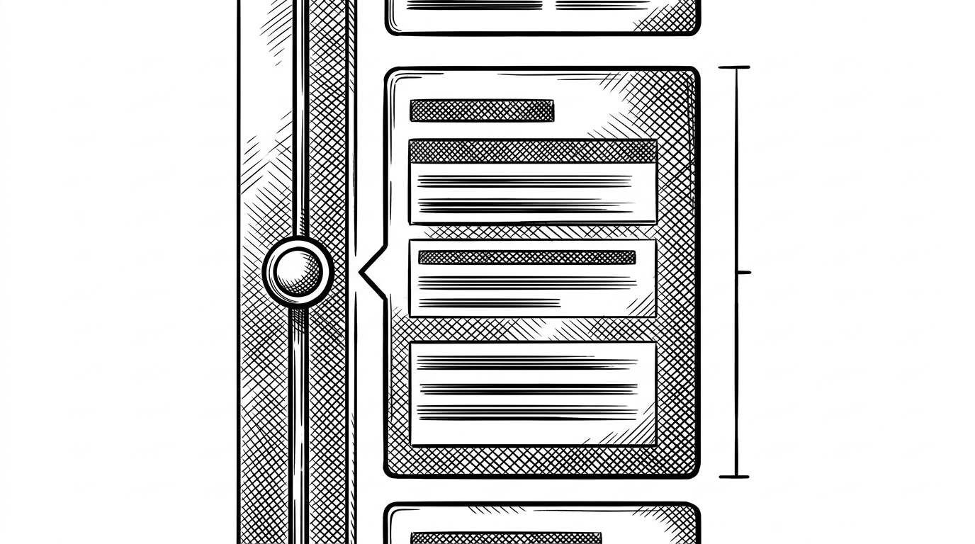
That one widget changes the feel of the whole component. Without it, the layout reads as approximate. With it, the rail and the content become one system.
Why the sample feels production-shaped
The repo does a lot of small things right. It uses `copyWith`, which keeps state updates explicit. It keeps the widget code separate from the demo scaffold. It leans on Material 3, uses minimal dependencies, and reads like something built by someone who wants the example to age well.
That matters because sample code often makes the opposite tradeoff. It is either too toy-like to trust or too abstract to learn from. This one lands in the useful middle: small enough to read, structured enough to borrow.
How it compares to timeline_tile and timelines
If you want a finished component today, a package still wins. If you want to understand the mechanics first, this repo is the better teacher. The raw implementation shows the moving parts that packages hide behind APIs.
| Dimension | This sample | Production packages |
|---|---|---|
| Learning value | High. You see the full widget mechanics. | Lower. The abstraction hides the layout trick. |
| Customization | Edit the source directly. | Configure through public APIs and builders. |
| State | Self-managed inside the widget. | Often parent-driven or more flexible. |
| Maintenance | A reference sample, not an ecosystem. | Feature-rich and actively maintained. |
| Best use | Study, prototyping, portfolio work. | Shipping a timeline quickly. |
That contrast is the point. `timeline_tile`, `timelines`, and similar packages trade transparency for breadth. This sample does the opposite. It gives you a small, legible implementation that explains why the pattern works before you decide whether to abstract it.
Where this sample belongs
This repo belongs in three places: as a learning artifact, as a portfolio example, and as a starting point for teams that need to reason about the layout before they adopt a package. It is not the most convenient path to production, but it is a good path to understanding.
That makes it easy to underestimate. The code is small, but the lesson is durable: polished process UIs are less about decoration than about respecting alignment, state ownership, and content variability.