gridsome-test: How a Tiny Gridsome Stack Makes a Local Business Feel Bigger
A close look at the data-driven Vue components, breakpoint-swapped mobile UX, and Netlify-powered lead capture behind a polished Dreamland Homes prototype.

- The repo’s real move is not Gridsome itself, but a breakpoint swap that changes the mobile experience instead of merely shrinking the desktop layout.
- A small set of Vue arrays and reusable components makes the site feel like a custom agency build without turning the codebase into a maze.
- Tailwind, wide containers, and full-width sections do most of the heavy lifting in the perception of scale and trust.
- Netlify Forms turns the contact page into usable infrastructure with almost no backend surface area.
The smartest move is not the grid
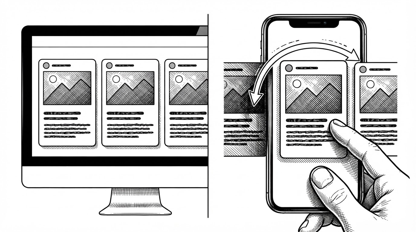
The most interesting decision in this repo is not visual polish. It is that Grid.vue changes the interaction model at the breakpoint, rather than simply rearranging boxes. Desktop gets a standard multi-card grid. Mobile gets a carousel.
That sounds small until you compare it with the usual responsive pattern. Most sites compress the same layout until it fits. This one changes how the content is consumed. On a phone, that matters more than squeezing three columns into a narrow screen.
| Desktop grid | Mobile carousel |
|---|---|
| Fast scanning across multiple cards at once | Focused touch interaction one card at a time |
| More visual density for larger screens | Better ergonomics for one-handed browsing |
| Efficient when users compare options quickly | Better when the goal is to guide attention |
| Fits the static brochure feel | Adds a product-like sense of interaction |
A homepage built like a data pipeline
The homepage is structured more like a data flow than a pile of templates. Index.vue defines content in arrays, passes that content into Grid.vue, and lets Card.vue handle presentation. The result is simple, but not simplistic.
// Conceptual pattern reflected in the repo
const benefits = [
  { title: '...', image: '...', text: '...' },
  { title: '...', image: '...', text: '...' }
]

<Grid :data="benefits" />

// Grid.vue chooses grid or carousel based on breakpoint
// Card.vue renders the shared fields
That separation is what keeps the prototype manageable. The page can swap out service sets, proof points, or feature blocks without rewriting the UI every time. For a solo builder, that is the difference between a one-off demo and a usable client pattern.
Why the site feels larger than the codebase
A lot of the perceived weight comes from design discipline rather than code volume. The Tailwind setup supports large containers, generous spacing, and strong typography. That combination makes the site feel like an agency project even though the implementation stays compact.
The point is not decoration. It is credibility. A construction business site needs to feel established before anyone reads the copy. Wide sections, strong type hierarchy, and confident card layouts do that work immediately.
| Small prototype cues | Larger-business cues |
|---|---|
| Sparse repo surface area | Rich visual hierarchy |
| Few reusable components | Consistent section structure |
| Utility-first styling | Cinematic spacing and scale |
| Solo contributor footprint | Agency-like presentation |
Netlify turns the contact form into infrastructure
The contact form is a good example of the project’s practical bias. A data-netlify="true" form gives the site lead capture without introducing a custom backend. For a small business brochure site, that is a high-leverage tradeoff.
<form name="contact" data-netlify="true">
  <input type="text" name="name" />
  <input type="email" name="email" />
  <textarea name="message"></textarea>
</form>
That choice fits the rest of the repo. The stack is built to deliver a finished commercial surface without making the developer maintain unnecessary machinery. The business gets a working intake path. The codebase stays small.
What this repo gets right, and what it leaves unfinished
This is clearly a prototype, and the repo signals that honestly. The README stays close to boilerplate, there are placeholder remnants like an empty Quote.vue page, and the contributor footprint is tiny. None of that weakens the main lesson.
The lesson is that polished client-facing value does not require a heavy stack. It requires a few strong decisions: component reuse, a breakpoint-aware interaction model, and a static backend substitute that covers the business need. That is enough to make a local company site feel bigger than the code behind it.