landing-desing-exp: landing-design-exp: the landing page as a choreographed system
Aiden Bai’s experiment treats motion, layout, and scroll activation as coordination, not decoration.
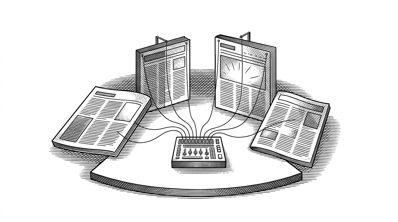
- landing-design-exp reframes a landing page as a state machine, where sections wake up in sequence instead of competing for attention.
- Its most interesting move is shifting visual polish onto shared signals and compositor-friendly transforms, so motion feels rich without a heavy runtime.
- The project fits Aiden Bai’s broader pattern of stripping wasted frontend work out of the stack and exposing only the control surfaces that matter.
- It is a better fit for teams that want technical control and performance discipline than for teams that want a drag-and-drop site builder.
The page that behaves like a machine
From the outside, landing-design-exp does not read like a pile of isolated sections. It reads like a sequence. That is the important shift. The page is less about stacking content and more about timing when each part becomes visible, active, and emotionally legible.
That matters because most landing pages fail for the same reason: they treat motion as garnish. This project points in a different direction. It suggests that premium-feeling motion can come from a small coordination layer, not a bulky animation stack.
Why Aiden Bai would build this
Aiden Bai’s public work already leans in this direction. Million attacks wasted rendering work. React Scan helps reveal where apps are paying unnecessary costs. React Grab is about pulling useful context out of the browser without extra friction.
Seen in that light, landing-design-exp is not a detour. It is the same instinct applied to a narrower problem. If a landing page can feel more intentional with less machinery, then the page becomes a proof case for the broader thesis: good frontend work is often subtraction.
The block model, in one sentence
The simplest way to understand the repo is this: each section is a block with its own activation state, and a shared scroll signal decides when that block should wake up. That makes the page behave less like a document and more like a cue-driven system.
That model changes the authoring problem. You are no longer asking, “What animation does this card have?” You are asking, “What role does this block play in the sequence?” That is a cleaner mental model for both designers and engineers.
How motion stays cheap
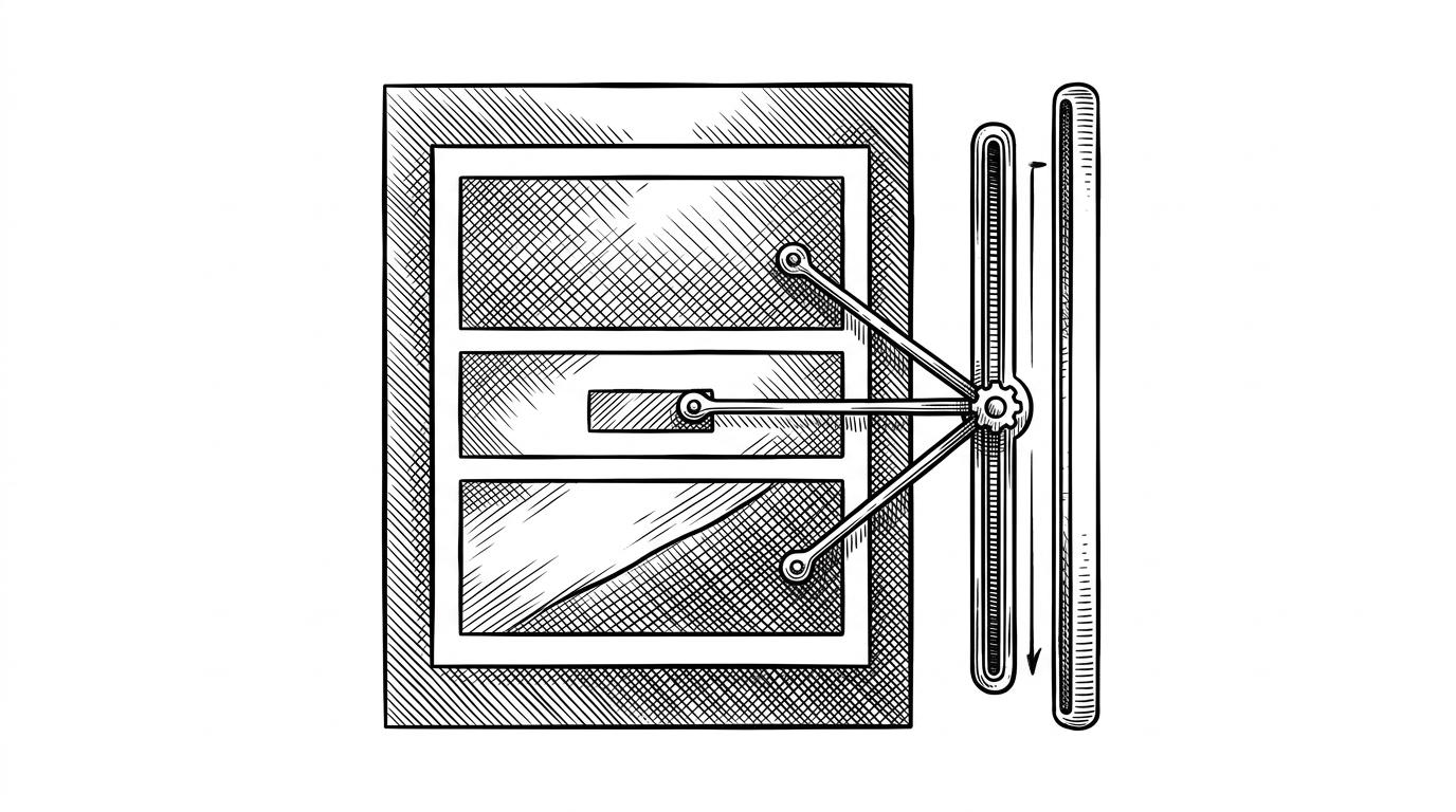
The architecture implied by the repo is straightforward, and that is the point. Use scroll observation to mark a block as active. Push that state into a shared variable. Let CSS do the expensive-looking work with transforms and opacity, which the browser can handle more efficiently than repeated rerenders.
That approach also keeps the blast radius small. Offscreen sections can stay idle. The page can feel elaborate while the runtime stays disciplined. The visual system looks premium because the control system is simple.
This is where the project is more interesting than a generic animation demo. The goal is not to show off motion. The goal is to turn motion into a dependency graph that the browser can execute without drama.
What this replaces
The cleanest comparison is with template-heavy landing page tools. Those tools optimize for assembly. They give you blocks, styles, and shortcuts. landing-design-exp seems to optimize for choreography, where the runtime behavior is part of the design language itself.
| Approach | Strength | Trade-off | Best fit |
|---|---|---|---|
| landing-design-exp | Choreographed sections, shared signals, lean runtime | Requires more technical authorship | Teams that want premium motion and control |
| Template-heavy landing kits | Fast assembly from prebuilt blocks | Motion and state can feel bolted on | Teams optimizing for speed to launch |
| Visual no-code builders | Designer-friendly editing | Less control over runtime and fine-grained behavior | Teams that prefer marketing ops over code |
Who should use this, and who shouldn’t
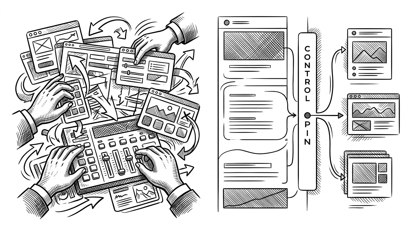
This project makes sense for teams that care about landing-page performance, motion quality, and technical control. It also makes sense for product teams that want the page itself to behave like a designed system, not a pile of reusable components.
It is less compelling for teams that want zero-code convenience, or for teams that need a broad visual builder to hand off work across many non-technical contributors. In other words, this is a tool for authors who want discipline, not just speed.
That is why the repo feels more like a manifesto than a template. It asks a sharper question than most landing-page experiments: how much feeling can you create once the runtime stops getting in the way?