`palantir-for-family-trips`: The Command Center for Coordinating a Family Yosemite Run
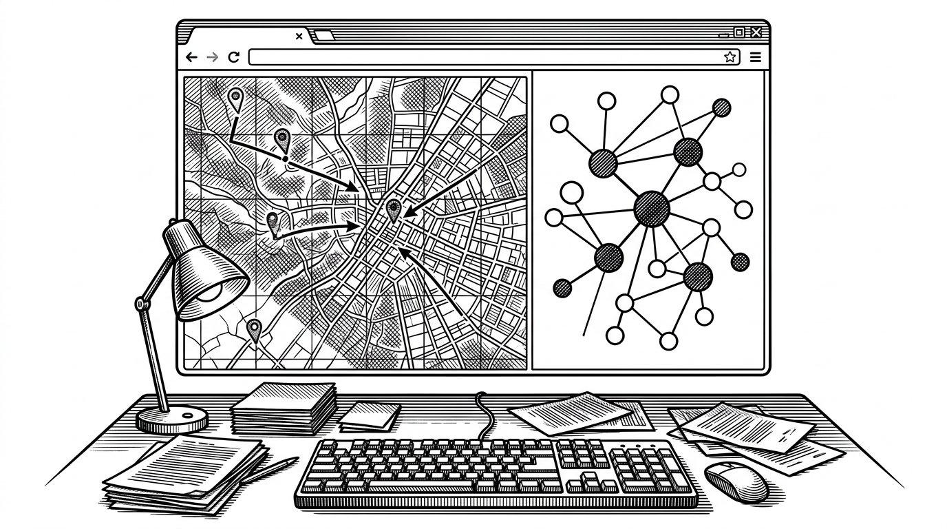
A React dashboard turns arrival windows, route playback, meal logistics, and trip readiness into an ops-style interface that makes group travel feel like a live system.
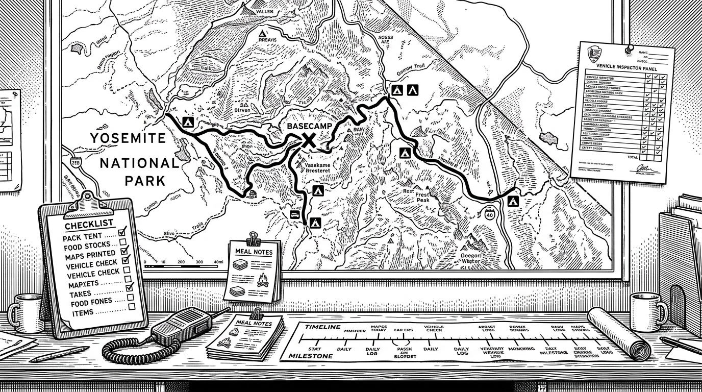
- This repo turns family travel into a stateful operations problem, not a list of errands.
- Its core trick is making time visible, so route playback and convoy status read as one system.
- The trip model, map engine, and inspector rail are designed to keep dense coordination legible at a glance.
- It is intentionally overbuilt, and that overbuilding is the point because it gives mundane logistics a shared mental model.
Why a Family Trip Needs a Command Center
Most travel tools optimize planning. This one optimizes coordination. That is the difference between a static itinerary and a live operations room.
The premise is almost funny at first glance: a family Yosemite run rendered like mission control. But the fit is real. When multiple cars leave from different places, arrive in different windows, and carry different readiness states, the problem stops being “where are we going?” and becomes “what is happening right now?”
That is where palantir-for-family-trips becomes more than a novelty. It treats movement, timing, and shared attention as first-class data, then gives them a UI that feels built for an ops team.
built “Palantir for Family Trips” for our Yosemite weekend with friends it has: - route playback and convoy tracking - meal logistics - family readiness + expense tracking, and - a full ops timeline for mission success absolutely unnecessary, but worked surprisingly well
The Strange Appeal of Operational Domestic Life
The interface borrows the visual grammar of defense-tech and intelligence dashboards, then applies it to an ordinary weekend. That is the joke, and also the thesis: software can make mundane coordination feel legible when it exposes state instead of hiding it.
A spreadsheet can store obligations. A map can show location. This project layers those ideas together, then adds a sense of tempo. Arrival windows, convoy overlap, readiness, and expenses become something you can scan instead of infer.
The emotional payoff is not just control. It is reduced ambiguity. A system like this gives a group one shared surface for attention, which is often the hardest thing to coordinate on a trip.
The Trip Model Is the Real Product
The repo's most important work happens before any map renders. In tripModel.js and tripData.js, families, locations, routes, and timeline spans are tied together through IDs and calculated windows. That means the UI is not guessing at relationships. It is reading them from a structured model.
The model does something subtle but essential: it makes convoy behavior computable. Functions like span calculations can tell the interface when multiple groups overlap in time, when an itinerary item becomes effective, and when a status should change from waiting to transit to arrived.
How the Map Becomes a Playback Engine
The technical heart of the project is CommandMap.jsx. It does not merely place markers on Google Maps. It turns route geometry into a time-based playback system that can animate convoy position across a route.
That matters because a static map is descriptive, while playback is operational. The route is reduced into path segments, then advanced through a current slot so the app can show where each vehicle is in the mission timeline. The effect is that the map feels alive, not decorative.
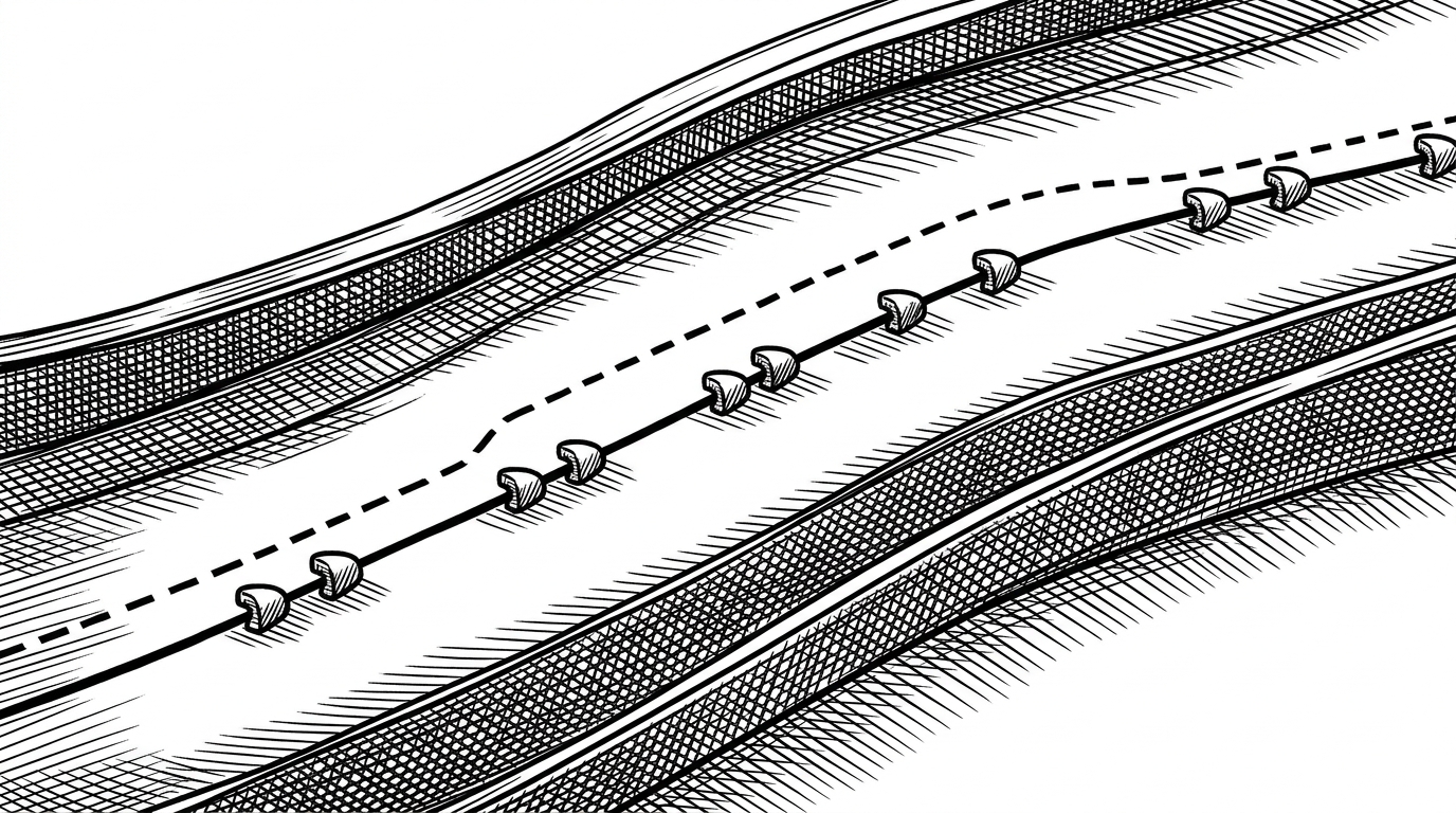
The implementation leans on Google Maps geometry helpers to measure path length, then smooths the route so playback does not look choppy. That is the right tradeoff. The interface is supposed to feel like a live system, not a GPS demo.
The inspector rail is the second half of the trick
A dense dashboard becomes useless fast if everything competes for attention. The inspector rail keeps the system readable by turning a selected entity into a focused narrative: what it is, where it is, what tone it carries, and how it relates to the trip state.
That is where the tone system matters. Status is not just color for color's sake. It gives the interface a fast semantic layer, so a convoy can read as transit, settled, or watch without forcing the user to inspect every detail.
Why This Beats a Spreadsheet, and Why It Also Doesn’t
| Google Doc or spreadsheet | Generic itinerary app | palantir-for-family-trips | |
|---|---|---|---|
| Primary unit of thinking | Rows and cells | Places and dates | State across time |
| Best at | Capturing obligations | Planning a trip | Coordinating a moving group |
| Breaks down when | People need a shared live view | The plan changes hour by hour | You need real-time operational clarity |
| What this repo adds | Not much beyond tracking | Some organization and discovery | Playback, convoy state, inspector context, and time-indexed routing |
The project is overbuilt on purpose. That is not a flaw in this case. It is the point. By adding just enough systems thinking, it makes the hidden work of family travel visible.
The Real Lesson Is Not About Travel
The deeper lesson is about interface design for shared state. If you can model sequence, readiness, and movement well enough, even a weekend trip can feel intelligible instead of chaotic.
That is why this repo sticks. It is not really about Yosemite. It is about the pleasure of seeing a messy human coordination problem translated into a coherent operational surface.