ShadowGraph: The Single-File GEOINT Tool That Turns a Browser Into an Intelligence Desk
A noir-styled map and graph app for tracing spatio-temporal links across people, institutions, and status states, built to work cleanly even when the network does not.
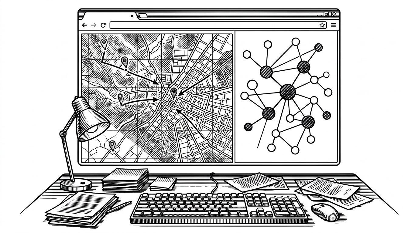
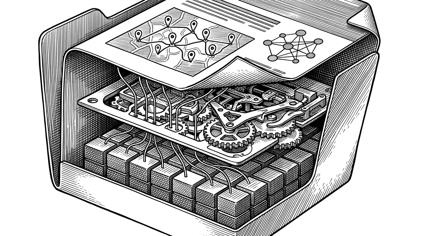
- ShadowGraph’s real trick is not the map or the graph alone, but the way one embedded dataset feeds both views at once.
- The single-file design is the product strategy, because it makes the tool portable, air-gap friendly, and easy to run without installation.
- Its noir interface is functional, not ornamental, because the visual language reinforces state, urgency, and investigative focus.
- Compared with typical dashboards, ShadowGraph bundles data, logic, and presentation into one artifact instead of outsourcing the experience to a framework.
ShadowGraph is easiest to understand as a refusal of normal web-app habits. Instead of spreading logic across APIs, build steps, and external services, it compresses the whole experience into one HTML file with embedded data, styling, and behavior. That choice is not just neat. It is the product.
The result feels less like a demo and more like a field tool. You open a browser and get a map, a relationship graph, and a status-rich control surface that all stay in sync. In a category full of heavyweight dashboards, that restraint is the most interesting thing about it.
One File, Two Worlds
ShadowGraph’s core move is to treat the browser as a self-contained intelligence desk. The map and the graph are not separate screens stitched together later. They are two projections of the same underlying model, rendered side by side from one embedded dataset.
That matters because the user is not forced to choose between geography and relationships. A location can be inspected as a coordinate, a node can be inspected as a person or institution, and the same filter can alter both views at once. The interface is doing synthesis, not just display.
Why the Offline-First Design Matters
The offline story is not a bonus feature. It is central to the tool’s identity. ShadowGraph is built to survive constrained environments, including file-based browsing and air-gapped setups, which means the deployment model is part of the product experience.
| Dimension | Typical dashboard | ShadowGraph |
|---|---|---|
| Dependencies | Framework-heavy and service-connected | Vanilla HTML, CSS, and JS in one file |
| Deployment | Usually expects a build step or host app | Can run as a self-contained artifact |
| Connectivity | Often assumes reliable network access | Designed to degrade cleanly offline |
| Data model | Externalized into separate backend stores | Embedded directly in the document |
| Primary payoff | Convenient reporting | Portable investigation |
That portability changes the economics of use. You do not need to assemble a stack before you inspect the data. You can hand someone one file and they can open the whole system. For environments where installation is friction or risk, that is a serious design choice.
Graceful degradation is part of the UI
ShadowGraph’s fallback behavior matters because the app assumes the network may be absent, not merely slow. The font stack is defensive, the layout is self-sufficient, and the visual system is resilient enough to keep its shape even when external assets fail to load. That is what makes it feel rugged instead of merely stylish.
The Dual View: Geography on One Side, Relationships on the Other
The combination of Leaflet and D3 is the project’s practical sweet spot. Leaflet handles the spatial layer, while D3 drives the force graph. Together they let the same subject appear as a location, a node, and a connection point without forcing the user to mentally translate between separate tools.
This is where the interface earns its keep. A map can tell you where something happened. A graph can tell you who is connected to whom. ShadowGraph uses both, then lets status filters and edge types reshape the same dataset from two angles.
| View | What it answers | What it misses alone |
|---|---|---|
| Map | Where are the subjects and institutions? | It does not show relationship density well. |
| Graph | Who is connected to whom? | It can flatten geography and distance. |
| Linked pair | Where and how are the links distributed? | Very little, because the two views complement each other. |
That pairing also gives the tool a useful rhythm. You can start broad on the map, then zoom into the graph when the structure matters. Or you can start with a cluster in the graph and jump back to geography when location reveals a pattern. The interface supports investigation, not just browsing.
That synchronization is the crucial detail. Filters do not live in one panel and then update the other as an afterthought. They act as shared state. If you change the lens, both the geography and the topology respond together.
The Data Model Is the Story
ShadowGraph’s dataset is not neutral scaffolding. It carries meaning through status labels like active, missing, and deceased. Those categories change how the interface reads the people in the network. This is not generic entity mapping. It is narrative data with an investigative posture.
That is why the tool feels so specific. The subjects, institutions, and links are not just rows in a table. They are a curated lens on a domain that mixes place, career movement, and affiliation. The graph is doing interpretation before the user even begins.
In practice, the status system gives the visual language moral weight. A missing node, a deceased node, and an active node are not interchangeable. They ask different questions, and the interface treats them differently instead of flattening them into one visual category.
Tech-Noir as Functional UI
The aesthetic layer is part of the comprehension layer. Scan lines, monospace accents, a live indicator, and dense HUD-like framing all push the tool toward the language of surveillance and monitoring. That is not accidental styling. It primes the reader to interpret the data as active intelligence work.
This matters because visual tone affects trust, urgency, and attention. ShadowGraph does not try to look like a friendly SaaS product. It looks like a control surface. That stance makes sense for a tool that wants users to think in terms of states, links, and movement.
How ShadowGraph Differs From Generic OSINT Dashboards
Most dashboards separate concerns too aggressively. The data lives elsewhere, the interface sits on a framework, and deployment is treated like a separate concern. ShadowGraph collapses those layers. That makes it less flexible in some ways, but much more portable and easier to reason about.
| Category | Generic OSINT dashboard | ShadowGraph |
|---|---|---|
| Artifact shape | App plus backend plus deployment stack | Single self-contained HTML file |
| Primary emphasis | Reporting and aggregation | Linked spatial and relational analysis |
| Operational model | Assumes a stable environment | Designed for offline and constrained use |
| Visual identity | Neutral product UI | Tech-noir investigative cockpit |
That difference is the article’s bottom line. ShadowGraph is not impressive because it does everything. It is impressive because it chooses a narrow deployment shape and then pushes that shape surprisingly far. The one-file constraint creates the whole experience.