ljg-cards: ljg-skills: The Claude Code Repo That Treats Design Like a Scoring Problem
Inside `ljg-card`, raw text is parsed for meaning first, assigned visual weight next, and rendered into polished PNG cards with headless-browser typography.

- `ljg-card` treats presentation as a judgment loop, not a formatting pass.
- Its visual-weight rules make multi-card output feel editorial instead of mechanical.
- Playwright turns the browser into a typesetter, which matters most when typography has to look premium in CJK layouts.
- `ljg-skills` is best understood as a chain of skills, where parsing, rewriting, and rendering are separate steps that can be recombined.
The judgment happens before the layout
Most text-to-image tools start with the canvas. `ljg-card` starts with judgment. It asks what matters, weighs each block, and then decides how much room it deserves before the browser ever renders a pixel.
That is the reason this repo feels different from a normal card generator. It does not simply pour Markdown into a template. It turns structure into a semantic problem, then lets rendering follow that decision.
Inside `SKILL.md`: the visual-weight engine
The heart of the skill lives in instructions, not in a giant codebase. `SKILL.md` tells the model how to classify content, assign weight to each element, and split long input into cards without breaking the logic of the page.
// Simplified visual-weight model
const weight = {
  h1: chars => chars * 6.0,
  h2: chars => chars * 4.0,
  quote: chars => chars * 2.4,
  p: chars => chars * 1.4,
};

// Keep adding blocks until the total crosses the card limit,
// then split at a sensible boundary and continue.
The interesting trade-off is that this makes the model do a little math and a lot of editorial judgment. In return, the layout becomes adaptive. A short quote can carry more visual weight than a long paragraph, and an orphaned header can be avoided because the split logic understands structure, not just character counts.
Why Playwright is part of the design system
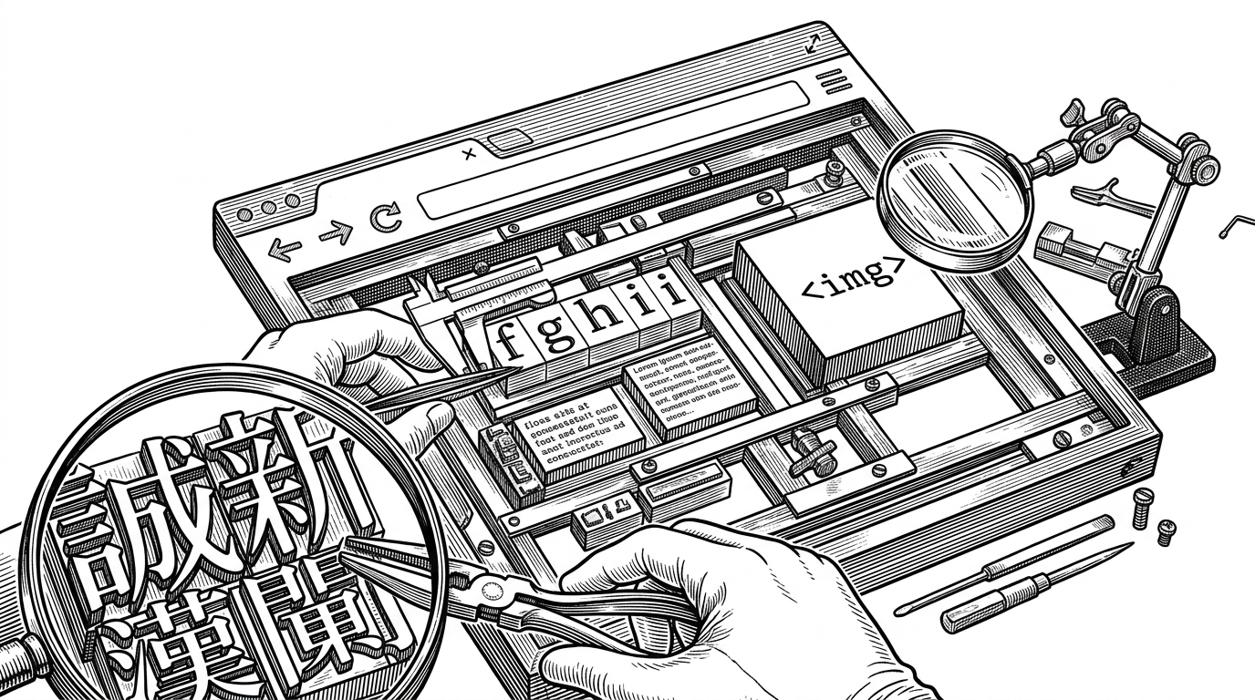
This is where the stack gets practical. Playwright and Chromium give the skill access to the full browser rendering model, which means flexbox, font faces, and sub-pixel anti-aliasing all work the way a designer expects them to work.
That matters most for CJK typography. A canvas library can place text, but a browser can typeset it. For a card meant to look polished on a phone, that difference is the whole game.
await page.goto(fileUrl);
await page.setViewportSize({ width, height });
await page.screenshot({ path: output, fullPage: true });
The repo is a skill stack, not a single trick

`ljg-card` sits inside a wider ecosystem. The repo also includes skills like `ljg-learn`, `ljg-plain`, `ljg-writes`, and `ljg-paper`, plus workflow chains such as `ljg-paper-flow` and `ljg-word-flow` that hand work from one skill to another.
值钱的不是 7 个 skill 本身,而是它把“理解内容 → 重写表达 → 视觉转译”做成了一套可拼装的工作流。
That is the real product strategy. The repo is not just shipping prompts. It is turning content work into a modular workflow where understanding, rewriting, and visual output can be chained together instead of handled in isolated tools.
What it replaces, and where it wins
| Approach | Layout logic | Typography | Adaptability | Output |
|---|---|---|---|---|
| `ljg-card` | LLM scores content first, then splits by visual weight | Browser-rendered CSS with strong CJK support | High, because structure can change with content density | Polished PNG cards |
| Fixed-template generators | Rules and slots decide everything up front | Often fine, but rigid | Low, because the template is the product | Static social cards |
| Canvas or PIL renderers | Manual placement or simple text flow | Functional, but less nuanced | Medium, but hard to make editorial | Raster images |
| AI note tools | Summarize or reorganize text, not render it | No real typesetting pipeline | High for notes, low for visual outputs | Text inside an app |
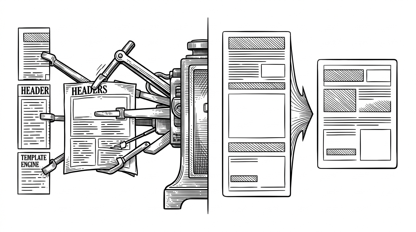
The win is not that `ljg-card` makes images. The win is that it decides structure first and presentation second. That is why it feels closer to editorial production than to a simple export button.
Why this feels like agentic design
The broader idea here is bigger than one repo. `ljg-skills` shows a pattern where the model does the reading, the editing, and part of the layout strategy, while the browser becomes the typesetter that makes the result concrete.
That is a useful split. It keeps the judgment where language models are strong and the rendering where browsers are strong. The result is not just automation. It is a design system with an editor in the loop.