gallery-web: Gallery’s Frontend Turns NFT Curation Into a Data System
A look at the Relay fragments, staged editor state, and mobile performance choices that make collector taste behave like software.
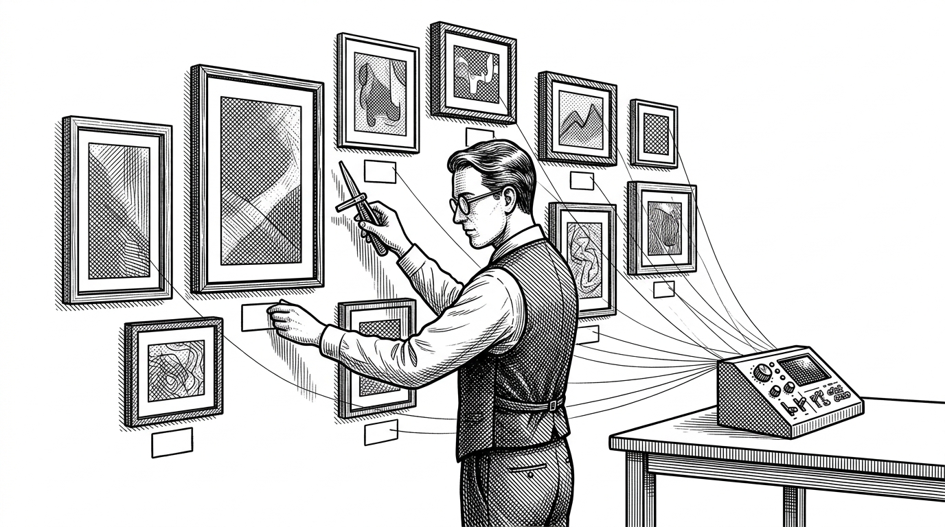
- Gallery’s frontend treats curation as a data model, so the product feels more like a publishing tool than a marketplace.
- Relay fragments give each component a narrow data contract, which keeps a highly visual UI resilient when NFT metadata is partial or missing.
- The editor is built around staged sections, turning arrangement and publication into a deliberate workflow instead of a loose drag-and-drop canvas.
- FlashList, Reanimated, and shared packages all serve the same goal: keep the experience premium while the same behavior spans mobile and web.
Gallery is not trying to win by being the biggest place to buy NFTs. It is trying to make collections look intentional. That sounds like a design preference, but in this codebase it becomes an architectural requirement.
The repository is a TypeScript-heavy monorepo built around React Native, Relay, and shared packages. That stack tells you the product is not optimized for raw trading flow. It is optimized for display logic, identity, and the messy reality of image-rich digital objects.
Curation is the product
The clearest thing about Gallery is what it is not. It is not a generic wallet dashboard, and it is not a commodity image gallery. Its core job is closer to publishing: arrange assets, present them cleanly, and make a collector’s taste legible to other people.
That changes the software problem. Once presentation becomes the main value, the app has to preserve visual consistency across partial data, different profile states, and multiple surfaces. The UI cannot just render what exists. It has to decide what deserves to be shown, in what order, and with what fallback behavior.
| Primary job | Gallery | OpenSea-style marketplace | Wallet-first profile |
|---|---|---|---|
| What the product is for | Curation and presentation | Buying and selling | Holding and verifying assets |
| What the UI optimizes for | Composition and display | Inventory and conversion | Balances and identity |
| How identity appears | Collector profile plus social graph | Account and transaction history | Addresses and holdings |
| How collections are assembled | Staged, authored, publishable | Listed or browsed as inventory | Usually incidental to custody |
| What success means | A collection feels published | A trade completes | A wallet is connected and recognized |
That comparison is the important one. Gallery is not denying the marketplace layer. It is simply solving a different problem class. The unit of value is not the token. It is the arrangement.
Why Relay is the right bet
Relay fits this app because Gallery is full of nested, image-heavy, partially complete records. NFTs bring collections, creators, metadata, avatars, ownership, and social context into the same screen. Relay’s fragment model lets each component declare exactly what it needs, instead of pulling a giant object through the tree and hoping it stays stable.
const nft = graphql`
  fragment NftPreviewInnerFragment on NFT {
    id
    name
    imageUrl
    collection {
      name
      slug
    }
  }
`;

function NftPreview(props: { nft: NftPreviewInnerFragment$key }) {
  const data = useFragment(nft, props.nft);
  return <PreviewCard nft={data} />;
}
That pattern matters because it changes the failure mode. If a field disappears or is still loading, the component boundary can catch the problem without taking down the whole feed. The result is a UI that can survive incomplete data and keep the rest of the screen alive.
The Gallery editor makes taste mutable
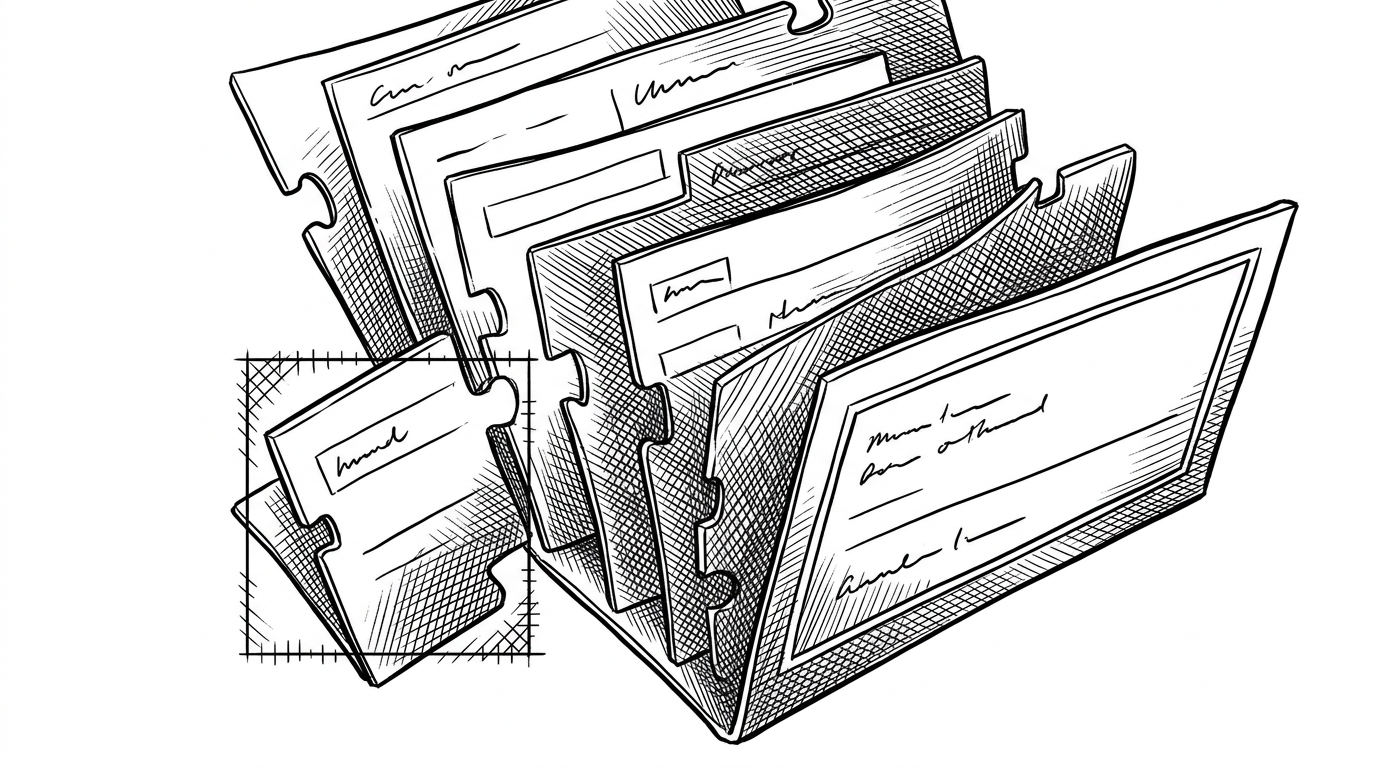
The editor is where Gallery stops being a viewer and becomes a tool. Staged sections create a draft state, which means a collector can compose a profile before it is published. That is a simple idea with a big effect: arrangement becomes intentional, not accidental.
This is a better mental model than a generic feed or drag-and-drop canvas. Gallery is not asking users to shuffle content around for its own sake. It is asking them to author a collection, then move that collection from private composition into public display.
| Editor behavior | Why it matters | What it replaces |
|---|---|---|
| Staged sections | Lets users compose before publishing | Instant, irreversible profile edits |
| Component-owned fragments | Each tile knows its own data needs | One giant editor payload |
| Boundary-based failure handling | One broken asset does not sink the page | All-or-nothing rendering |
| Shared render logic | Keeps web and mobile behavior aligned | Surface-specific one-off implementations |
The important design move is not just interactivity. It is persistence of intent. Once the app models a draft collection as its own state, the editor can support premium behaviors like rearranging, previewing, and publishing without turning the interface into a fragile pile of local assumptions.
How the feed stays fast
Gallery’s feed is image-heavy, gesture-heavy, and likely unforgiving. That is why the repository leans on FlashList and Reanimated. In a normal content app, smoother scrolling is nice. In a visual identity app, it is part of the product promise.
FlashList helps recycle rows so the interface does not thrash under a long stream of artwork and profile cards. Reanimated handles motion and interaction without forcing the whole screen through expensive rerenders. Together, they keep the app feeling polished even when the underlying content is expensive to paint.
| Layer | Standard list behavior | Gallery’s choice |
|---|---|---|
| Scrolling | Frequent jank on heavy rows | Recycled rows with FlashList |
| Gesture feedback | Often tied to React rerenders | Animated on the UI side with Reanimated |
| Visual density | Images can overwhelm the viewport | Performance tuned for premium browsing |
| User perception | Feels like a feed | Feels like a curated exhibition |
Authentication, identity, and the Web3 mess
Web3 identity is usually a pile of addresses, signatures, and loosely connected profiles. Gallery tries to collapse that into something more human. Privy, Farcaster, and wallet data become part of a single profile story instead of separate authentication systems competing for attention.
That matters because collectors do not think in provider names. They think in identity continuity. If I am recognized on one device, with one wallet, and across one social profile, then the app feels coherent. If not, it feels like a stack of integrations.
| Identity model | User experience | Risk |
|---|---|---|
| Wallet-only | Precise but cold | Users look like addresses |
| Social-only | Familiar but incomplete | Ownership is detached |
| Gallery’s approach | Wallets and profiles converge | More moving parts, but better continuity |
What the monorepo buys them
The monorepo is not just engineering hygiene. It is the thing that lets Gallery keep its behavior aligned across mobile and web while still letting mobile lead the product. Shared packages keep data contracts, business logic, and UI expectations from drifting apart.
Moon and Yarn PnP are the quiet signal here. This is a repo that has already paid the complexity tax of scale. The payoff is consistency: the same collection logic, the same fragment contracts, and the same identity assumptions can move across surfaces without being rebuilt from scratch every time.
That is the product strategy in engineering form. Gallery wants a single collection model to survive two interfaces, one mobile-first and one web-facing. The repo structure exists to make that possible.
Why this frontend stands out
Gallery is interesting because it treats curation as a system problem. The app is not just rendering NFTs. It is enforcing data boundaries, staged composition, and a performance profile that matches a premium visual product.
That is a rarer ambition than it first appears. Most crypto interfaces are built around transaction completion. Gallery is built around presentation quality. That difference explains almost every technical choice in the repository.