openai/apps-sdk-ui: The design system that teaches apps how to feel native inside ChatGPT
A deep dive into the host-aware component layer, data-attribute styling, and responsive patterns that let third-party widgets disappear into a moving interface.
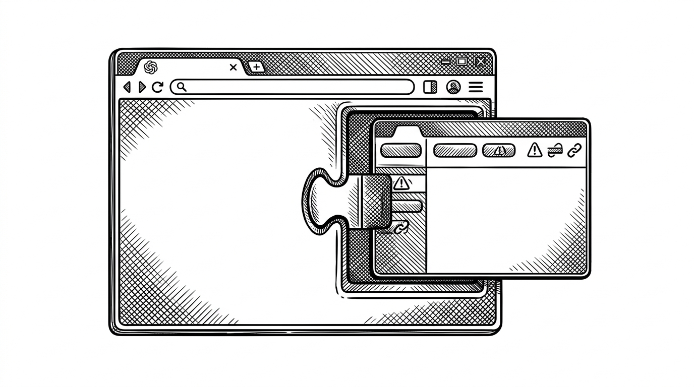
- openai/apps-sdk-ui is a host-aware contract for UI inside ChatGPT, not a generic component library for the public web.
- Its most interesting trick is to turn declarative props into data attributes and CSS behavior, which keeps the React layer thin.
- Container-aware components like Alert show that the library expects its environment to change width and adapts before the layout breaks.
- The provider layer matters because routing and link behavior are injected, so the kit can stay agnostic while still feeling native.
Most component libraries start with a palette and a box of primitives. openai/apps-sdk-ui starts with a harder problem: how do third-party widgets feel native inside a host that owns the frame, the routing, and the available width?
The UI kit is not the point. The host experience is.
That constraint changes the design brief. A button is not just a button, because it has to cooperate with the surrounding surface. An alert is not just an alert, because the available space can shrink under it. A link is not just a link, because the host may want to own routing. The repo reads less like a generic UI kit and more like a translation layer between React and a chat host.
Apps SDK UI is a lightweight, accessible design system for building high-quality ChatGPT apps with the Apps SDK. It provides Tailwind-integrated design tokens, a curated React component library, and utilities optimized for consistent experiences inside ChatGPT.
What OpenAI is standardizing
This repository is not trying to compete as a broad, everything-for-everyone design system. It is standardizing a vocabulary for ChatGPT apps: buttons, alerts, links, icons, tokens, and the behavior that ties them together. That vocabulary matters because the host is part of the product. If the surface is wrong, the app feels off even when the logic is right.
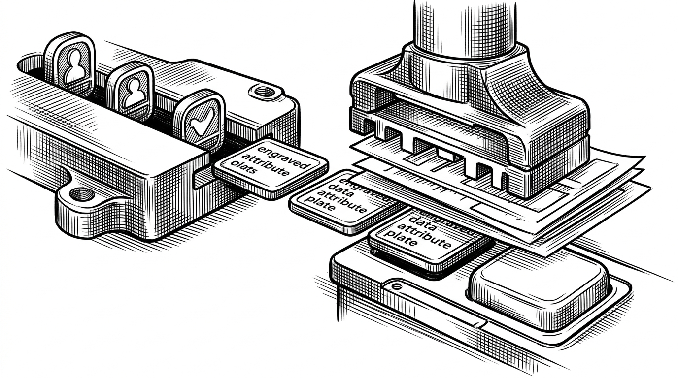
The trick is in the props-to-CSS pipeline
The repo's most elegant move is to keep the component API declarative while pushing the visual logic into attributes, selectors, and CSS variables. In practice, that means a component can expose a clean prop surface, then let the stylesheet decide how those states should look inside the host. The result is less string building in JavaScript, fewer style branches, and a clearer contract between component logic and presentation.
function Button({ size, variant, color, disabled, inert, children }) {
  return (
    <button
      data-size={size}
      data-variant={variant}
      data-color={color}
      data-disabled={disabled ? '' : undefined}
      aria-disabled={disabled || inert}
      disabled={disabled || inert}
    >
      {children}
    </button>
  )
}
That pattern is more than tidy code. It makes state legible in the DOM, keeps styling close to the component, and preserves room for the host to impose its own constraints. In a surface like ChatGPT, that is the right trade. The component should describe intent, then let the environment finish the job.
A button is not just a button
The Button implementation shows the library's philosophy in miniature. Variant, size, color, disabled, and inert are not stuffed into sprawling utility strings. They become explicit states that CSS can target. That also lets the component distinguish between being visually disabled and being inert during a transition, which is a small detail with a big accessibility payoff.
export function AppsSDKUIProvider({ LinkComponent, children }) {
  return (
    <Provider value={{ LinkComponent }}>
      {children}
    </Provider>
  )
}
The provider is the other half of the contract. Routing is injected instead of hard-coded, so a ChatGPT app can keep the library agnostic and still make links behave like they belong in the host. That is the same philosophy as the button example: define the surface cleanly, then let the environment supply the missing context.
The layout adapts when the container gets tight
Alert is the clearest example of container awareness. When the action area becomes too wide for the available space, the component can shift from a side-by-side layout to a stacked one. That is not a decorative flourish. It is a practical response to an embedded environment where the same widget may appear in a sidebar one moment and a wider canvas the next.
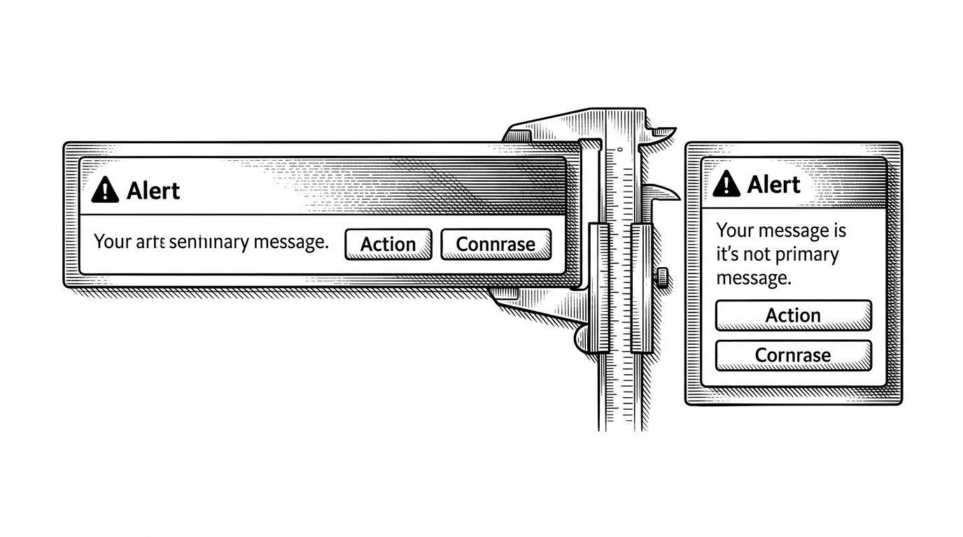
That is the kind of detail you only build when the host matters. A generic component library can assume the page controls the width. This library cannot. It has to survive inside a chat interface that may present the same app under different constraints, so it watches the container and adapts before the layout breaks.
What this beats, and what it does not
The right comparison is not whether this is better than MUI or shadcn/ui in the abstract. It is whether those libraries solve the same problem. They do not. They are broader, more flexible, and more general. apps-sdk-ui is narrower on purpose, because it is optimized for a single environment where host awareness is a feature, not an afterthought.
| Library | Optimizes for | Host awareness | Trade-off |
|---|---|---|---|
| apps-sdk-ui | ChatGPT apps that must feel native inside a host | Built in, through attributes, provider injection, and container-aware layouts | Narrow outside the Apps SDK context |
| MUI | General product interfaces | Manual | Broad and powerful, but not host-specific |
| shadcn/ui | Composable app building blocks | Manual | Fast to start, but you own the system design |
| Tailwind only | Custom one-off interfaces | Whatever you implement | Maximum freedom, maximum repetition |
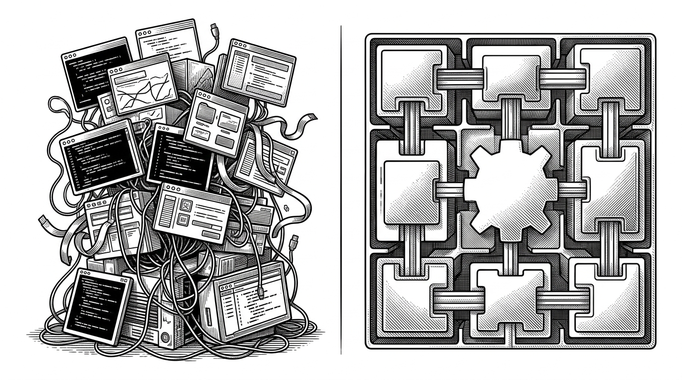
That is the sharpest reading of the repository. It does not promise a universal future for UI. It promises a believable one for ChatGPT apps, where the interface is part of the conversation and the host is never really out of the frame.
The broader bet on AI-native UI
The larger idea here is not that every app should live inside chat. It is that conversational products are starting to need a real interface discipline, not just a transcript and a few buttons. openai/apps-sdk-ui is an early sign of that shift. It shows what happens when a model, a host, and an embedded app are all treated as parts of the same design system.