Shithub: The Small GitHub Clone That Treats the Repo URL as the Product
A Next.js rebuild of GitHub’s core browsing flow, where routing, file navigation, and repo chrome do almost all the work.
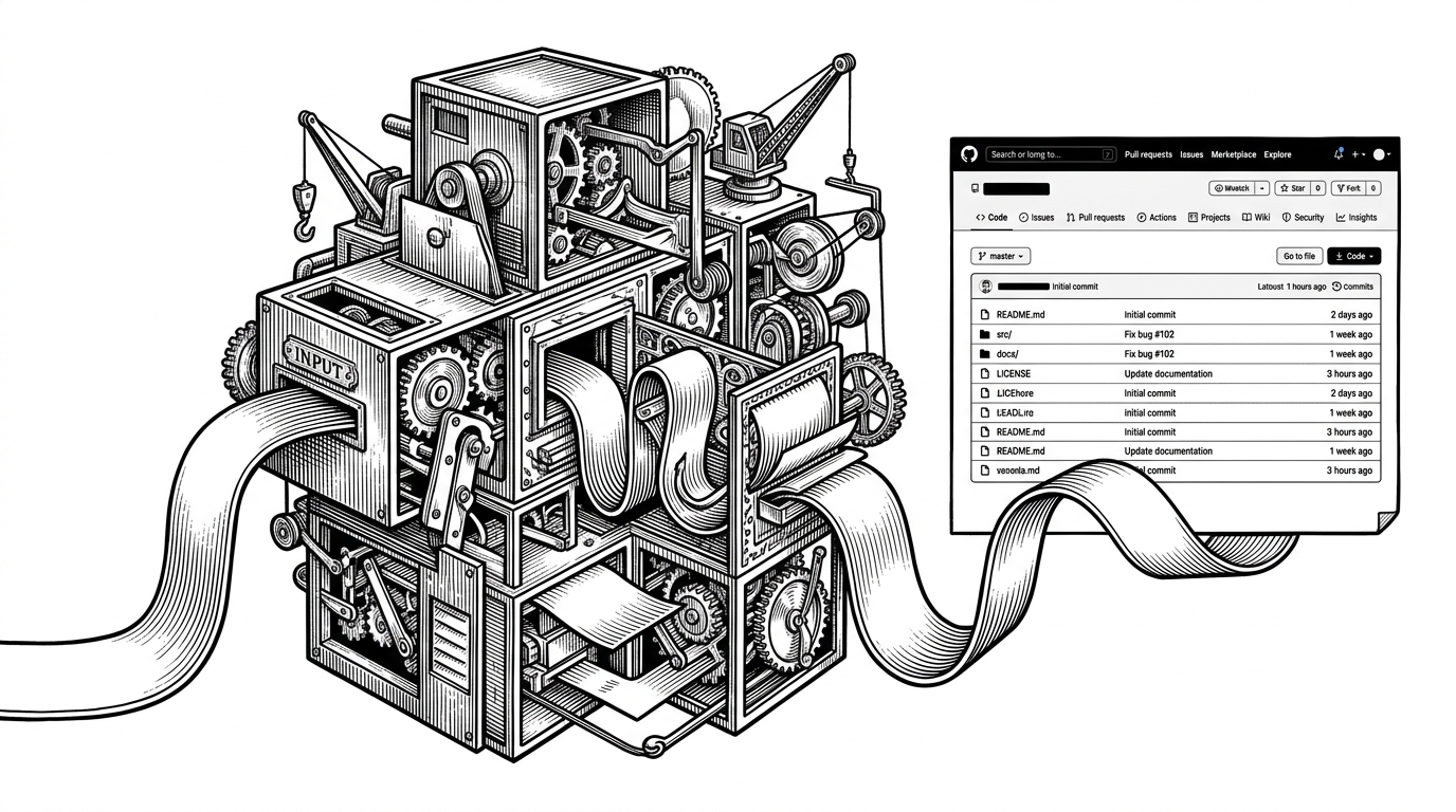
- Shithub shows that a repository can feel real when the URL grammar, header, tabs, and file tree all line up.
- The file explorer is the emotional center of the clone because it turns navigation into the product itself.
- Its Next.js route structure mirrors owner, repo, and path states, so the interface behaves like a small state machine.
- As a clone, it reads less like a replacement for GitHub and more like a critique of how little surface area a repo browser truly needs.
Shithub is not trying to rebuild GitHub’s universe. It is trying to make a repository feel believable with the fewest possible moving parts. That is the useful idea here, because repo browsers are mostly a grammar problem, not a feature-count contest.
The entire product is a URL
The project’s structure tells the story before the UI does. The important routes are organized around owner, repository, and nested path segments, which means the app’s shape is already baked into the address bar.
const appRoutes = [
  '/',
  '/:owner',
  '/:owner/:repo',
  '/:owner/:repo/*segments',
];

// Conceptually, the catch-all path drives the repo shell,
// the repo nav, and the file explorer state.
That is a smart place to start. Once the route model matches the mental model of a repo browser, the rest of the interface can stay spare and still feel complete.
What Shithub copies, and what it leaves out
| Dimension | GitHub | Shithub | Why it matters |
|---|---|---|---|
| Primary unit | A platform with code, people, issues, and workflows | A repo browser built around owner, repo, and path | The clone keeps the unit of interaction narrow and legible |
| Navigation model | Many parallel entry points | A route hierarchy that mirrors repository structure | The URL itself becomes the map |
| Visual density | High, with lots of product chrome | Lower, with only the signals needed for recognition | Less clutter makes the illusion easier to read |
| Collaboration depth | Full social and workflow layer | Mostly browse-first | The project is about discovery, not orchestration |
| Product ambition | A complete developer platform | A focused interface study | The scope tells you this is a design argument, not a vendor pitch |
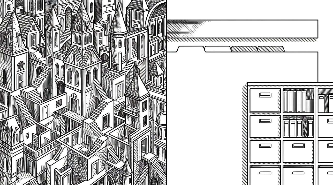
The omission is the point. There is no need for an activity feed, a social graph, or a big collaboration layer when the article of faith is browsing a repo cleanly. The clone narrows itself to the interaction that matters most here: moving through structure.
Why the file explorer does most of the work
In a project like this, the file tree is not a sidebar. It is the proof that the browser works. Once the explorer responds to path state, the whole page starts to feel more complete than it actually is.
That is why the repo header and nav matter so much. They do not need to be exhaustive, they only need to stay consistent while the explorer changes, because continuity is what sells the illusion of a real repository.
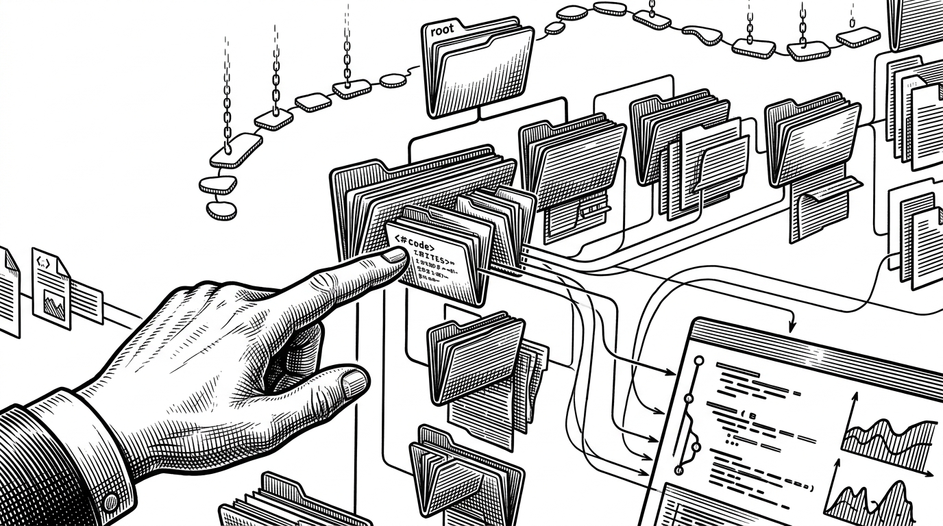
That is the design lesson hiding in plain sight. A small number of repeated cues, like breadcrumbs, tabs, and a stable tree view, can make a browser feel much richer than its feature list suggests.
Inside the app shell
The likely technical shape here is straightforward Next.js App Router composition. The route files map cleanly onto the product states, and the catch-all segment gives the app a way to render different levels of repository context without changing the overall shell.
// The important part is the route hierarchy.
// Each deeper segment reveals another layer of repo context.

export const routeMap = {
  home: "/",
  owner: "/[owner]",
  repo: "/[owner]/[repo]",
  path: "/[owner]/[repo]/[[...segments]]",
};
The filename pattern matters because it mirrors how people think about repositories. A path is not just a string here, it is state, and the app can keep its shell intact while the content underneath changes.
That is a clean use of the App Router. The folder names become the mental model, and the mental model becomes the interface.
A clone is also a critique
Shithub works because it exposes how much of GitHub’s recognizability lives in a small set of stable patterns. The address bar, the repo header, the tabs, and the file list do most of the persuasion. Everything else is expansion.
That makes the project more interesting than a novelty clone. It is a reminder that product identity often lives in information architecture, not in feature breadth. If the path grammar is right, the rest can be surprisingly minimal.
| Product | What defines it | What you notice first | What Shithub borrows |
|---|---|---|---|
| GitHub | A full developer platform | The ecosystem and the social layer | The familiar repo browsing grammar |
| Shithub | A narrow repository browser | The route-driven shell and file explorer | The minimum set of cues needed to feel real |
| SourceHut or Codeberg | Opinionated hosting with different priorities | A clearer philosophy and lighter collaboration layer | Proof that Git hosting can be shaped by interface choices |
That is why tiny clones are worth reading. They are not trying to win on scope. They make the original system easier to see.
What this project teaches builders
For builders, the lesson is practical. If your product has a strong navigation grammar, you do not need to drown users in surface area to make it feel complete. You need consistency, a few durable cues, and a shell that never loses orientation.
Shithub is useful because it compresses that lesson into a small codebase. It shows that a repo browser can be persuasive when the URL, the layout, and the explorer all tell the same story.
- Match your route structure to the way users think about the object they are browsing.
- Let a few stable interface primitives do the work of a much larger product.
- Treat a deliberately narrow clone as a design probe, not just a joke project.