Swiggy-End-To-End-Data-Analytics: Swiggy End-To-End Data Analytics: When a Churn Model Becomes a Retention Playbook
A portfolio project that moves from SQL and Power BI to machine learning and a Flask app, then turns customer risk into concrete business action.
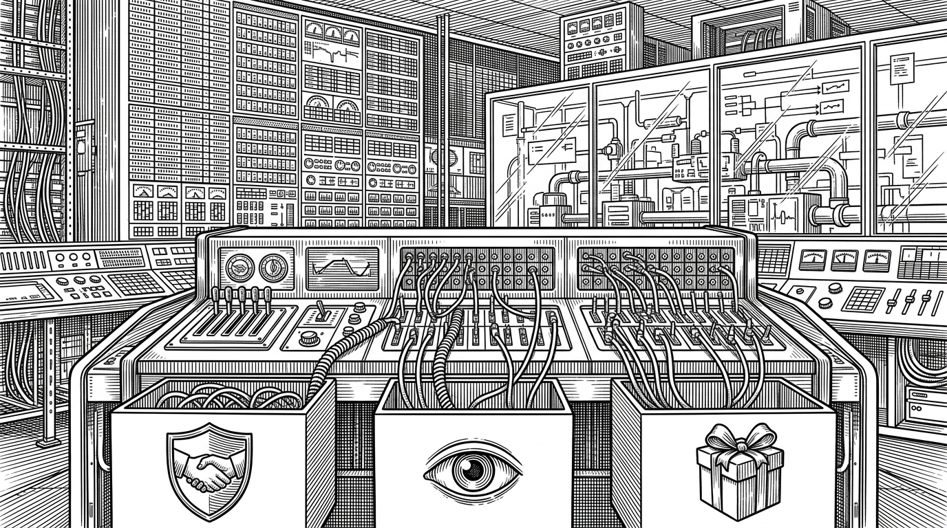
- This repo stands out because it turns churn prediction into a retention decision, which is where analytics starts paying rent.
- SQL, Power BI, the notebook, and Flask each handle a different layer of the same business problem instead of repeating one another.
- The project feels complete because it closes the loop from raw data to model output to recommended action.
- Its biggest weakness is not the stack, but the fact that the product story is stronger than the production story.
Most portfolio analytics repos stop when the model produces a probability. This one keeps going. In parlhad/Swiggy-End-To-End-Data-Analytics, the useful output is not just churn risk. It is a suggested response: discount, monitor, or push a premium offer. That is the difference between predictive analytics and prescriptive analytics.
Not a churn score. A retention decision.
The strongest detail in the repo is in `app.py`. The app does not just surface a score and leave the user to interpret it. It turns that score into an action band. That small design choice changes the entire project from a dashboard demo into a decision system.
The primary objective of this project is to create an interactive Power BI dashboard for analyzing food delivery data from Swiggy.
How the repo turns raw orders into a business system
The pipeline is cleanly layered. Raw CSVs live in `Data/`. SQL defines the schema and business queries. Power BI handles diagnostic reporting. The notebook trains a churn model. Flask and Docker wrap the result so a non-technical user can interact with it.
| Project type | What it produces | What decision it supports | Where it stops short | Why this repo goes further |
|---|---|---|---|---|
| Dashboard-only portfolio | Charts and KPIs | Describes the business | Stops at diagnosis | Adds prediction and action |
| Notebook-only churn model | A probability score | Ranks risk | Stops at modeling | Maps risk to a response |
| Generic end-to-end demo | A stitched stack | Proves tooling | Stops at integration | Closes the loop from data to retention playbook |
The database is the first model
`SQL/schema.sql` is doing more than storage work. It defines the source of truth, cleans inconsistent IDs, and precomputes business questions that matter to a revenue team. That includes customer value, restaurant performance, geography, and rankings. In other words, the database is already expressing a point of view about the business.
-- Schema and cleaning logic shape the analytical backbone
CREATE TABLE users (
  user_id INT PRIMARY KEY,
  name VARCHAR(100),
  city VARCHAR(100),
  gender VARCHAR(20)
);

-- Example of the cleanup pattern used in the project
NULLIF(REGEXP_REPLACE(restaurant_id, '[^0-9]', '', 'g'), '')::INT AS restaurant_id_clean;

-- A business query pattern seen throughout the file
SELECT r.city, r.restaurant_name,
       RANK() OVER (PARTITION BY r.city ORDER BY COUNT(o.order_id) DESC) AS city_rank
FROM orders o
JOIN restaurants r ON o.restaurant_id = r.restaurant_id
GROUP BY r.city, r.restaurant_name;
That matters because analytics projects often treat SQL as a necessary prelude. Here it is part of the product logic. It defines what counts, how it is joined, and which comparisons the business can trust.
The dashboard asks the right questions
Power BI is not the main event, but it is not window dressing either. It gives the project a diagnostic layer before the model tries to make a prediction. That is useful. A team should understand where the problem lives before it decides how to intervene.
The dashboard’s value is organizational, not cosmetic. It separates users, cities, restaurants, and overall insights into views that are easy to scan. For a PM or analyst, that means the conversation starts with the business shape of the problem instead of the ML output.
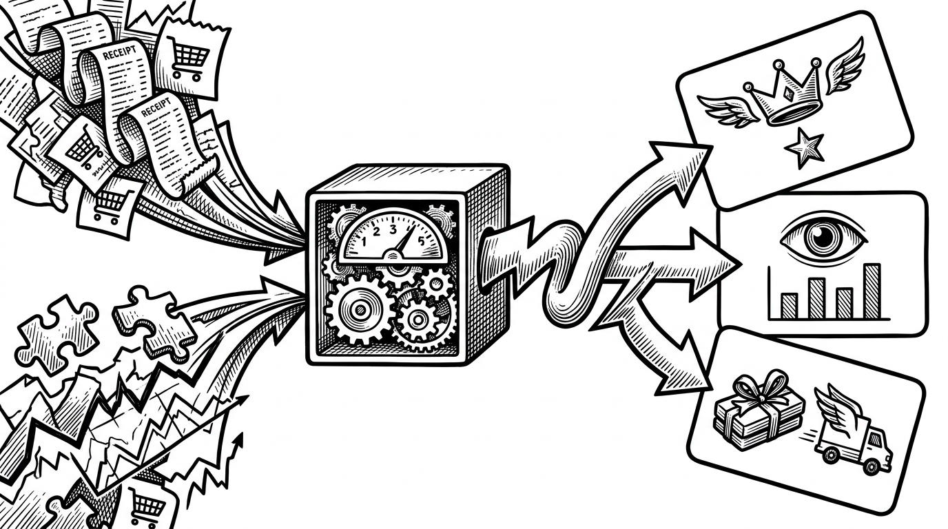
The notebook turns history into risk
The notebook is where the project becomes predictive. It uses feature engineering, label encoding, and a tree-based classifier to estimate churn. That is standard enough. The interesting part is the context: the README signals a high churn rate, which makes class imbalance central, not incidental.
That explains the modeling choices. When churn is skewed, accuracy is a trap. ROC-AUC is the right kind of evaluation because it asks whether the model can rank risky users above safer ones. That is more useful for a retention workflow than a single yes-or-no label.
from sklearn.preprocessing import LabelEncoder
from sklearn.ensemble import RandomForestClassifier
from sklearn.metrics import roc_auc_score

# Encode categorical features
le_city = LabelEncoder()
df['City_enc'] = le_city.fit_transform(df['City'])

# Train churn model
model = RandomForestClassifier(n_estimators=200, random_state=42)
model.fit(X_train, y_train)

# Evaluate ranking quality
probs = model.predict_proba(X_test)[:, 1]
auc = roc_auc_score(y_test, probs)
Designed a Swiggy-themed Power BI dashboard to analyze sales, user activity, and restaurant performance. Used Power Query and DAX to clean data, create KPIs, and deliver interactive visual insights.
Why this portfolio project feels complete
Compared with a dashboard-only repo, this one has a real downstream use. Compared with a notebook-only churn model, it has a user-facing interface. Compared with many end-to-end demos, it does not just prove that the stack works. It shows how the stack supports a business decision.
| Signal | What it suggests |
|---|---|
| SQL schema and cleaning | The project starts with data integrity |
| Power BI views | The project understands the business problem |
| RandomForest model | The project can rank churn risk |
| Flask app with action bands | The project is meant to trigger action |
There are limits, and they matter. This is still a solo portfolio repo, not a team-hardened product. The notebook environment appears fragile, and the public footprint is small. But those limits do not weaken the central insight. They make it easier to see the idea in its pure form.
The idea is simple and strong: analytics is only valuable when it changes a decision. This repo gets there by letting SQL define the facts, Power BI frame the business, machine learning rank the risk, and Flask tell the operator what to do next.