Inside `ridham1404/Flight_Price_Prediction`: How Raw Flight Records Become a Price Model That Actually Learns the Booking Window
A clean notebook pipeline shows why airline pricing is less about the algorithm and more about turning dates, durations, and departure times into signals a Random Forest can use.

We will analyze this dataset using Machine learning techniques in order to predict the flight ticket price based on the features provided in the columns of the dataset.
- This repo wins by translating messy airline booking fields into signals that expose the booking window, not by chasing a clever model class.
- Its strongest feature engineering is temporal: journey date, departure and arrival times, duration, and days left become the real predictive surface.
- Random Forest fits because the fare structure is nonlinear and threshold-driven, so the model can exploit jumps without needing a smooth equation.
- The notebook reads like a clean teaching template for junior data science work because the preprocessing, modeling, and cleanup stay legible.
The Real Product Is Not the Model, It’s the Translation
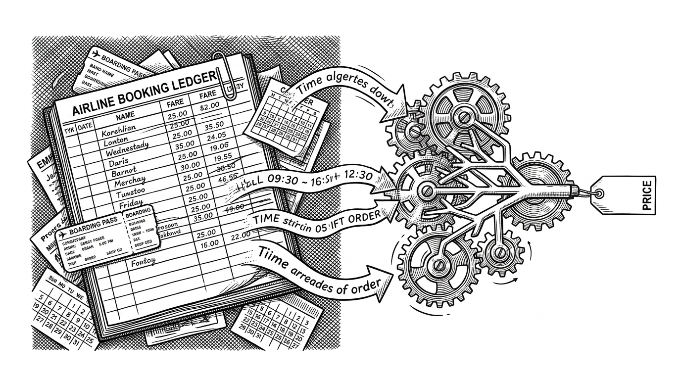
Flight pricing looks like a regression problem, but the repo treats it like a translation problem. Human-facing fields such as Date_of_Journey, Dep_Time, Arrival_Time, and Duration are not useful to a model until they are split, normalized, and turned into numeric signals.
That is the interesting part here. The notebook does not rely on a fancy architecture to create value. It gets value from making airline booking chaos legible enough for a tree-based regressor to see patterns in it.
Why Booking Window Beats Guesswork
The conceptual center of the repo is the booking window, captured here as Days Left. Airline fares rarely move in a straight line. They jump when inventory shifts, demand spikes, or the departure date gets close enough to squeeze out last-minute premiums.
That makes Days Left unusually valuable. It compresses timing into a signal that a Random Forest can use directly, and it explains why the project feels stronger than many flight-price notebooks that stop at raw timestamps.
How the Notebook Turns Strings Into Signals
The notebook’s most useful move is not training the model. It is the parsing layer that turns text into structure. Journey dates are split into day, month, and year. Departure and arrival times become hour and minute fields. Duration strings such as 2h 50m become a single numeric value measured in minutes.
for col in df.select_dtypes(include='object').columns:
    df[col] = df[col].astype(str).str.strip()

# Typical feature engineering pattern in the notebook
# Date_of_Journey -> Journey_day, Journey_month, Journey_year
# Dep_Time -> Dep_Hour, Dep_Minute
# Arrival_Time -> Arrival_Hour, Arrival_Minute
# Duration -> duration_to_minutes(duration)

# days_left = trip_date - booking_date
That utility layer matters because flight data is full of mixed formats. Time strings, dates, categorical labels, and free-form duration text all need different treatment. Once they are normalized, the model gets a clean feature space instead of a pile of loosely related strings.
Why Random Forest Fits This Dataset
Random Forest is a sensible choice here because airfare behavior is nonlinear. Prices respond to thresholds, not smooth gradients. They also depend on interactions between stops, airline, timing, and journey date, which makes a tree ensemble a good match.
| Model style | Main strength | Tradeoff | Best fit |
|---|---|---|---|
| Random Forest in this repo | Handles mixed signals and threshold effects well | Less aggressive on squeezing out the last bit of accuracy | Readable regression work with engineered features |
| Linear regression | Easy to explain and fast to train | Struggles with jumps and interactions | Baseline checks |
| XGBoost-heavy projects | Often stronger raw performance | More tuning and less pedagogical clarity | Benchmark chasing |
| Streamlit or Flask flight apps | Easy to demo to users | Sometimes thin on feature craftsmanship | Portfolio deployment |
The comparison is not about declaring a winner. It is about fit. This repo is optimized for clarity and learning, while many competitors optimize for deployment polish or leaderboard gains.
What Clean Notebook Hygiene Looks Like
The repository’s discipline shows up in small things. The allow-list style .gitignore keeps the repo from filling up with notebook clutter and model artifacts. The project stays focused on the notebook, the dataset, and the documentation instead of drifting into file sprawl.
That matters because most student data science repos are messy in predictable ways. This one keeps the surface area tight. It is easier to inspect, easier to reproduce, and easier to learn from.
| Repo type | Main goal | Strength | Tradeoff | Best for |
|---|---|---|---|---|
| ridham1404/Flight_Price_Prediction | Teach regression on flight data | Feature engineering stays visible | Not built for app deployment | Learning and reference |
| Streamlit flight price app | Create a user-facing demo | Interactive and easy to show | Can hide the model details | Portfolio demos |
| Flask or FastAPI project | Serve predictions through an API | Closer to production patterns | More plumbing than insight | Backend-minded builders |
| XGBoost benchmark repo | Push predictive accuracy | Strong model performance | Less readable as a teaching artifact | Performance-focused comparison |
How It Compares to More Production-Oriented Flight Projects
The repo sits in a different lane from the deployment-first flight apps you see on GitHub. Streamlit and Flask projects are built to be clicked. XGBoost-heavy projects are built to be benchmarked. This one is built to show how the signal is made in the first place.
That is a useful niche. The repo is not trying to be the final product. It is a clean, legible intermediate artifact that explains how a travel-price dataset becomes a working regression pipeline.