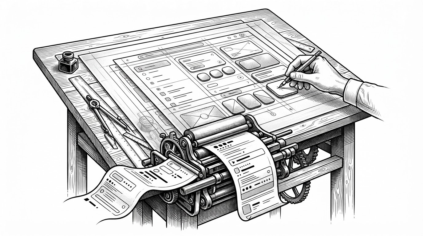
Kami: The Design System That Teaches AI to Typeset Like an Editor
A print-first document engine built on templates, typography constraints, and agent instructions that turn raw text into polished PDFs and slides.
A lightweight, declarative, and composable UI library for building web components.
- Kami’s real invention is not templates, but enforced restraint that makes AI-generated documents look edited instead of assembled.
- The repository turns typography, layout rules, and build validation into one production pipeline for print-safe output.
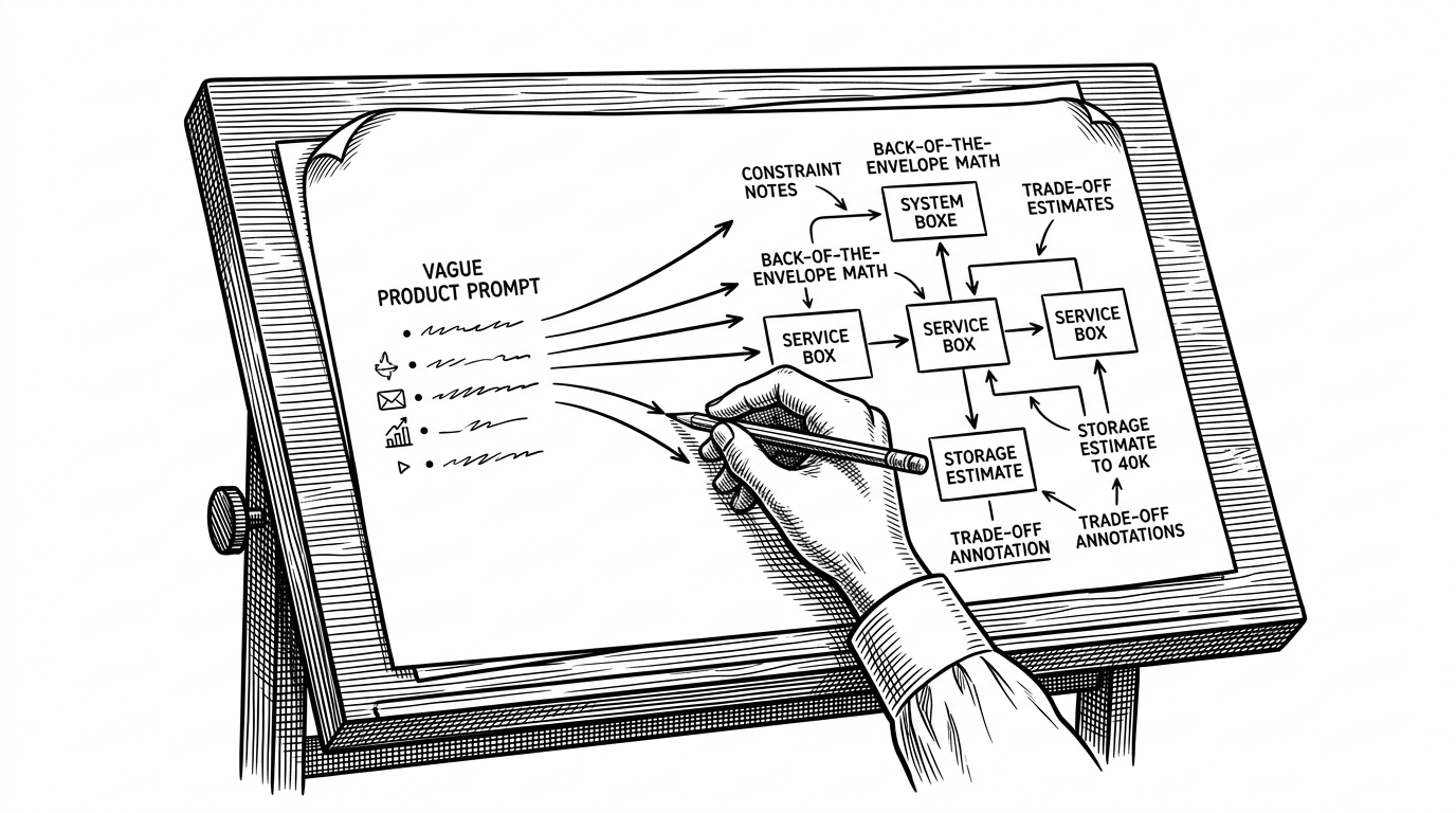
- SKILL.md acts like a decision layer for agents, routing vague requests into the right document type before generation starts.
- The project is a design system for editorial authority, not a general-purpose UI framework.
Most design systems try to help software look consistent. Kami is trying to help documents look authoritative. That difference changes everything, from the palette down to the rendering engine.
The repo reads like a refusal of default web taste. No dashboard gray. No flashy gradients. No loose typography. Instead, Kami pushes every document through a narrow set of choices that make the final PDF feel intentional.
The quiet system that refuses to look like software
Kami is built around a simple bet: if you reduce freedom early, you get better output later. The project is organized around templates, references, scripts, and a skill file that tells an AI agent how to behave like a careful production designer.
The constraint philosophy
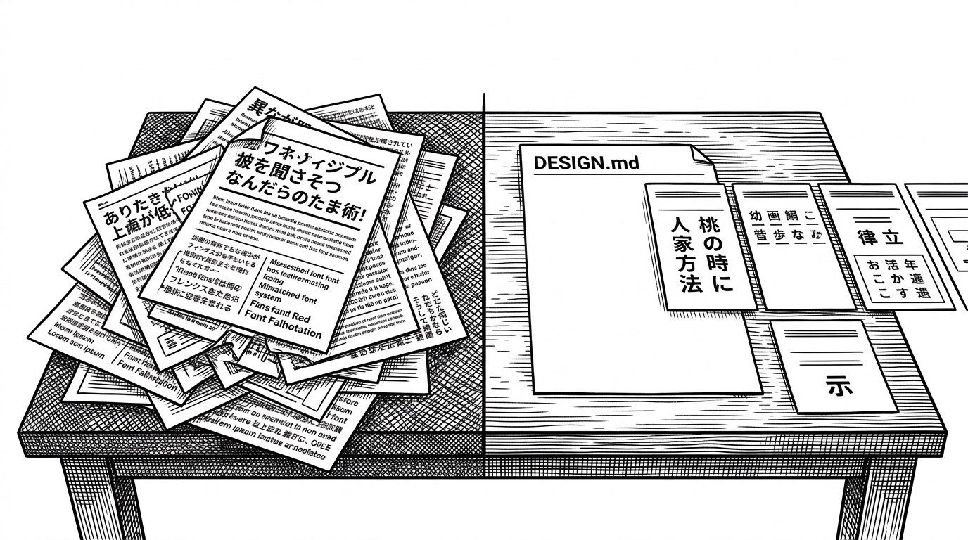
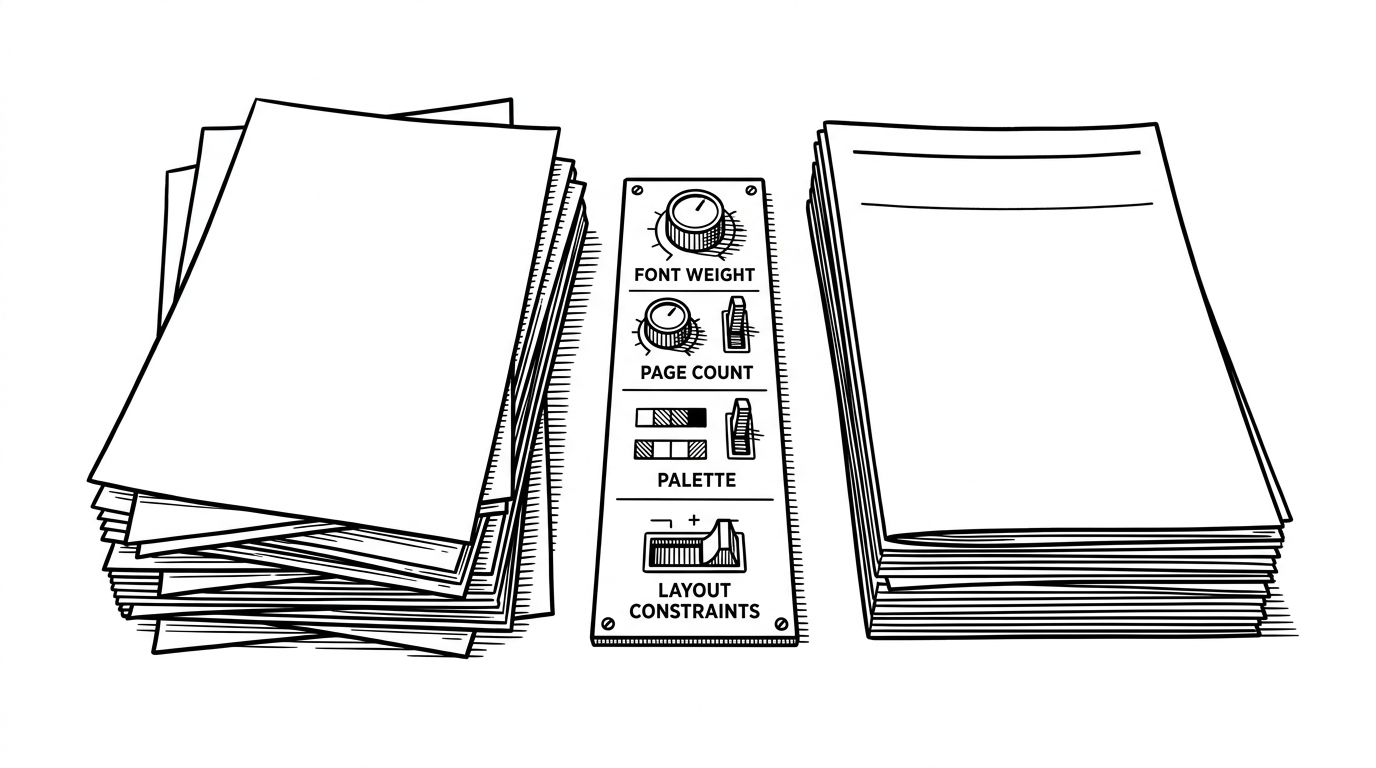
Kami’s visual identity is built from restrictions that would feel hostile in a general app framework. The codebase favors solid hex colors, warm neutrals, and a tight typographic system. It avoids the usual web habit of solving every problem with another weight, another shade, or another layer of chrome.
:root {
  --paper: #f5f4ed;
  --ink: #1b365d;
  --olive: #5a6b4f;
  --stone: #8a8476;
  --sand: #c8bfa8;
}

body {
  background: var(--paper);
  color: var(--ink);
  font-family: "Newsreader", serif;
}

/* The point is not decoration. The point is restraint. */
Those choices are not cosmetic. They make the output safer for PDF generation and more coherent as a visual language. In other words, the style is a compatibility layer.
Templates as semantic containers
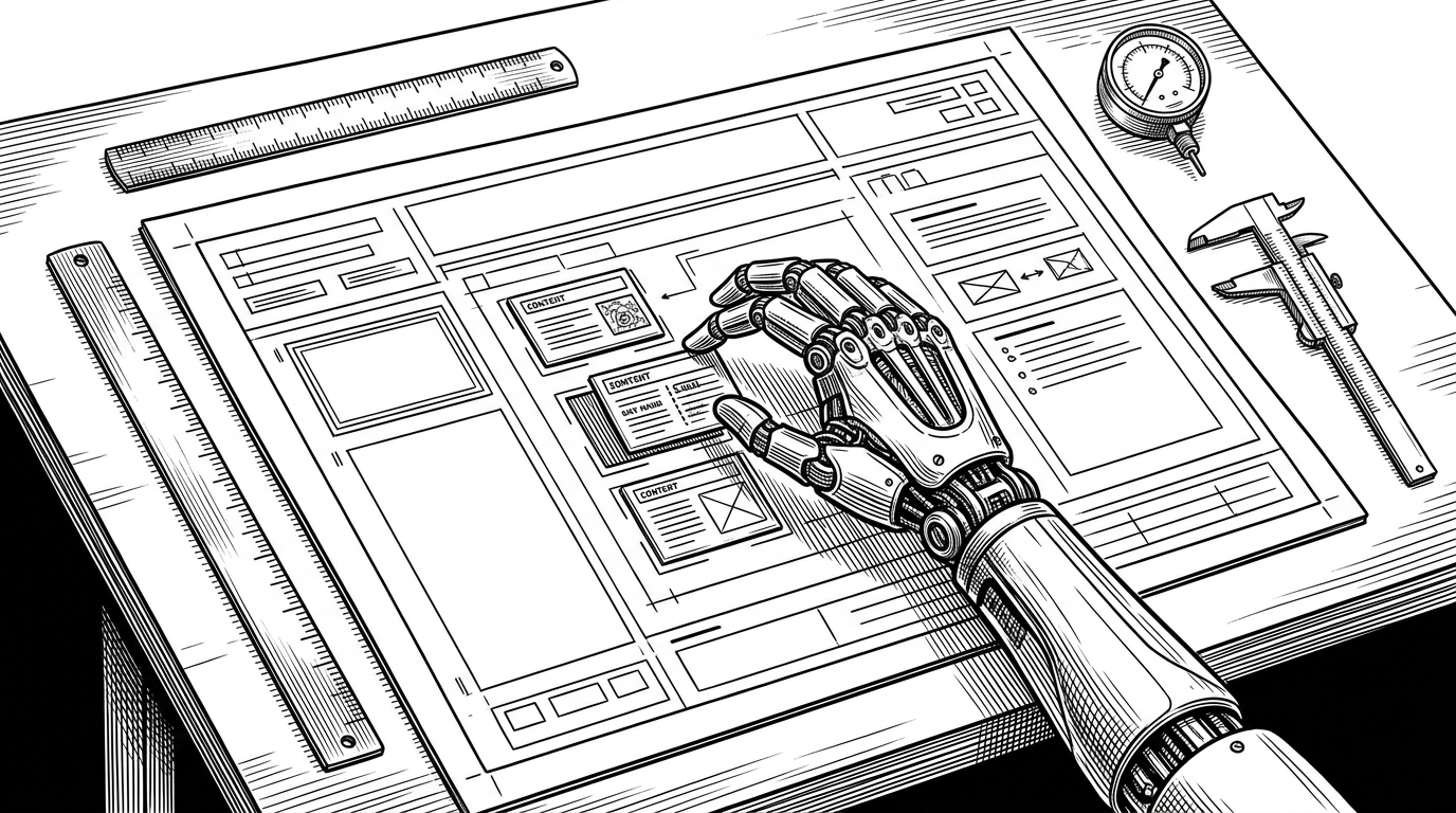
The template system is the project’s spine. Rather than one flexible layout that tries to do everything, Kami ships document archetypes: resume, one-pager, long doc, letter, portfolio, and slides. Each template signals intent before any content is rendered.
That is a small architectural choice with a big effect. A template is not just a layout. It is a promise about length, structure, and audience.
SKILL.md is the real interface
The most modern part of the repo is not the CSS. It is the instruction layer in SKILL.md. That file behaves like an operating manual for AI agents: detect language, map intent, check for missing information, then route the content into the correct document shape.
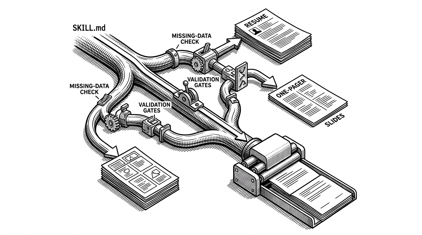
That gap check matters more than it sounds. A lot of AI tools are good at producing text and bad at noticing what is missing. Kami makes omission part of the workflow.
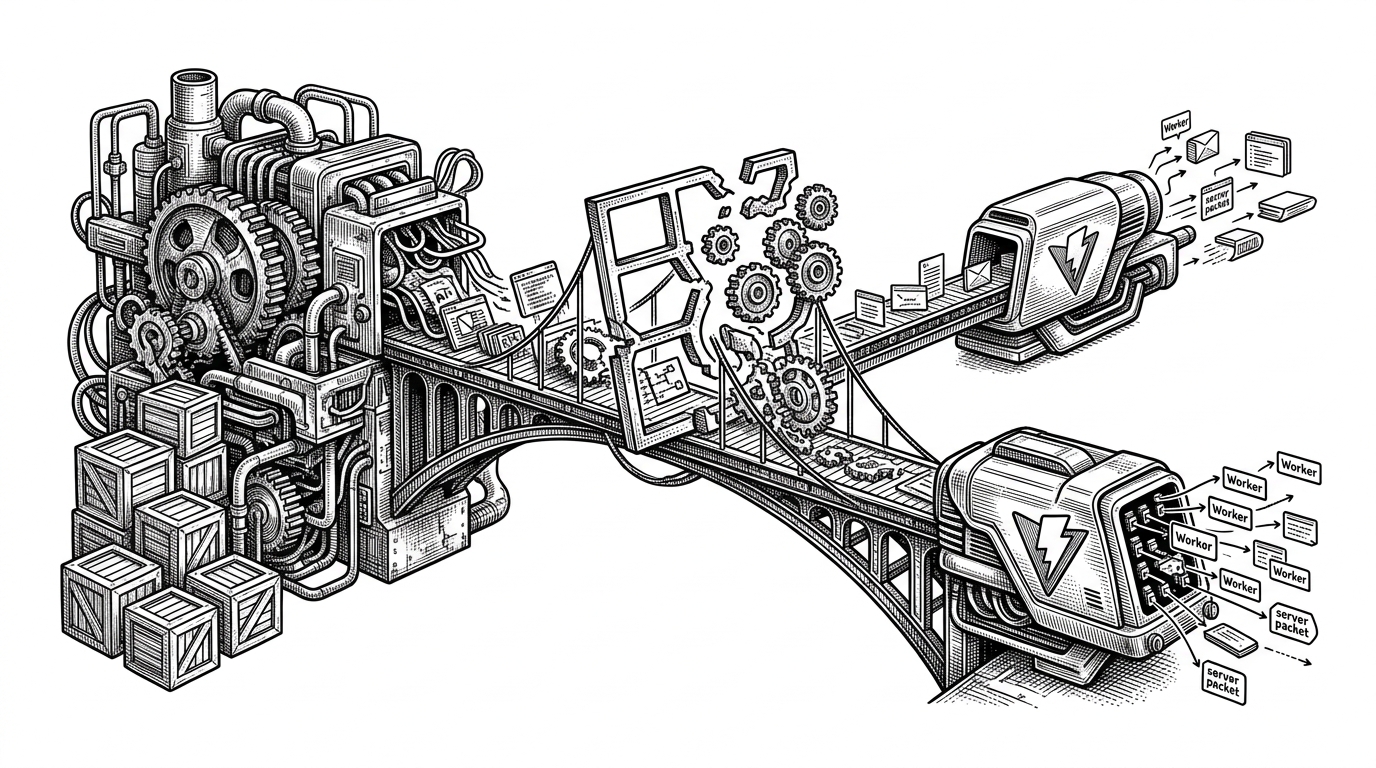
Why the build script is part of the design system
scripts/build.py is not a utility tucked off to the side. It is a quality gate. The repo treats page-count contracts, font checks, token synchronization, and CSS linting as part of the same design promise.
That is the difference between a template pack and a production system. A template pack gives you a starting point. Kami gives you constraints, checks them, and then renders only when the output still fits the rules.
Typography is the product
If you strip away the pipeline, what remains is taste. Kami’s typography leans literary rather than app-like. One dominant serif weight, warm paper tones, and careful spacing do more work than a stack of utility classes ever could.
That is why the documents feel composed. The system does not ask for attention. It earns it through hierarchy that reads like editorial judgment, not interface decoration.
Kami vs the usual ways people make documents
| Approach | Strength | Weakness | What Kami changes |
|---|---|---|---|
| Google Docs exports | Fast and familiar | Style drifts easily and print polish is limited | Adds a stricter visual contract before rendering |
| Generic design systems | Reusable UI patterns | Optimized for screens, not editorial output | Reorients design around documents and PDFs |
| Browser print workflows | Low setup cost | PDF fidelity can be inconsistent | Uses WeasyPrint and validation to stabilize output |
| Freeform AI generation | Flexible and quick | Often produces messy, inconsistent documents | Forces AI through templates, checks, and type rules |
The point is not that Kami has more features. The point is that it solves a different problem. It is trying to make AI-generated documents look like they came from an editor who cared about margins, not a model that just filled space.
The bigger bet
Kami hints at a larger shift in software: agent instructions becoming part of the design stack. If AI is going to draft documents for us, the important question is not just what it writes. It is what constraints it inherits before the first line lands on the page.
That is the real elegance here. Kami does not trust raw generation. It builds a narrow path that makes good judgment more likely than bad output, then lets the renderer do the rest.