Leonxlnx/multilayer-effect: How to Make a 404 Feel Like a Stage Set
A small Next.js experiment that turns parallax, masking, and particle recycling into a convincing illusion of depth.
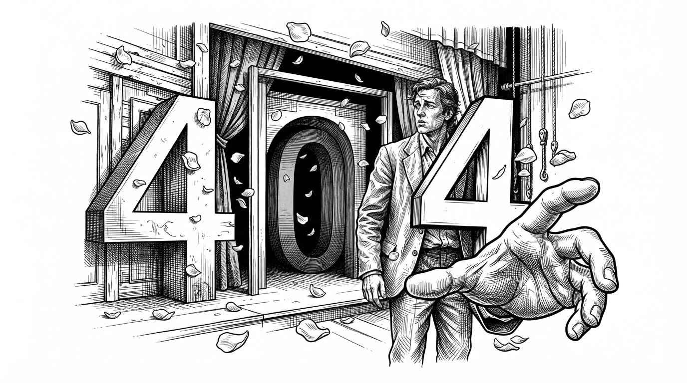
- Leonxlnx/multilayer-effect treats a 404 page as a depth engine, not a dead end.
- Its illusion comes from layer order, eased pointer tracking, and different motion weights per plane.
- The petal animation and CSS masking do more with less by recycling motion and shaping light instead of simulating full 3D.
- The project is a compact lesson in how restraint can make a front end feel tactile and expensive.
The 404 Is the Product, Not the Error
Most 404 pages apologize. This one performs. It uses a failure state to stage a tiny world: background image, central figure, foreground hand, split numerals, and petals that keep the frame alive. The point is not to distract from the error. The point is to make the error feel authored.
That matters because the page is doing brand work before it does utility work. The viewer reads depth, not just layout. And the depth is not coming from a 3D engine. It is coming from a careful stack of flat things that never stop negotiating with one another.
The Whole Trick Depends on Layer Order
| Approach | Motion model | Performance cost | Depth control | Best use case |
|---|---|---|---|---|
| Flat hero with simple transitions | Mostly static, a few fades | Low | Minimal | Landing pages that only need polish |
| Library-driven motion stack | Declarative animation with a heavier runtime | Medium to high | Strong, but more abstract | Interfaces with many coordinated transitions |
| This repo’s manual layered approach | LERP plus per-layer multipliers | Low | Precise and tactile | Small scenes that need a convincing sense of space |
The stack works because it is interleaved, not merely layered. The background stays back. The figure and hand occupy different planes. The numerals cut through the scene instead of sitting on top of it. That arrangement gives the eye a reason to believe in space before motion even starts.
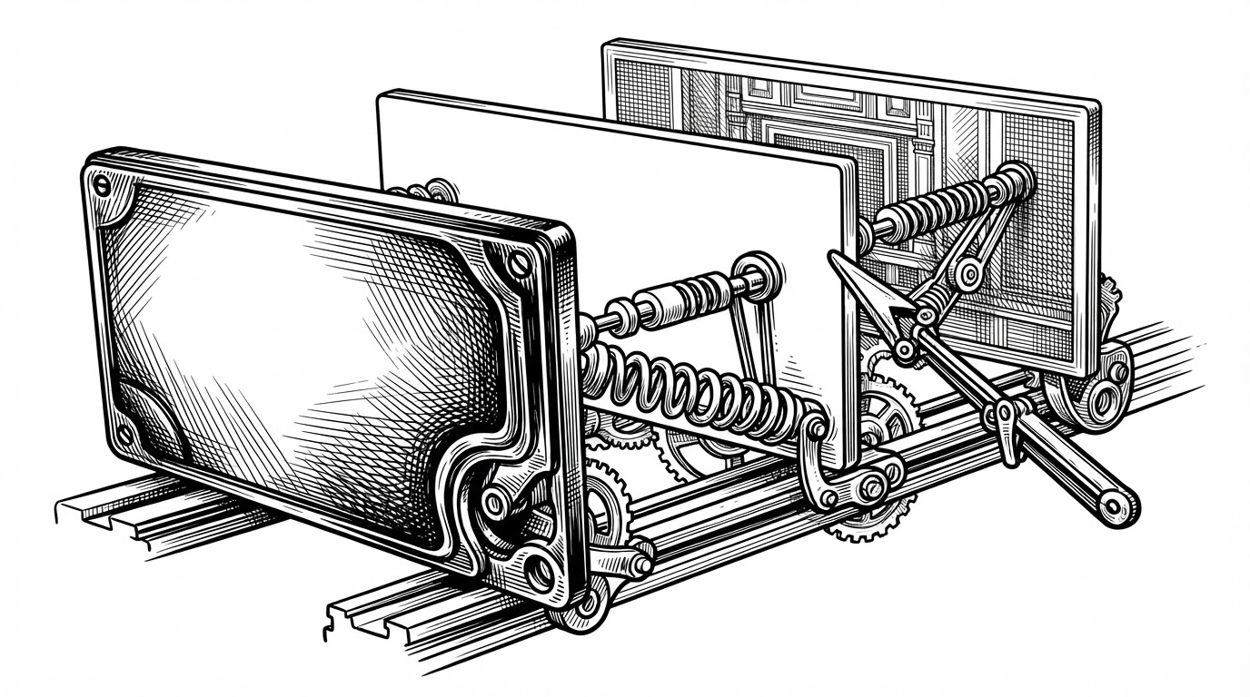
The Parallax Engine Is Just LERP and Weighting
In page.tsx, the page does not snap to the cursor. It eases toward it. That interpolation, often written as lerp, is the quiet center of the whole effect. Instead of chasing the pointer directly, the scene glides toward it at a controlled rate, which makes the movement feel weighted rather than twitchy.
const lerp = (current: number, target: number, ease: number) =>
  current + (target - current) * ease;

// one eased motion field, many responses
backgroundX = lerp(backgroundX, targetX * 1, 0.12);
personX = lerp(personX, targetX * 4, 0.12);
handX = lerp(handX, targetX * 12, 0.12);
That is the important move. Every layer shares the same base input, but each one multiplies that input differently. Near objects travel farther. Distant objects lag. Your brain supplies the missing depth cue because the motion is consistent with how space usually behaves.
The Petals Prove the Project Is About Feel, Not Features
Getting Started First, run the development server: Open http://localhost:3000 with your browser to see the result.
The petal system in Petals.tsx is a good clue to the repo's priorities. It uses a simple class-based particle model, updates position and rotation with browser-native transforms, and recycles petals when they leave the viewport. That means the animation reads as continuous without asking the browser to do wasteful work.
The effect is not trying to be a simulation. It is trying to be convincing. That is a better benchmark for a decorative system. If the viewer feels continuity, the implementation has done its job.
CSS Is Doing More Than Styling Here
The heavy lifting does not live in one obvious animation library. It is spread across the CSS. Masking blends the assets into one another. Gradients and shadows give the digits volume. Fluid type keeps the numerals from feeling bolted on. The stylesheet behaves less like decoration and more like a compositor for the page's visual logic.
.heroDigit {
  text-shadow:
    0 1px 0 rgba(255,255,255,0.3),
    0 8px 24px rgba(0,0,0,0.18),
    0 0 1px rgba(0,0,0,0.6);
  will-change: transform;
}

.layerMask {
  -webkit-mask-image: linear-gradient(to bottom, #000 72%, transparent 100%);
  mask-image: linear-gradient(to bottom, #000 72%, transparent 100%);
}
That is why the page feels more expensive than it is. The work is distributed. Motion, overlap, masking, and typography all share the burden of creating depth. No single trick has to carry the illusion alone.
This Is a Better Demo of Motion Craft Than a Framework Showcase
| What it looks like | What it actually is | Why it matters |
|---|---|---|
| A flashy 404 page | A disciplined layering exercise | The page proves that restraint can still feel premium |
| A framework demo | A rendering-pipeline lesson | The interesting part is how the browser is being used |
| An animation showcase | A system for visual weight | The code teaches motion judgment, not just syntax |
The project uses current tools, but its real value is older than the framework. It shows that custom motion can be more expressive than packaged animation when the developer understands composition, easing, and the cost of each moving part. In that sense, the repository is less about Next.js than about taste.
The strongest front-end work often looks simple after the fact. That is the point here. The page feels dimensional because every layer is placed with intent, every movement is weighted, and every CSS decision serves the same illusion.