RetroVesta Turns React Into a Split-Flap Machine
A deep dive into the timing loop, manual DOM updates, and design discipline behind a screen that feels mechanical, not decorative.
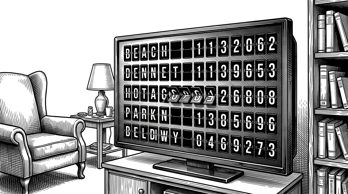
- RetroVesta works because it treats timing as a physical property, so the screen feels engineered instead of themed.
- Its best technical choice is to step outside React’s usual comfort zone for the flap grid and update the board directly.
- The design system keeps the board surface separate from the page chrome, which preserves the illusion of a real object.
- The project is less a novelty UI than a prototype for ambient interfaces that need to read clearly from across a room.
Most retro UIs borrow the look. RetroVesta borrows the behavior. That is the difference between something that feels decorative and something that feels built.
A screen that behaves like a machine
The target is familiar: the split-flap boards that once filled stations and airports. But RetroVesta is not trying to cosplay a departure board. It is trying to recreate the small physical tells that make those displays feel alive, like staggered motion, settling, and brief flashes of noise.
The animation loop does the heavy lifting
if (phase === "decelerate") {
  currentDelay *= 1.25;
}
if (phase === "decelerate" && currentDelay >= maxDelay) {
  flap.textEl.innerText = targetChar;
}
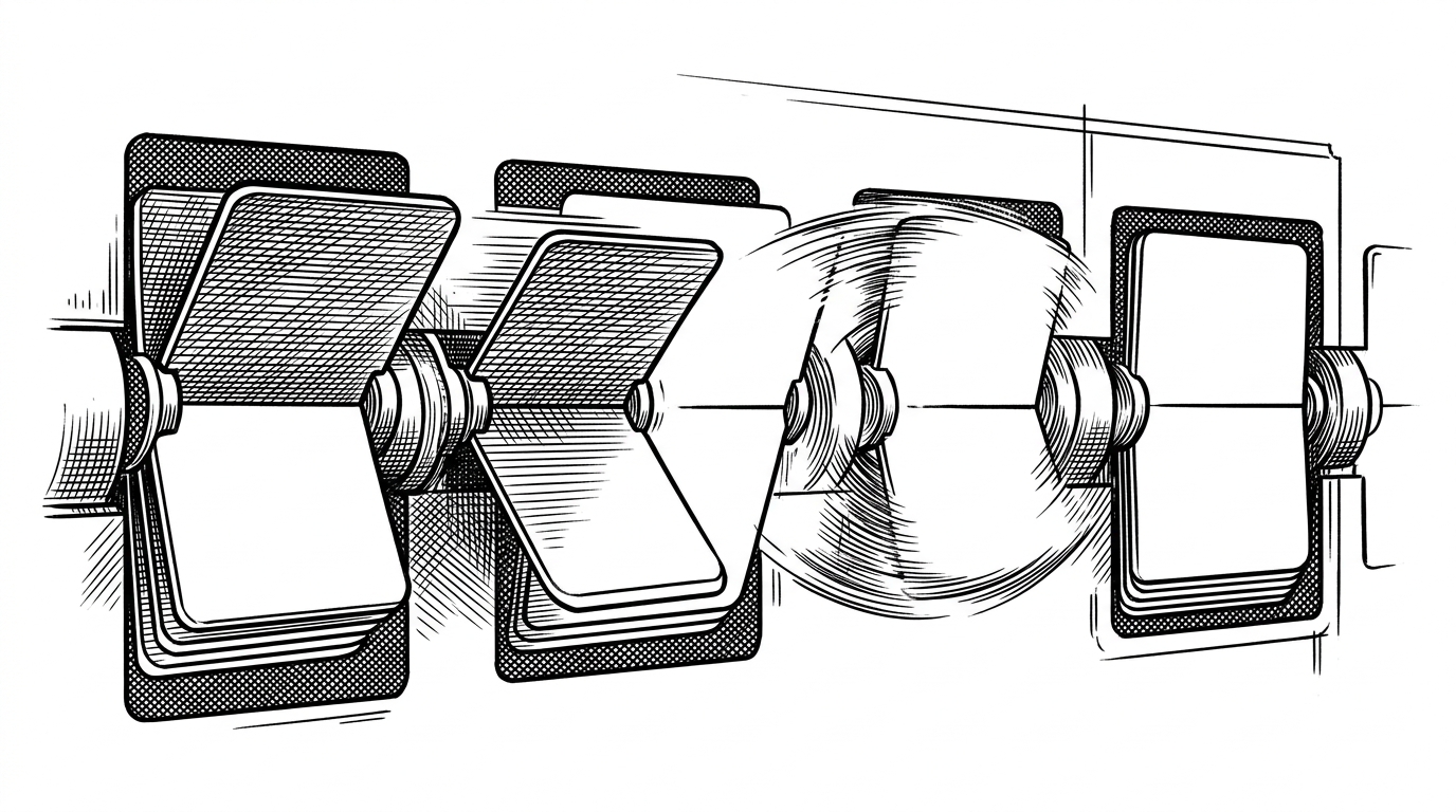
That tiny delay multiplier is the trick. Instead of easing toward the end like a generic UI animation, the flap stretches out as it slows, which gives the motion a sense of weight and resistance. The final snap to the target character lands because the board has already convinced you something physical was happening.
Why the board lives outside React’s comfort zone
The code makes a deliberate tradeoff. Rather than letting React re-render every flap on every tick, RetroVesta builds and updates the board more directly, using the DOM as the thing that matters most. For a dense grid of rapidly changing tiles, that is not a hack. It is the shortest path to a believable machine.
| Dimension | Vestaboard | Generic retro clone | RetroVesta |
|---|---|---|---|
| Hardware | Dedicated electromechanical device | Browser UI that looks nostalgic | Browser UI that behaves like hardware |
| Motion model | Real flaps and physical inertia | Often a simple CSS tween | Custom accelerate, fast, decelerate loop |
| Rendering strategy | Built into the machine | Usually declarative and decorative | Manual DOM updates for fast flap changes |
| Best fit | Premium installed display | Theme or novelty screen | Ambient living-room or office board |
The hero background keeps the page alive
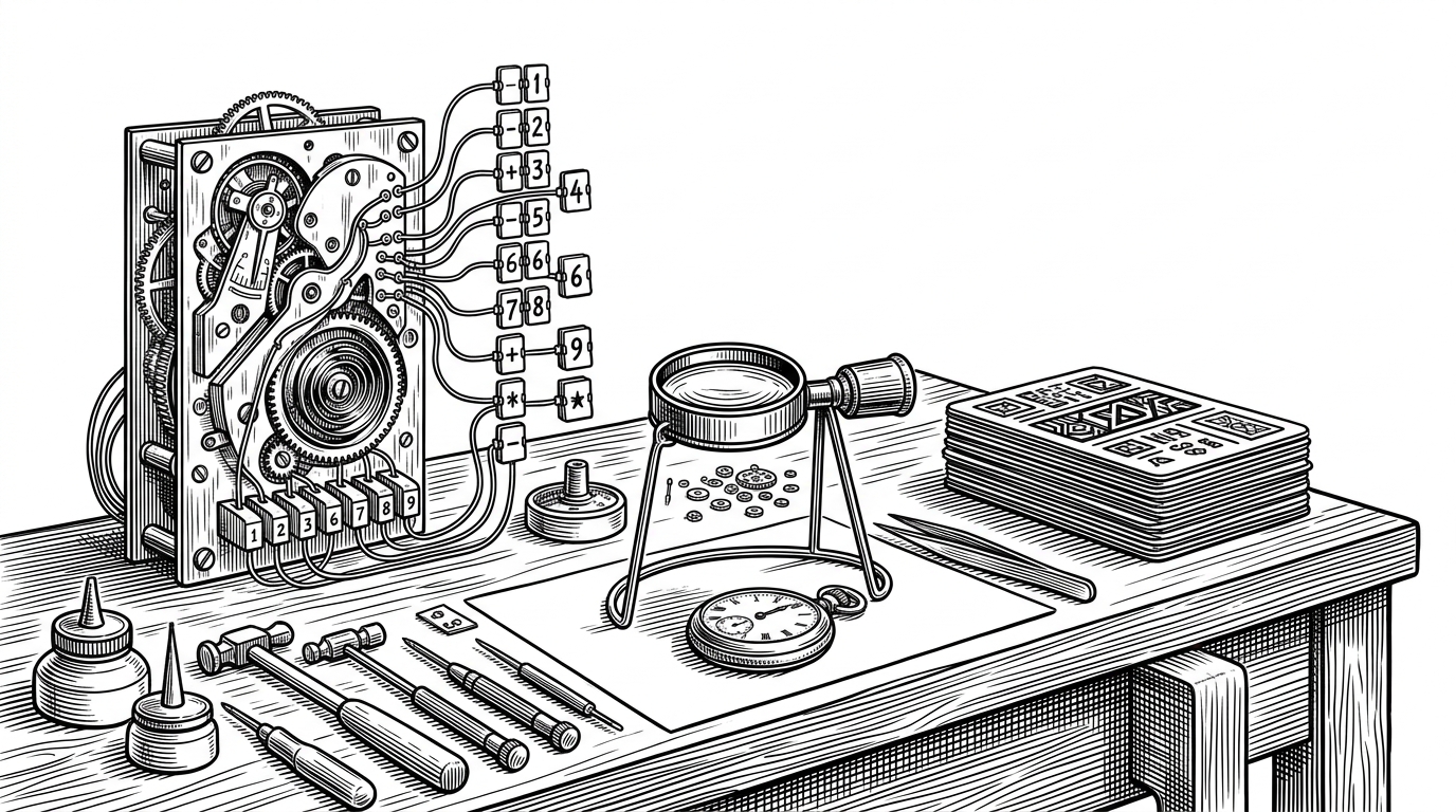
The main board is only half the idea. RetroVesta’s scattered mini-flaps keep the page from going dead, with periodic re-flips that make the screen feel like it has a pulse even when you are not interacting with it. That background motion does a quiet but important job: it makes the whole interface feel inhabited.
The design system is part of the product
RetroVesta’s polish comes from constraints. The fonts, contrast, and spacing are tuned so the board reads like a separate physical object, not a component that happens to sit on a page. The codebase even encodes a taste doctrine, which is a strong signal that the project is trying to fight off generic, over-styled frontend habits.
RetroVesta sits between product demo and product category
Compared with Vestaboard, RetroVesta gives up physical hardware and premium permanence. Compared with a generic retro clone, it gives up the easy shortcut of style-only animation. The result lives in the middle: more alive than a mockup, less expensive and more flexible than dedicated hardware.
What RetroVesta gets right about ambient interfaces
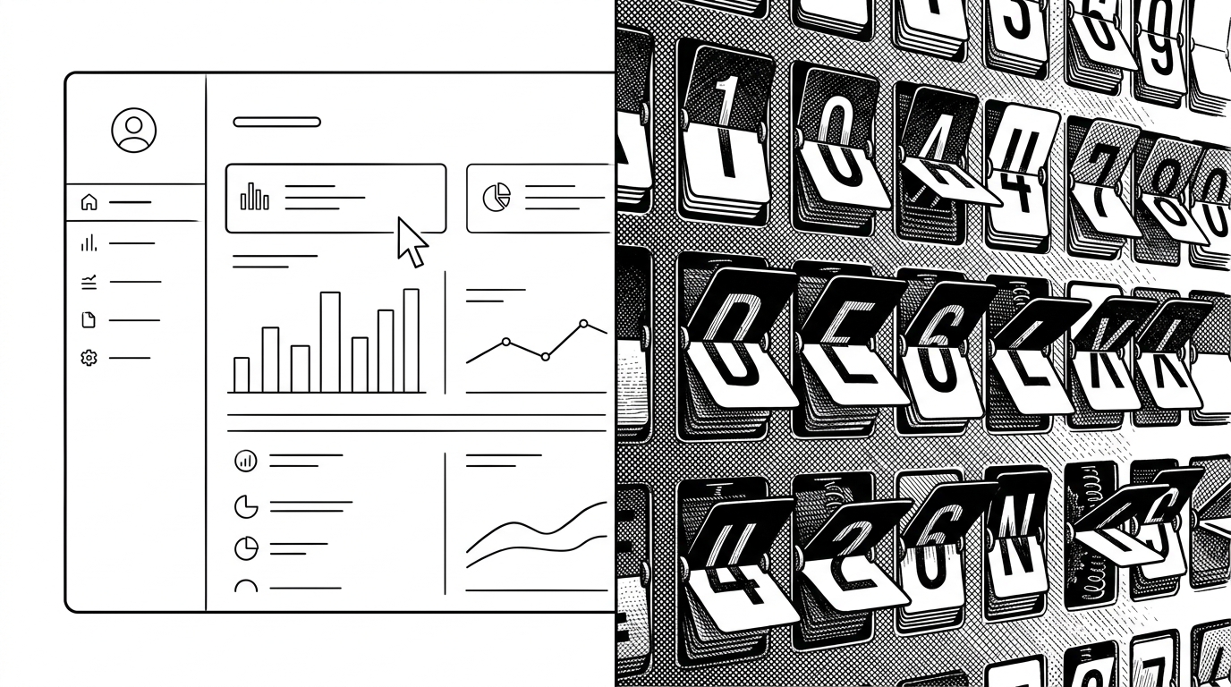
The best ambient interfaces do not demand attention. They reward glances. RetroVesta understands that a background screen has a different job from a dashboard or app: it has to stay legible from across a room, hold its mood over time, and still feel like something with internal logic. That is why this repo is interesting. It is not just a retro effect. It is a design argument, expressed in timing code.