StarKnightt/windows-xp-portfolio: The Browser Tab That Thinks It’s Windows XP
A high-fidelity retro desktop, built as a portfolio template, where the real invention is not nostalgia but the orchestration of windows, state, and user attention.
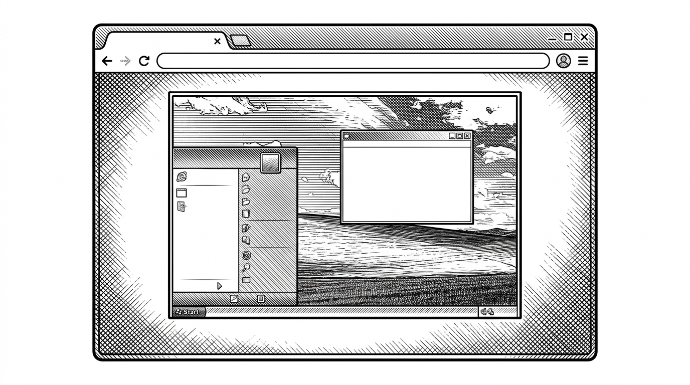

WINDOWS XP PORTFOLIO ... A portfolio based on windows xp and retro theme
- This repo works because it treats nostalgia as an interface contract, not a skin.
- The desktop feel comes from a few disciplined rules around boot flow, focus, dragging, and boundary control.
- It is more complete than a CSS theme and less ambitious than a full browser OS, which makes it practical as a portfolio template.
- The result is memorable branding that still reads as a serious front-end build.
StarKnightt/windows-xp-portfolio is not trying to fool anyone into believing a real operating system is running. It is doing something sharper: it makes a browser tab behave like a desktop just enough that your brain fills in the rest. That is why it lands. The interface is familiar, but the delivery is stripped to the minimum machinery needed to keep the illusion intact.
The project’s own framing is blunt. In the README, StarKnightt describes it as "A portfolio based on windows xp and retro theme". That undersells the useful part. This is a working pattern for turning personal branding into a desktop metaphor people understand in a second.
A Portfolio That Opens Like a Computer
The first trick is staging. The page does not greet you like a normal portfolio, with a hero section and a grid of cards. It bootstraps into a Windows XP world: boot screen, welcome transition, desktop, taskbar, start menu, draggable windows. That sequence matters because it creates a sense of arrival before it reveals any content.
If you have used XP, the interface carries instant emotional weight. If you have not, the design still reads as software with rules. Either way, the page makes a promise: this is not a static résumé, it is an environment.
The Illusion Is Built From Small, Specific Rules
The technical core lives in a state machine. In app/page.tsx, the app moves through boot, welcome, desktop, and logging off states. That sounds simple because it is simple. The craft is in how those states are sequenced so the interface behaves like an old machine that still has momentum.
The best shortcut is the one you barely notice. The code uses sessionStorage to remember whether the boot animation has already played, so the experience skips the long intro on repeat visits. That is not just a performance tweak. It is an attention decision. The page respects the returning user without losing the ritual for the first one.
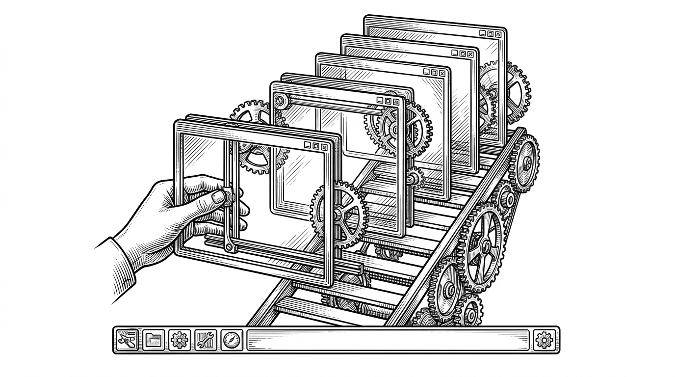
The windowing logic in Window.tsx does the rest. Active windows rise through z-index changes, dragging is handled with document-level pointer movement, and positions are constrained so a window cannot be thrown off-screen. None of this is novel in isolation. Together, it creates software-like friction, which is exactly what the desktop illusion needs.
const [appState, setAppState] = useState<'boot' | 'welcome' | 'desktop' | 'loggingoff'>('boot')
const [booted, setBooted] = useState(false)

useEffect(() => {
  const seenBefore = sessionStorage.getItem('xp-booted')
  if (seenBefore) {
    setBooted(true)
    setAppState('desktop')
  }
}, [])

const focusWindow = useCallback((id: string) => {
  setWindows(prev =>
    prev.map(win =>
      win.id === id ? { ...win, zIndex: nextTopZ } : win
    )
  )
}, [])
Why the XP Look Still Works
The Luna-era styling does a lot of quiet work. Title bars use glossy gradients, buttons are beveled with inset shadows, and the whole surface language is built to trigger a memory of controls that felt physical. It is a specific kind of nostalgia, one that comes from touch as much as appearance.
That matters because the visual system is not decorative. It carries the logic of the interface. A start button that looks pressable, a window frame that looks grabbable, and icons that look like app shortcuts all tell the user where attention should go next.
This is the kind of CSS that does not merely style a component. It imitates a piece of physical hardware from a specific moment in interface history.This Is a Template, Not a Toy
The strategic value is the part many retro projects miss. This is not a one-off art piece, and it is not a proof-of-concept waiting for an idea. It is a portfolio scaffold. A recruiter can click around, understand the personality immediately, and still encounter a developer who knows how to manage state, layout, and interaction in detail.
That makes the template more useful than a pure theme library. A CSS package gives you a look. This repo gives you a format for telling your story inside that look. The difference is huge if your goal is to be remembered without sacrificing clarity.
| Project | What it is | Best use | Why it matters |
|---|---|---|---|
| StarKnightt/windows-xp-portfolio | A complete portfolio template with desktop interactions | Personal branding and showcase sites | Turns nostalgia into a usable front-end format |
| xp.css / 98.css | CSS libraries for retro styling | Fast themeing and UI skins | Provides the look, not the application shell |
| daedalOS | A large browser desktop environment | Deep simulation and hobby OS experimentation | Proves the browser can host a real desktop-like system |
| Win98 | A React-based retro desktop simulation | Interactive nostalgia projects | Explores a similar idea in a different era and stack |
How It Compares to the Rest of the Retro Desktop World
The comparison is useful because this repo sits in the middle of a crowded spectrum. On one end are style systems like xp.css and 98.css, which give you the skin. On the other end are projects like daedalOS, which pursue the full desktop fantasy with far more ambition. StarKnightt’s project is deliberately narrower. It is easier to fork, easier to brand, and easier to ship as a personal site.
That narrowness is the point. The repo does not need a file system or a terminal to do its job. It needs a convincing desktop envelope, a set of content windows, and enough behavioral discipline to make the environment feel coherent.
| Dimension | StarKnightt/windows-xp-portfolio | CSS skin libraries | Full browser desktops |
|---|---|---|---|
| Scope | Portfolio-first desktop metaphor | Styling foundation | Operating-system simulation |
| Complexity | Moderate | Low | High |
| Customization | High for content and branding | High for visuals, low for behavior | High, but heavy |
| Audience | Recruiters, visitors, and prospective clients | Builders who want a retro look | Power users and OS hobbyists |
| Payoff | Memorable identity with low friction | Fast aesthetic transformation | Deep immersion and technical spectacle |
Why This Works as Personal Branding
Good portfolios do two things at once. They help the visitor find the signal, and they make the builder feel distinct. This repo succeeds because it uses a familiar interface to create an unfamiliar first impression, then gets out of the way and lets the work inside the windows do the rest.
That is a smart trade. It is memorable without being random. It is playful without becoming a gimmick. Most importantly, it shows taste and execution in the same gesture, which is exactly what a strong personal site should do.