employee-attrition-predictor: Employee Attrition Predictor: The Last Mile from Notebook to HR Decision Tool
A compact Flask app that freezes a Random Forest, preserves preprocessing, and surfaces confidence so HR teams can act on risk instead of guessing.
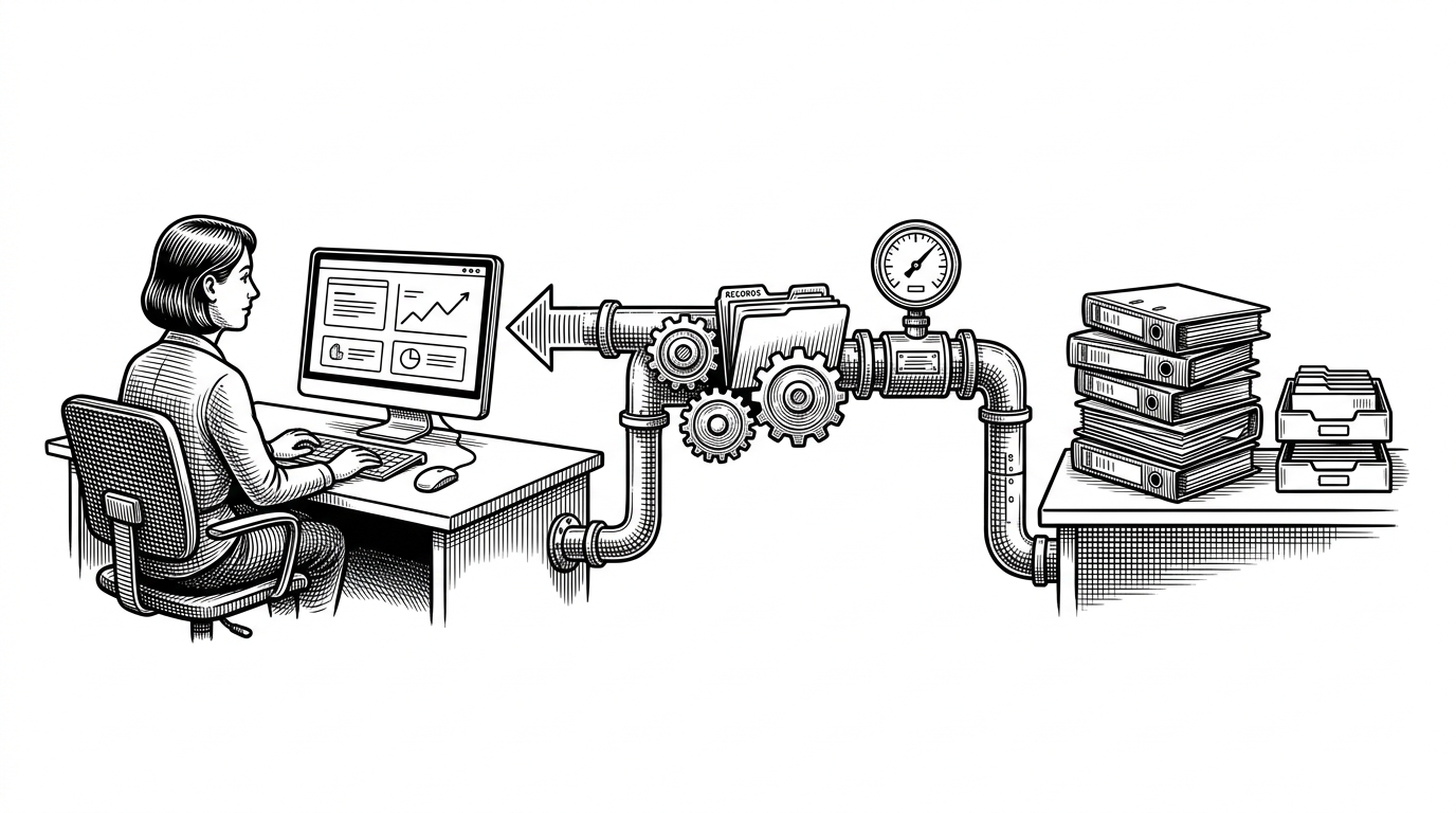
- This repo matters because it turns a trained attrition model into a decision-ready HR interface with confidence, not just a binary label.
- Its real technical strength is the inference contract: saved artifacts, preserved scaling, and manual categorical mappings keep live predictions aligned with training.
- The UI is part of the model, because constrained inputs and a result banner reduce bad data before it reaches Flask.
- The project sits in a useful middle ground between notebook demos and enterprise people-analytics software, with enough structure to be integrated without pretending to be a full HR platform.
Why this is not just another attrition demo
Most attrition projects stop at a notebook and a chart. This one takes the harder step: it turns a Random Forest into a small HR application that can accept structured input, return a prediction, and surface a confidence score. That changes the object from a demo into a decision layer.
That confidence score is the tell. A manager does not just get “leave” or “stay.” They get a probability, which is far more useful for triage, follow-up, and escalation. The repo’s value is not the model alone. It is the wrapper that makes the model actionable.
What the app actually does for HR
The workflow is straightforward. A user enters a handful of HR signals, the backend applies the same transformations used during training, and the model returns both a class prediction and a probability. The result is shown in a web form, but the same prediction core can also serve JSON through an API endpoint.
That dual surface matters. It means the project is not locked into one interface. A people analytics dashboard, an internal HR system, or a lightweight automation layer could all call the same prediction logic.
How the model stays mathematically honest
This is where the repo gets interesting. The code does not just load model.pkl and call it a day. It also loads scaler.pkl and reconstructs the categorical mappings for department and salary. That keeps inference aligned with training, which is the difference between a reliable app and a misleading one.
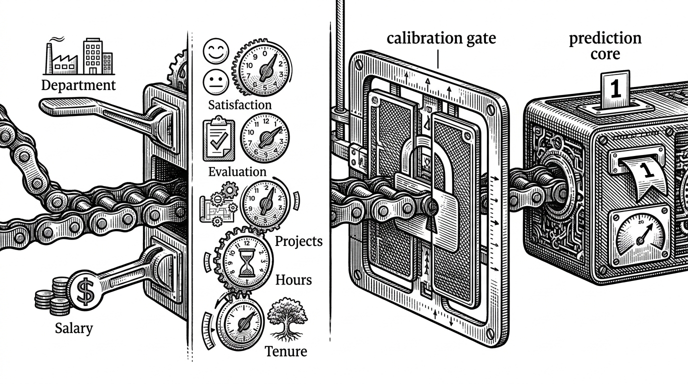
The important idea is simple. The model was trained on transformed data, so live data has to be transformed the same way. Scaling matters because feature magnitudes differ. Manual label mappings matter because categories must resolve to the same numeric codes used during training.
# Core inference pattern in app.py
model = pickle.load(open('model.pkl', 'rb'))
scaler = pickle.load(open('scaler.pkl', 'rb'))

DEPARTMENT_CLASSES = ['sales', 'technical', 'support', 'IT', 'hr', 'accounting', 'management', 'product_mng', 'marketing', 'RandD']
SALARY_CLASSES = ['low', 'medium', 'high']

features = np.array([[satisfaction_level, last_evaluation, number_project,
                      average_monthly_hours, time_spend_company,
                      department_encoded, salary_encoded]])
features_scaled = scaler.transform(features)

prediction = model.predict(features_scaled)[0]
probability = model.predict_proba(features_scaled).max()
That last line is the feature worth noticing. The app does not stop at classification. It extracts probability from predict_proba and turns it into a confidence percentage. That makes the output more useful for triage, because borderline cases and high-certainty cases should not be treated the same way.
The UI is doing more than looking good
The frontend is not decorative. Sliders, dropdowns, and toggles constrain the input space before the request ever reaches Python. That is a quiet but important form of validation, especially in a tool where malformed categories or out-of-range values can break the inference contract.
The result banner does one more job: it interprets the output. Instead of dumping raw probability at the user, the interface gives a clear visual cue about risk. That is the difference between a model endpoint and a usable workflow.
| Dimension | Notebook-only demo | Generic HR dashboard | This repo |
|---|---|---|---|
| Setup effort | Low | Medium | Low to medium |
| Trust in live inference | Low | Medium | Higher, because artifacts and scaling are preserved |
| Human usability | Low | Medium | Higher, because the form constrains inputs |
| Integration readiness | Low | Medium | Higher, because of the API route |
| Interpretability | Usually weak | Medium | Higher, because confidence is exposed |
| Ethical risk | High | Medium | Medium to high, depending on use |
The project lives in the space between experimentation and enterprise. It is not pretending to be a full HR suite. It is doing the narrower, more realistic job of making a model callable, understandable, and harder to misuse.
Why this matters in the HR software landscape
Compared with a notebook-only project, this repo adds persistence, input discipline, and an integration path. Compared with a commercial people analytics suite, it lacks scale, benchmarking, and deep organizational context. That is exactly why it is interesting. It shows the minimum viable shape of a trustworthy internal tool.
The comparison is less about features than posture. Notebook demos prove a model can work. Commercial suites prove a market exists. This repo shows how a small team can sit in the middle and build something operational without inheriting an entire enterprise platform.
The ethical catch
A confidence score can improve judgment, but it can also create false precision. If the feature set is shallow, or the historical data reflects bias, the probability can look more authoritative than it really is. HR teams should treat this as a triage aid, not a decision machine.
That is the trade-off in predictive people analytics. The better the interface, the easier it is to trust. The more reason there is to ask what the model actually knows.